We’re absolutely delighted to roll out the first step in our journey to make our website a little prettier and easy to use. Today’s step is a small one, it’s mainly cosmetic, but it fixes a lot of the things we’ve wanted to change for a while. This initial work now gives us a platform to continually improve our UI throughout 2014.
We know that it can be quite stressful to get used to a different look, so we’ve compiled a list of the most important things that you need to know, and noted the reasoning that has gone into the new design.
What’s changed?
A New Design
We’ve given the site a mini-makeover. Don’t worry, it’s not a complete rebuild, all of your pages and tools are still where you remember them.
The most in-your-face change is the new header background. We’ve taken out the old gradient, retired the dot-matrix world map, and replaced them with a strong solid colour which was part of our earlier colour palette. This really brings out the contrast in the fonts, making the text feel crisper and easier to read.
A Stronger Search Bar

The search bar has evolved over the last few months and is so much more now than just a link to Site Explorer. You can type any search term, URL or domain in there, and we’ll automatically redirect you to either Site Explorer or our Search Explorer. So, the “Site Explorer” header seemed redundant, and it’s gone.
A few of you lovely customers have given feedback that they’d like the search bar to automatically focus when you land on the front page. It’s a great suggestion and we’ve added that.
More Intuitive Navigation

The old two-line navigation looked dated and cluttered. It was full-up and there was nowhere left where we could give you more links to get to your stuff quickly, and we’ve got lots of plans this year to give you more stuff.
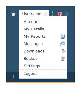
Our solution is to bring all of your personal navigation items from this bar into a single menu, easily accessed with a hover or tap on your name.
Where’s “My Reports” ?

Don’t worry, you can still quickly get to My Reports, Messages, Account and Logout. They are safe and well, in your user menu.
Our minds tend to connect themes and ideas together, so we expect to see the parts of the site that are unique to us to be grouped together. We have therefore grouped them under your username.
The new home for My Reports does feel odd at first, and it may take a few days for you to stop looking for it top-left, but it becomes second-nature very quickly.
And now that we’ve brought these items under your own personal menu, we can start to add new things in there. You may notice that there are now links to your Downloads and Settings pages.
Search Explorer & Site Explorer
We’ve brought the new front-page style through into the Site Explorer and Search Explorer tools.
What a difference! You can now see at-a-glance how the different parts of the page hold different types of data. The top blue is where you can tweak your input, scope and data indexes, the darker sub-menu holds data sets and summary tabs, and the grey bottom bar lets you filter your data view. All nice and neat, and all in order.

Almost everything is still in the same place, but we have moved two items. The old Scope clickable links now live in a single drop-down to the right of the input box, and the Create Report and Verify Domain buttons that used to the in line with the search bar are on the dark blue tab bar, over on the right-hand side.
Data Table Icons and Link Behaviour
We’re excited about this one.
We’ve removed the row of icons that littered every data table URL. Unless you use the site daily, these icons are very confusing and get in the way of moving around. There was also a problem with the URLs, in some tables the URL would open in Site Explorer, in other tables it would open the URL. It wasn’t intuitive and had to be fixed.

The left side in this image shows how it used to look, and on the right is how it appears today.
As you can see, the repeated icons have gone. Hurray.
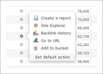
In their place is a single cog icon. When you hover or tap that icon you bring up a lovely little box with the actions you can perform on your URL. And this one has labels so that you can be confident that the icon does what you expect it to do.

When we put this menu together, we realised that we had to make a choice on the default link action for the URL – which one of those happens when you click on a URL in a table? We needed a standard action for everyone.
Rather than decide for you, we thought it would be a better idea to let you choose what you would like to happen when you click on a URL link. If you are a registered user, you can click on “Set Default Action” in the cog menu. You’ll find this lovely form:

Choose what you’d like to happen, press Update Settings, and you’re good to go. If you were in the middle of a search, don’t worry, we’ll put you straight back to your page when you press Update.
You can change this settings as often as you like.
At the moment you can choose that a link either opens a URL, opens the domain in Site Explorer, or creates an Advanced Report (and you can set whether or not that’s in a new window). But over time, we definitely plan to expand this.
Tweaks
That concludes the round-up of the most visible updates today.
There are also lots of small tweaks around the site here and there. Most are very minor, but the three that may interest you are
- Trust Flow now appears before Citation Flow throughout the site.
- We’ve moved Site Explorer’s “Download Data” link from the bottom of each table to the top. No more scrolling to grab the top data items.
- Improved paging underneath each table. We now tell you how many pages are in your table, and have added a way for you to quickly jump to any page.
Those are the main tweaks, we’ll leave you to discover the other micro-improvements we’ve made.
Feedback
We really hope that you like what we’ve put together. If you’ve anything to suggest, we are always interested in your feedback. If a quick link would make your life easier, if there’s anything that you think we’ve missed, or if something doesn’t look quite right in your browser, please use the orange feedback button that’s on the left-hand side of almost every page. We obviously can’t promise that we’ll include everyone’s ideas, but we do read every one of them.
This refresh is the first major step on a long journey to improve your Majestic SEO experience, and help you get to the reports and data that you need. You can definitely expect to see ongoing improvements throughout the year.
- TLD Checker – New for 2026 - February 26, 2026
- Welcome Hub – Improving the final step of your login journey - September 9, 2025
- Site Explorer – Advanced Query Filters BETA - August 28, 2025


Well done guys. Really great work.
February 5, 2014 at 12:26 pmThanks Seb. That’s praise indeed from you!
February 5, 2014 at 12:59 pmI like this style. Thanks.
February 5, 2014 at 3:25 pmThank YOU! We are just pleased that most people seem to like it. As Daniel says – you can’t please everyone – but I think every change in this update is for the better. We also got some constructive feedback for the next phase.
February 5, 2014 at 5:23 pmOne small thing that doesn’t seem quite right….. Although you’ve changed the title of the search box on the homepage to be more descriptive (which is a good thing), once you go through to site explorer the title changes to “Site Explorer Results” implying that the search box in that section doesn’t facilitate the same level of rich searching as the homepage. This is likely to lead to a high percentage of users carrying out subsequent searches by passing back through the homepage when they are switching from site explorer to search explorer or vice versa.
Otherwise, looking good, liking the cleaner lines.
February 5, 2014 at 3:33 pmHi Daniel.
Thanks for the observation. Astute, but raises an interesting point when you say:
“implying that the search box in that section doesn’t facilitate the same level of rich searching as the homepage”
You are right, but strictly speaking that is correct. On the home page you can either enter a URL/domain OR you can enter a search phrase. We will decide for you whether you are asking for our SITE EXPLORER (which analyzes back links) or SEARCH EXPLORER (which analyzes phrases). On the inner page you have already made the decision one way or another. I gues we COULD add the drop down of “phrase” but I expect that would really mess with people’s heads as we jumped from (say) this
February 5, 2014 at 3:46 pmto
this. I think that would be too much for someone to take in, because the tools are extremely different in nature.
> Always a problem when you’re trying to make a product to suit everyone. The joys of UX design 🙂
February 5, 2014 at 3:57 pmDixon,
Love the changes!!
Still hoping you give the option to sort by column (ex. Report Name, External Backlinks, External Ref Domains…etc) in the “My Reports” folders.
You mentioned on a webinar awhile back that this was on the list, fingers crossed on this!!
February 5, 2014 at 7:04 pmHi Dave,
February 6, 2014 at 7:51 amYes – that is definitely on the list, although the output from within “MyReports” itself is right at the heart if the system and as such much harder to modify. But we do have ideas and plans 🙂 – Thanks for the feedback!