We need your help.
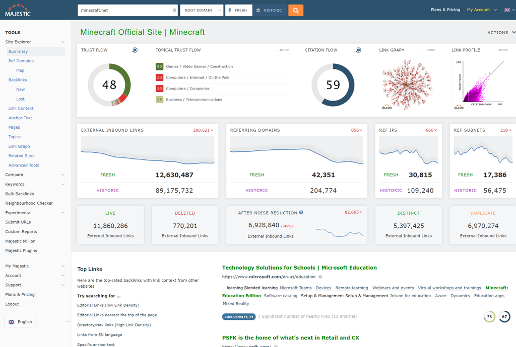
Over the last few months we have been busy on an overhaul of the Majestic Site to present a more contemporary look and feel to the tools you use to access our backlink data.
We are now preparing to switch the Majestic.com website over to the new look and feel. Before we do, we want your input to ensure your use of Majestic is enhanced as a result of these changes.
UPDATE The new look and feel is scheduled for launch on August 1st 2022. Please take the time to have a look around before the switch over.

What is changing?
A great deal is changing in Majestic. We still offer the same great data, but have taken care to enhance access to the tools and improve how you can view the same data through different tools.
The guiding philosophy behind these changes is to balance resolving UX issues now with building a platform for future development.
We have aimed to:
- Move tool navigation to a menu on the left, making it easier to navigate between tools and reports
- Enhance our responsive design. Majestic has long supported small devices. We have now made Majestic work better with contemporary, high resolution desktop monitors.
- Resolve a number of UI inconsistencies which have crept into the interface after years of development.
- Create an interface that acts as a foundation for future innovation and new features.
In the more recent stages of development, we have run a pilot with some of our Ambassadors and a small number of guests. This has been amazingly informative (thanks all!) and helped shape a number of updates to the system.
When is this going live?
The good news: We aren’t aiming to disrupt your workflow immediately.
We have been running a secret new version of the website in parallel with our current site for some time.
We have been delighted with feedback to date. The left navigation has been received positively. The message so far is that this update represents a huge step in the right direction for Majestic.
We have encouraged participants in the pilot to use this new pilot version of the website as a part of their daily work in order to prepare for the update of the new version.
This is where you come in.
We would like you to join our pilot.
We invite you to try out our new site. It’s backed by the same data as the normal Majestic site. Our aim is twofold:
- To encourage you to try the new site ahead of our update on the main Majestic site.
- To give you the opportunity to let us know if we have broken any of your workflows on Majestic ahead of launch.
We will be acting on your feedback and updating the pilot site in the build up to launch.
Read on for details of how to join the pilot
How to access the new site?
We invite you to access the pilot version of the website. This version is simply a new skin on the existing Majestic backend. Your existing login details are used to access your existing account via this new site.
To access the new website, simply visit:
As part of your checks, we are particularly interested in …
- Your First Impression
How does the navigation feel in the first few minutes? Did you instantly like/hate any part of it? - Your Ongoing Impression
Once you’ve got used to the left navigation, how does Majestic feel to you? Have we made things better, or worse? Please Note: We hope the pilot will be updated as a result of your feedback. Regular use of the pilot site will keep you informed of enhancements prior to the update of the main site. - Is there something you can’t find?
We are particularly interested in frustrations where something that used to be at your finger-tips now feels too far away. In any significant interface change, many of us struggle with muscle memory the first few times we use it… but after that – is there anything you just can’t find, no matter where you look? - Is anything clearly broken?
While we have tested extensively, there is a chance we have missed something. Maybe the layout is broken, or perhaps a label is overlapping inside, or outside its box? Please let us know.
Our customer services team will be working closely with our developers to ensure your comments and observations are seen by the product development team. We will continue to offer free one-to-one demos, but may prioritise our valued subscribers should demand exceed session availability. Book your walkthrough at: https://walkthrough.majestic.com.
We hope your impression is positive. Either way, we would love to hear from you.
To get in touch with any feedback, please visit: https://majestic.com/help/contact-us?subject=New+UI+Pilot&Topic=feedback .
UPDATE The new look and feel is scheduled for launch on August 1st 2022. Please take the time to have a look around before the switch over.
- How SEO and Paid Search can work more effectively together - March 30, 2026
- Safe Link Building in 2026 - February 19, 2026
- How to Optimize for Google AI Mode - January 23, 2026


I love it, great work guys! Majestic is here for me and has already been so dependable for us and what we do in the face of some other less reliable tools that are out there. Thank you, and all that we ask is that you keep doing what you do!
Sincerely,
the folks at We are Simply SEO
July 17, 2022 at 1:40 pmPlease increase the size of the graphs for Backlink History and Referring Domains, because there is a lot of empty space to the right of them.
July 28, 2022 at 3:14 pmHello Andre. Thanks for the feedback. I have passed this to the development team for consideration.
July 29, 2022 at 12:01 pm