Data visualisations are powerful business tools, not only do they enable you to understand vast amounts of information, but if done correctly they allow you to identify insightful trends that can be used to transform business strategies – giving you that competitive edge that we all strive for. However, we understand how difficult it can sometimes be to come up with creative and thought provoking data visualisations, so hopefully this post can help spark up that needed inspiration.
Continuing on from a previous blog post about visualising data with ‘Round the Clock’, where we started off our mini-series of recapping over our favourite data visualisations developed through the work of Labs.majestic, today we have chosen to revisit Link Events
Link Events
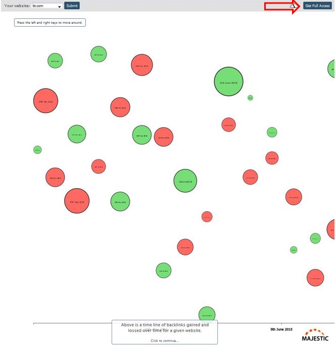
Link Events is a visualisation that displays a timeline of the backlinks gained and lost overtime for a particular website. The green bubbles that you see are the links that the website has gained and the red bubble are the links that the website has lost. The size of the bubbles signifies the quantity of links lost or gained that day. Clicking on a day will break down the visualisation further by displaying the domains that the links were gained or lost from, and by clicking on an individual domain link reveals the specific URL that the link was gained or lost at.
[iframe src=”http://labs.majestic.com/2015/link-events/” width=”100%” height=”600px” frameborder=”1″ scrolling=”auto” ]
To gain full access of Link Event so that you are able to enter any website of your choice into the visualisation, you will need to make sure you are logged in to the Majestic site and click on ‘Get Full Access’ shown below.
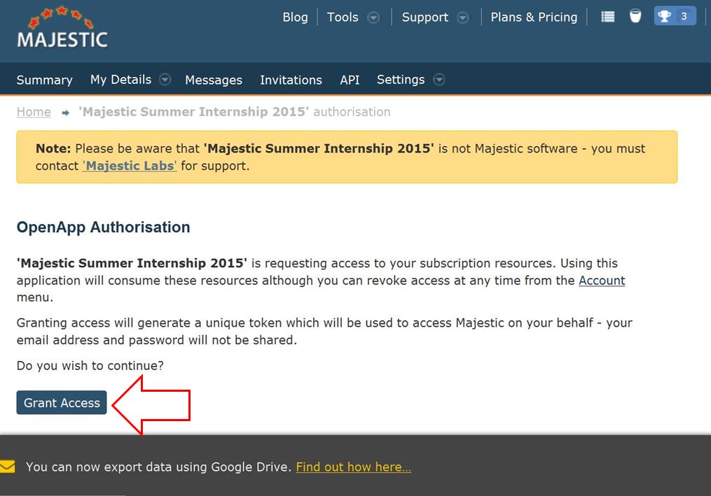
You will then need to click on ‘Grant Access’ where you will be given an access token code that you will need to copy and paste into Link Event to be granted full access.
We hope this has given you some inspiration, let us know what you think 🙂
- Majestic Historic Index Update - July 30, 2018
- Updated version: Solo Links Tool - June 28, 2018
- Majestic Historic Index Update - May 30, 2018


