Majestic has always placed the quality of its data first and foremost – this has been the basis of everything we have done – from developing infrastructure to support what we believe is the fastest link data API’s, maintaining stability of platform, and adding high quality Flow Metrics like Trust Flow and Citation Flow.
However, we recognise that quality of data is just one of many concerns of the modern professional, and in a busy time table, ease of access to that data is also a very important consideration. As such, we’ve been working hard over the last couple of years to try to enhance the usability of our website. This started in subtle ways by reducing the onscreen clutter, adjusting alignments and modifying the site to be more responsive.
The simpler UX changes have become less numerous in number, and following a much needed overhaul of our checkout system, we have invested some time in the slightly less glamourous world of Information Architecture.
We were frustrated that seemingly straight forward tasks in the website had become unnecessarily difficult – something as simple as obtaining an invoice required far too many clicks and far too much knowledge of how our application was structured.
Now we have made some changes. The changes can be seen in two core parts of the site; The Navigation menu, and the Dashboard.
Navigation Menu
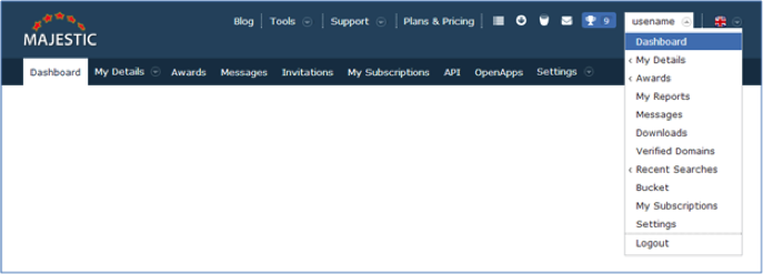
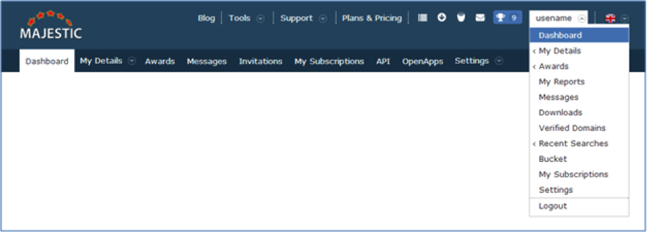
Navigation Menu Before:
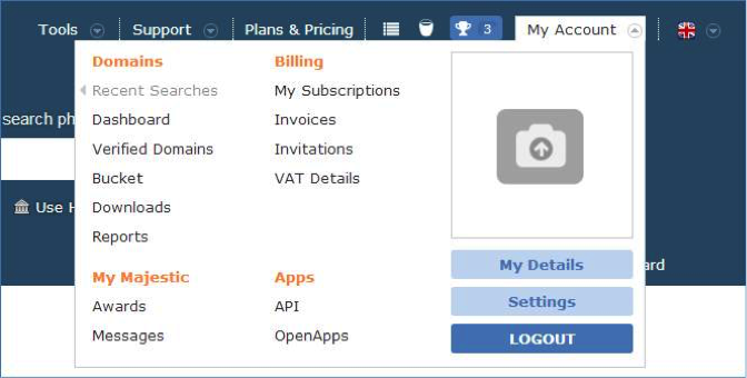
Navigation Menu After:
We’ve broken the options down into 4 clear categories, which we hope simplifies the task of navigating our application. We’ve also added the ability to stamp your identity on the menu by uploading an image of your company or brand.
If you have a business profile, your business profile logo is used – if you don’t want a business profile, then don’t worry – you can upload your own image without committing to a public profile. If you do have a business profile, and you want your new logo to publically appear on your business profile, you should resubmit it for approval.
Dashboard / My account
The second part of the Information Architecture overhaul is focused on the Dashboard.
Dashboard before
Dashboard After
Whilst we have been piloting a new dashboard in 2016, our navigation was still a “hang over” from the organically grown accounts section.
On the left of My Account, you now have the Domain/URL parts of your Majestic experience; Dashboard/Home, Verified Domains, Bucket, Downloads, Reports and Apps. From today, you’ll be able to quickly jump between the collections of Domains and URLs that are important to you, without having to go back through the main site navigation.
“API” Access.
If you have an API account, or use OpenApps, links to manage both of these are found together in the “API” Menu.
Ongoing
The organisation of majestic.com is constantly refined. This isn’t just based on our internal roadmaps, but brings in so many ideas and feedback from the Majestic community.
If there is anything that you would like to see added, removed, or changed in your Majestic, please let us know through the feedback form on the website. Every single submission is read.
- How Important will Backlinks be in 2023? - February 20, 2023
- What is in a Link? - October 25, 2022
- An Interview with… Ash Nallawalla - August 23, 2022


So, so delighted that access to API management and invoices are no longer hidden beneath a mountain of kruft. A big step forwards – thank you Majestic!
July 29, 2016 at 9:59 pmHi! Thanks for the info. But refresh me, if you will.
What is Majestic? And why are your fonts so small? A senior like me will not struggle to read your articles. I will just click away from it.
July 30, 2016 at 3:02 am