Majestic has just launched a new “Maps” tab on Site Explorer to help you visualize where in the world people are hosting sites that link to any URL, Sub-domain or TLD. A literal “Link Map” if you will. A few years back we ran a competition to come up with good ideas for our data. Wiep won an iPad with his entry. One of our developers simply had to finish his university course before having the time to see how we could implement this without the need to download all the data into Google maps. Here is what he has come up with:
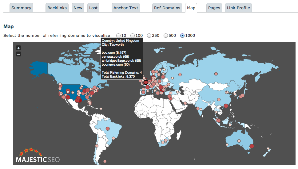
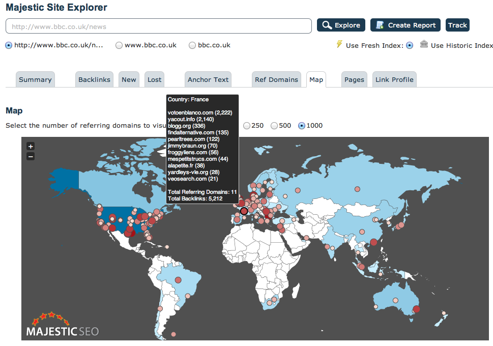
By default we take the top 1,000 links and represent them on a world map based on the longitude and latitude of the server hosting the link. We can then aggregate these and represent the number of links by country. Hovering over the country shows the number of TLDs from that country linking to your URL. You can easily flip this to the to 10, top 250 or other limit if you prefer. We also have added the top 15 links using the red dot.
I put bbc.co.uk/news into the system in the above example and we can see a surprising 34 TLDs originating from the Netherlands linking to the page, but only 11 from France. This probably reflects the relative respect the BBC has in each of these countries. France has a long history of news reporting and if you asked a typical French user, I doubt they would choose the BBC as their first port of call for news.
Interestingly, if you start to analyse different pages on the BBC, we start to see distinct differences in the world map. For example, whilst the News page has 19.5% of top links originating from the UK, the Sports page has nearly 26.7% – probably reflecting the cultural differences in sport are more marked than for news. When the content gets increasingly localized in its audience, such as the weather page, this percentage jumps up to a massive 39.1%.

How does it work?
When we crawl the web, we use an IP server look up system to record where in the world each website is physically hosted. We store this data and now we have introduced this new representation. You can still download the referring TLD by country list as a CSV immediately below the map. Because we keep this data directly, we do not have to look up 1,000 IP addresses on the fly using third party APIs. This makes the visual representation pretty quick as usual. Something we know you have come to expect from Majestic when delivering link intelligence data at this scale.
Why does the BBC have so many links from the USA?
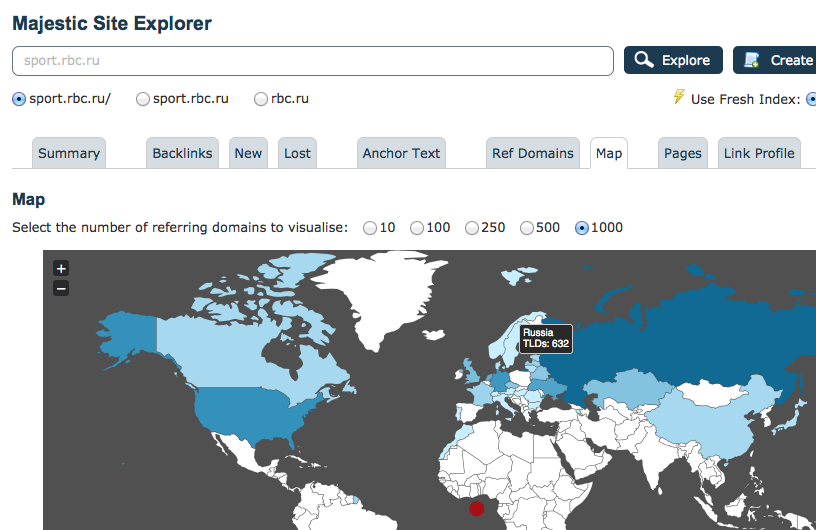
So many English Language websites are hosted in the USA regardless of the location of the intended audience. In fact – there is also significant hosting infrastructure in Germany as well, which may go some way to explaining the larger than expected German links to the BBC. However – this “natural” pattern of country bias merely acts as a the background reading. The insight will come by seeing the variations from the norm. This bias towards America is not always the case. When I typed in “Sports News” into Google.co.uk the top site was not surprisingly the BBC.co.uk/news. By translating “sports news” into Russian and entering this into Google.RU we of course find a completely different sight and therefore a different map with 63.2% of links coming out of Russia and only 12.4% coming from the USA:

What insights does this data give us?
As so often with data at this scale, the real insights will need to come from our users taking specific examples like the ones above and extrapolating meaning from the data. I do feel that this opens up a new area for market research – particularly in understanding behavior across boundaries when switching from one topic to another.
The data may also reveal a possible ranking signal. As the content gets more and more targeted towards an individual country, it would likely follow that the concentration of links from that country would also tend to increase. In short – if we were a search engine – we might use the weighting of links from a given location as signal as to the localized nature of that content – even if the content was not hosted in the country to which it is targeted!
So some questions for you. What might YOU use this map and data to understand? Do you like the map? Shall we give the developer a pat on the back?
Other Geo-based tools at Majestic
We also have a few other tools that express information based on the country code data:
- Majestic Million shows the top 1 million websites daily charted by country TLD based on their referring domain counts.
- Neighbourhood Checker shows the location of any website or IP number.
You will also see country data sprinkled through our downloadable reports and as a section in our advanced reports.
- How Important will Backlinks be in 2023? - February 20, 2023
- What is in a Link? - October 25, 2022
- An Interview with… Ash Nallawalla - August 23, 2022


Thanks for that great new feature! The map is very pretty and impressive, but an extra pie/bar chart would be more readable.
November 7, 2012 at 12:31 pmI would think another bar chart is less readable – but if you wanted this, you could create one easily by clicking the Download CSV button at the bottom. This give the following columns:
Domain
CountryCode (e.g. UK,US,JP)
Country City
Latitude
Longitude
Backlinks
IP
So it is very easy to create a bar chart or pie chart if that is your desire. the reason I like the map is that you can see where in the world very visually the links are coming from. This help you to see where a site’s brand is strong and wear t is weak. You do not get a feel for that in a bar chart or a pie chart.
November 7, 2012 at 1:14 pmThis looks great! Now we can see where our brand is strong (or weak) and so focus marketing efforts.
I second the suggestion of a pie chart and maybe a bar chart for the data.
November 8, 2012 at 10:18 amGlad you are loving it 🙂
Can I ask you to put a name in the name field and not a keyword when you comment. We know a bit about links, but the comments on blog.majesticseo.com is not the place to try and get link love.
November 8, 2012 at 10:44 amInteresting this should make it possible to see wich software is popular in wich regions. Will try this with some popular open-source project. As example to look wich distribution is strong in wich region. This might even be interessting for sociological analysis about internet usage in different countries.
November 8, 2012 at 6:36 pmGreat feature! thanks for adding up.. Looking forward to play with this in-depth.
It would be great if we could have a Local Competition (similar to market samurai) also for Keyword Checker to check the number of competing pages per country.
Overall, MJSeo is a very useful tool!
November 9, 2012 at 12:26 pmThis is a really great, new addition. It makes for a unique graphical way to say to clients that their brand is good in this country or that country. I’ve not seen Ahrefs or Open Site Explorer offer anything like this.
November 10, 2012 at 4:53 amI am a very visual person, so I love this feature! And I love that I can create another pie chart if I wish 🙂
November 14, 2012 at 12:24 amI don’t want a pie or chart, just love the map as it comes. Very useful tool. Thanks!
November 15, 2012 at 3:57 amActually here in the U.S. BBC is respected as a source of world news, so I am not surprised this large country shows many links to the news site. And our public media (listener-supported) do offer some news reports or licensed shows from the BBC, so websites for U.S.-based regional or national public media outlets (NPR, PBS) may be another source of links (to acknowledge that organization as a contributor).
December 10, 2012 at 9:41 pm