In Parts 1, 2 and 3, we looked at statistical measures of datasets that were purely one-dimensional in nature, i.e., all the observations constituting the dataset were of the same type. Examples of such datasets are the time elapsed between eruptions of the Old Faithful Geyser in California, or the number of sunspots in a given solar cycle, etc. We investigated measures of central tendency, such as the mean, which assist us in summarizing a bunch of data with a single number. We also studied measures of dispersion, such as the variance and standard deviation, which help us to estimate the spread of the data about the mean value.
However, all data sets are not necessarily one-dimensional. An example of a multidimensional dataset could include variables that describe future salary expectations (A), academic variables (standardized test scores (B)) and gender (C) taken from a sample of university students, and a researcher could be interested in how the set of salary variables relates to the academic variables and gender. Here, the future salary expectation (A), academic (B) and gender (C) variables constitute the three dimensions A, B and C of this three-dimensional dataset. In this part, we will discover what it means to say that two or more sets of variables are associated with one another, and explain how to go about exploring higher dimensional datasets to determine the inter-relationship between the dimensions.
Covariance
A measure to determine the extent of association between two or more variables is the covariance. Covariance is always evaluated between two dimensions. So, for a three-dimensional data set (A,B,C), it is possible to measure the covariance between the dimensions A and B, B and C, and C and A. In the real world, data can only be visualised in at most three dimensions. The ability to compute the covariance between any two dimensions in a data set enables statisticians to discover relationships between dimensions in high-dimensional data, where visualization would otherwise have been difficult.
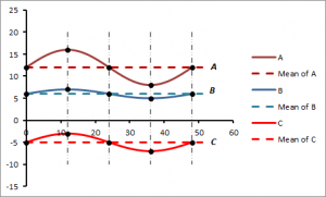
To understand the concept of covariance, let us consider three in-phase waveforms A, B and C that have peak amplitudes of 4, 1 and 2, and oscillate around mean values of 12, 6 and -5 respectively. The waves are represented graphically in Figure 1.
Figure 1: Waveforms A, B and C
Note that for this example, the troughs and crests are at exactly the same horizontal positions on the waveforms, and are denoted by the solid black dots. A visual inspection of Figure 1 shows a high degree of association between the displacement of points about the mean of each waveform. We can observe that points on the waveforms rise or fall together about their individual means. In particular, note that corresponding points which lie above or below the means respectively do so for all the waveforms. In this example, we say that the waveforms A, B and C have a high degree of covariance.
The positions of the troughs and crests for each wave are represented by values along the vertical axis as shown in Figure 2 below.
| A | B | C | |
| Mean | 12 | 6 | -5 |
| Crest | 16 | 7 | -3 |
| Mean | 12 | 6 | -5 |
| Trough | 8 | 5 | -7 |
| Mean | 12 | 6 | -5 |
Figure 2: Trough and Crest Positions for Waveforms A, B and C
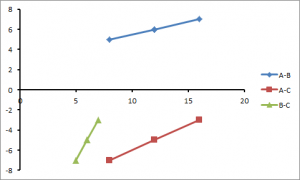
The corresponding scatterplots, with the mean, crests and troughs highlighted, are shown in Figure 3.
Figure 3: Scatterplots of crest and trough positions between waveforms A and B (A-B), A and C (A-C) and B and C (B-C)
Despite the original data in Figure 1 following curved paths, the points on the scatterplots all form straight lines. We saw in Part 1 that such a straight line scatterplot indicates a perfect correlation between the waveforms.
Example: Tourists on a Trip
As a real life scenario, imagine a group of tourists, who live in different countries, on a guided tour. When the group is on tour, the distance between individual members is very small and we could say that they are more or less in the same location. And when their location changes, it changes for all individuals together (say, travelling on a bus to a tourist attraction or to their hotel). In such a situation, we could say that the level of covariance is high. But at the end of the day, when they are not touring with a guide, then the covariance rate is likely to be pretty low, because they may be going to different places at different times, e.g. the beach, the various nightspots, or other local attractions.
So it is possible to predict the location of a group member, based on another group member’s position when they are at their hotel (or touring with a guide) with a high degree of accuracy. The covariance measurement would be highly positive. But when they are not in their assigned hotel or out sightseeing, there is a much smaller chance of predicting one person’s location based on the location of another group member. The covariance measure would in all probability be close to zero, since sometimes group members could be friends and may visit other locales together on their own time.
However, if you randomly selected individuals in the United Kingdom, and tried to use the position of one individual to predict the locations of the other people, you would probably discover that the covariance is close to zero. In other words, the chance of there being a relationship between one randomly selected person’s location in the UK, and another’s, is miniscule.
Mathematical Formulation
As we saw in Part 3, the formula for variance of a dataset X can be written as:
A similar formula exists for the covariance:
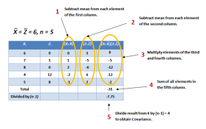
So, if the covariance is calculated between one dimension and itself, one gets back the variance. Thus the result of the calculation of the covariance between A and A, B and B, or C and C is the variance of the A, B and C dimensions respectively. To demonstrate the properties of the covariance, let us use the same datasets X and Z that we described before in Part 3 and reproduce below in Figure 4, which also shows a step-by-step calculation of the covariance cov(X,Z).
Figure 4: Calculation of the Covariance between Datasets X and Z
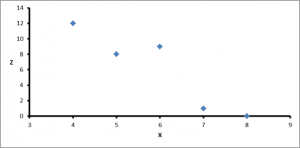
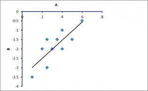
The corresponding scatterplot is shown in Figure 5.
Figure 5: Scatterplot of Z vs X
So what conclusions can be derived from these results? The exact value of the covariance is not as important as its sign (i.e. positive or negative). If the value is negative, as it is here, this is an indication that as one dimension increases, the other decreases, implying that, in general, as X increases, Z decreases, and vice versa. This can be easily viewed by drawing a scatterplot of the data, as in Figure 5. If, on the other hand, the covariance is positive, both X and Z increase or decrease together. If the covariance is zero, it indicates that the two dimensions are independent of each other.
Centering
Since the covariance is a measure of the relationship of the variation between two datasets about their individual mean values, the calculations are carried out on the mean-centered datasets, i.e., the mean is subtracted from each element of the dataset. This process of subtracting the mean is referred to as centering of the data. This essentially transforms the datasets so that the mean is set to zero.
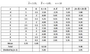
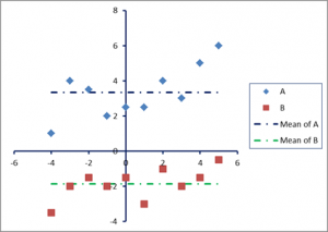
To illustrate this concept, let us consider a numerical example. Two datasets A and B are shown in Figure 6, and represented graphically in Figure 7.
The scatterplot of A and B is displayed in Figure 8. It shows a positive correlation between the two datasets.
Figure 8: Scatterplot of datasets A and B
Figure 9: Plots of centered datasets A and B
Figure 9 shows the plots corresponding to the centred datasets A and B.
Centering allows us to work with datasets whose elements have been transformed so that their deviations can be standardized by measuring them from a common datum (in this case, from the zero mean). This is intuitive. In the current example, the datasets A and B have positive covariance. That means that we expect an increase in A to be accompanied by a corresponding increase in B. Thus, in situations where A is greater than Ā there is a tendency, on average, to have B greater than ![]() , thus making the covariance positive. Also, if A is less than Ā we expect B to be less than B and, again, cov(A,B) is positive.
, thus making the covariance positive. Also, if A is less than Ā we expect B to be less than B and, again, cov(A,B) is positive.
This can be visualised as follows:
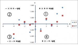
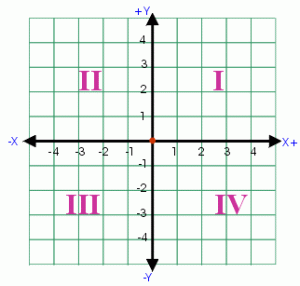
Each coordinate plane is divided up into four quadrants, labeled below in Figure 10.
Figure 10: Coordinate Plane Quadrants
In the first quadrant, both x and y are positive while in the second quadrant x is negative and y is positive. The chart below depicts the sign of x and y [denoted by (X, Y)].
Quadrant I: (+, +)
Quadrant II: (-, +)
Quadrant III: (-, -)
Quadrant IV: (+, -)
The corresponding quadrants are labelled 1, 2, 3 and 4 in Figure 9. Note that both variables A and B have been centered to zero mean. In quadrant 1, the x- and y-coordinates are both positive, so the product of the centered data (Ai−Ā)(Bi−B) is positive (+ve), whereas in quadrant 3, x and y are both negative (-ve), again producing a +ve product. In quadrants 2 and 4, the products are negative. Thus, the covariance will be greater than zero if the sum of the products of the centred data that are +ve (i.e. those that lie in quadrants 1 and 3) is larger than the sum of the products that are –ve (i.e. those lying in quadrants 2 and 4), and vice versa. It follows that the points that lie in quadrant 1 are above the means of both variables A and B, and in quadrant 3 lie below the means of both variables. In quadrants 2 and 4, the points are below the mean on A, but above the mean on B, or vice versa.
Limitations of the Covariance
There are, however, limitations of the covariance as a measure of association between two variables. In the examples so far, we can only make use of the sign of the covariance to get an idea of the relationship between the two variables (either positive, negative or zero). One drawback of the covariance is that the size of the covariance depends on how much each variable deviates from its own mean in absolute value. If the deviation has a small value, then the highest possible value of the covariance will also be small. However, if there is a significant amount of variability, the maximum value of the covariance can be large. As a consequence, it can be difficult to estimate the relative magnitude of the covariation between two variables.
From Covariance to Correlation
Ideally, we would like to standardize (or normalize) the value so that the magnitude of the covariance is evaluated relative to the maximum possible covariance. So the next question would be: what is the maximum possible value for the covariance? To answer this, it can be noted that, among all the range of values a variable may covary with, it will covary with itself most strongly (recall the example of tourists above. The closer the tourists are to each other, the higher their level of covariance, and nothing can be more closer or identical to a dataset than the dataset itself). Let us now see how we can normalize the covariance.
As a matter of fact, as we saw from equation (1) above, the “covariance of a variable with itself” is just an alternative way to define variance (for a definition of variance, see Part 3):
Also, recall that the variance is just the standard deviation (SD) sx squared. The equation above can be rearranged as follows:
Thus, the result obtained by dividing the covariance of a variable with itself by the variance of the variable, is 1. This provides us with a criterion for estimating the magnitude of the covariance. However, we are not interested in evaluating the covariance of a variable with itself, but with another variable. We must therefore obtain a maximum possible covariance for these situations as well.
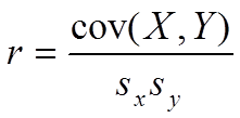
We have seen above that the maximum value of the covariance of a variable with itself cov(X,X) cannot exceed sx × sx. Taking this analogy further, the covariance between two variables cannot be any greater than the product of the standard deviations for the two variables. Thus, if we divide the covariance between two variables (X and Y) by sx × sy, we can evaluate the magnitude of the covariance relative to one.
When expressed this way, the covariance is called a correlation, specifically, the Pearson correlation coefficient (or Pearson’s r). The correlation coefficient r can therefore be defined as a normalized covariance. Let us calculate the correlation coefficient r for the two datasets A and B in the example above:
If we calculate the standard deviations of the datasets A and B, we get:
sA = 1.472903, sB = 0.883491.
From Figure 6 above, cov(A,B) = 1.05. Therefore, the correlation coefficient r is given by:
r = cov(A,B)/( sA × sB ) = 0.809022,
which indicates a high degree of association between A and B. It is important to note that what we have done above is to take the covariance and “standardized” it, such that its values lie between +1 and -1. The larger the absolute value of this index r, the stronger the degree of association between the two variables.
Conclusions and Further Observations
In conclusion:
- The value of the correlation coefficient r lies in the range between -1 and +1.
- A value of r = 0 indicates that there is no correlation between the two variables.
- If r = 1 (or -1), then there is a perfect positive (or negative) relationship between the two variables (see Parts 1 and 2)
- The absolute value of the correlation coefficient corresponds to the magnitude or strength of the relationship
- When a correlation between two variables X and Y is strong (e.g., r = 0.90), then values that lie above the mean on x are substantially more likely to lie above the mean on y than they would be if the correlation was weak (e.g., r = 0.10).
The advantage of the correlation coefficient is that it provides a standardized way to quantify the association between two variables represented by a single number.
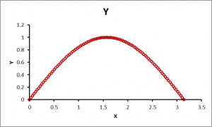
So far, we have discussed relationships between variables that are essentially linear in nature. The criterion for the measurement of the correlation coefficient is how much they deviate from a straight line. But what about situations as shown in Figure 11?
Figure 11: Plots of datasets X and Y where the relationship is nonlinear
From the graph, you can see that there is a strong relationship between the variables X and Y, but if we use the techniques described so far to calculate the correlation coefficient, we will get a value that is close to zero. This is because the methods to calculate correlation that we have discussed up to this point are not capable of dealing with nonlinear relationships between the variables. Ideally, the correlation between X and Y shown in Figure 11 should be close to 1 because of the strong curvilinear association between X and Y. We will discuss techniques for computing the correlation between variables that may have a nonlinear relationship in a future posting.
Should you wish to read the other guides as part of the Majestic Beginners Guide please click on the links below:
Part 4 you have just read..
- Ranking of Top Data Scientists on Twitter using MajesticSEO’s Metrics - August 19, 2014
- Measuring Twitter Profile Quality - August 14, 2014
- PageRank, TrustFlow and the Search Universe - July 7, 2014






It’s so difficult to understand for me
July 16, 2013 at 5:34 am>Hi Vahid:
Try going through Parts 1 and 2 to get a basic non-mathematical idea of correlation. Hopefully these parts will be easier to understand.
July 16, 2013 at 8:48 amThanks Neep.
Are you planning to make tools which leverage MOZ data to find correlations which might somewhat back-engineer the search algo’s?
e.g. find correlations within a set of websites (or maybe sites within a niche) between search position and known ranking factors.
Although it would be weird, and only an amateur would follow it slavishly, one can envisage a system using correlation to give a “wish list” of what the most successful sites/pages in your niche have (e.g. on page indicators of quality like trust logos, unique images, % of unique content, video embedded/length, low keyword density etc and off page indicators like links from xyz authorities, number of different c-class IPs, variation of anchor text, links from content with verified author tags, etc, etc).
It could be an interesting way to focus efforts on one’s site, rather than scattergun working through thousands of “possible” ranking factors.
For instance, in our niche a huge and formerly Online-weak company recently went big on SEO and I see them blasting the big press release sites with keyword rich links… it would be fascinating to see if there is really a correlation between this tactic and actual success, rather than just using my human “what I noticed this week” approach (because we humans see patterns that aren’t really there!)
I could imagine a tool where the MOZ subscriber inputs a keyword, or maybe the top 5 in their niche, and the system looks through many predetermined ranking factors, to spot ones with high correlation between sites on page 1 for those searches.
It would be fascinating from the perspective of “new seo” too. i.e. the seo for people not algos (which we’ve all moved onto now) because it would give us an indication of what pages do well in user metrics (if that’s really one of the most important ranking factors now)…
… apologies for stream of consciousness… seems there is huge potential here.
July 18, 2013 at 9:31 amIt’s so difficult to understand for me for all part 🙁
July 19, 2013 at 12:29 amThat’s maths for you 🙂
July 22, 2013 at 9:43 amAt first sight it might can be difficult to understand everything. But over time evetything will be clarified if you will go deeper into it.
July 23, 2013 at 1:27 pm