Today we have launched a new version of Site Explorer with improved functionality and a much improved user interaction. There’s more than one blog post of upgrades – so here’s a summary, with screenshots below.
- Improved Summary screen layout with Anchor Text type charts added
- Ability to tailor your Site Explorer tabs and filters to see the data your way
- Added information about the last crawl result, to show 404s, successful crawls, Compression errors and much more
The first thing you should notice when you use our Site Explorer now is a cleaner font layout and a cleaner summary screen in general. But there’s added functionality in there as well. Here’s the screen shot for a typical site. 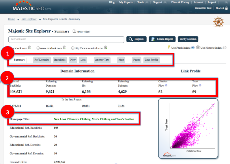
1: More Logical Tab Order
Whenever I demo Majestic, I find myself looking at the Referring Domains tab BEFORE I start looking at individual back-links. So we changed the default tab order for usability – but we are seeing different people using our data for different things – so if you don’t like our order, you can change it. More of that later.
2: Clearer Summary Data all on One Line Above the Fold
Here’s the “top line” stats – now presented on the top line! If you want to switch between Fresh and Historic you can, but for most uses the Fresh data is still the default.
3: Home Page Title added to Domain Info
To make it easy to see what the site is about, the Title of the home page is now shown when you ask for domain data. Previously we had this data displayed at the URL level only – which just felt we missed a trick, so this should be better for the user.
Pie chart of link types
Scroll down the summary page a bit and you’ll see a shiny new chart:
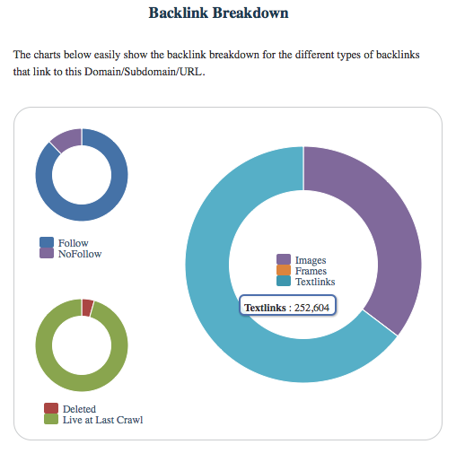
Here you can easily visualize a site’s links in different ways. It’s interesting to see when pages have excessive amounts of No Follow links going to them, for example. If I was looking for Search Engine signals, I would suggest that a site with lots of No Follow links coming in might be engaging in large amounts of blog comments. Shopping sites are likely to have more image links than other types of site and new for the first time you can visualize what percentage of links in our indexes (Fresh or Historic) did not resolve in the last crawl.
You wanted 404s… We now give that and MUCH more
A number of users have helped us by using the Feedback button (It’s on the left hand side in orange next time you have a suggestion). One common request was a list of links you the site that resolve in a 404. So we have given you something better on the Pages tab and listed the most accurate crawl result we can from the last time we checked your pages:
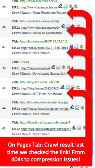
So for most websites and pages, we will arrive at a page through a link and try to crawl the page. Sometimes we believe the page to be there but have not yet crawled it – for whatever reason – so if that’s the case we mark it “Not Crawled”. But most pages should be marked “downloaded successfully”. If they aren’t, then you have some technical issues to attend to! But we can now give lots of other responses. In the screen shot above, one crawl result is “failed to decompress” on the Superteddy page. So Super Teddy maybe needs to sort out his super hero abilities as his main strength now appears to be invisibility. You’ll see a 404 in the list too – something that can easily be rectified with a 301 redirect (at which point we’d SHOW a 301 redirect there).
This new layer of data will – we hope – prove invaluable for web-masters trying to make sure their sites are working well. We’ll be showing if the page was blocked by robots.txt, didn’t resolve, had server issues or time outs and all sorts of other reasons. If we can’t specify why we were unable to see the page then we’ll tell you that too.
Handy eh?
So if you want a list of 404s being generated on your site, export to CSV and filter out the 404 responses.
See it Your Way
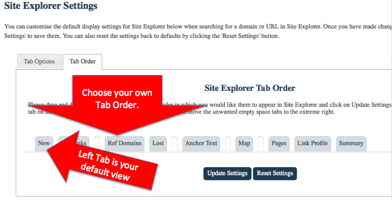
We had a chat internally about the best order for the tabs in Site Explorer – but we found different people looked at different sections. Maybe you always look at the same screen – say the “New Links” screen. We decided that always having to see the summary screen first if the only thing you do is click on the same tab was a waste of a UI enhancement. So now you can change the default tab order and filter settings for Site Explorer in your account settings.
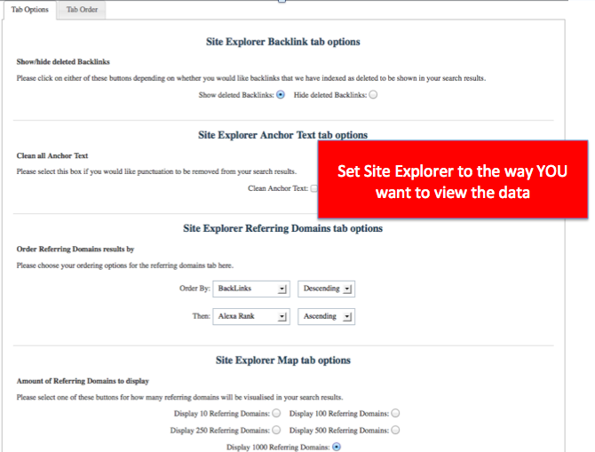
The options screen helps you to filter much of the data on the fly as well too – just to save you clicking every time on the “remove deleted” button in the back links tab for example. The options are:
- Removing the Deleted back links in the Backlinks display
- Cleaning the anchor text. E.G. making “Majestic-seo” and “MajesticSEO” the same.
- Setting you default ordering in the Referring Domains tab
- Setting the default results per page from 10 to 500 or 1000 per page if you want.
I have already found this useful – setting the referring domains order to “Trust Flow, Descending”; removing the deleted back links from my default list and cleaning up the anchor text. Sweet.
One Less Click to your Favourite Tool
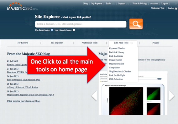
We also noted that some people always head for the backlink history tool. Others want to download the Majestic Million every day. We found a way to save you a click every time – by using a hover on the home page to get you straight to where you need to be:
Win a Gold Star and find the other Easter Eggs
We have made some other enhancements too – to one of our tools in particular. We’ll try and get around to writing about it, but maybe you can have a look around and see if you can find the tools we upgraded. As a hint – if you use the new tool correctly you will be able to find out a site’s most prolific link partners or you can use it to find holes in your link strategy much faster than you could before.
If you want a chance to win a gold star – tell us in the comments what you think has changed in our toolset since you last looked. You will be surprised at how much has changed.
- How Important will Backlinks be in 2023? - February 20, 2023
- What is in a Link? - October 25, 2022
- An Interview with… Ash Nallawalla - August 23, 2022


And that’s why I love majesticseo 😀 Great job!
July 8, 2013 at 12:27 pmNice new view, I like this follow/nofollow graph
July 8, 2013 at 1:30 pmLove u Majestic! You do a great job! Hope the new interface will be more friendly. 😉
July 8, 2013 at 1:53 pmIndeed a great job, but these changes looks like the same functionality a competitor of your already have in place since a while.
It’s good to see companies challenging themselves.
July 8, 2013 at 2:03 pmI hope this is first stage of refreshing Majestics. Good direction btw
July 8, 2013 at 5:05 pmLooks interesting, now everything clear from one look.
July 9, 2013 at 6:11 amI found one more change in blog post section, Now its easy to +1 😉
Great job guys, it looks more clear like this and we will definitely save time! 🙂
July 9, 2013 at 7:35 amLooks great 🙂 On the report screens like :
Homepage Title:
BBC – Homepage
Educational Ref. Backlinks:
763,560
Governmental Ref. Backlinks:
569,126
Educational Ref. Domains:
5,975
Governmental Ref. Domains:
2,111
Indexed URLs:
5,908,075
Position in Majestic Million:
31
Would it be possible to have the numbers of gov/edu links etc, link to a report of those specific links only?
I always like to look which gov.uk and ac.uk competitors have, and see if I can get listed there too.
July 9, 2013 at 8:56 pmHi Jenny,
July 10, 2013 at 8:37 amAlthough generating these on the fly in Site Explorer would be too CPU heavy to be done on a limitless basis, you can filter down to these in advanced reports if you want to.
Can we expect including % of links on the new chart (text links, frames, images)?
July 11, 2013 at 11:16 amYes – that is in the new Pie Chart on the summary page.
July 11, 2013 at 5:22 pm> Ohhhh! I’l put that on a wishlist.
July 12, 2013 at 5:00 pm> I would also appreciate this % view!
Very good job Majestic SEO, thank you for new features!
July 24, 2013 at 3:43 pmOne thing that I would like to see is a list of the 302 links. There are a lot of big sites that have a ton of affiliate links and it is hard to tell if they really have a lot of links or if they just have a lot of affiliate links.
Thank you for improving. I love MajesticSEO.
July 11, 2013 at 4:56 pmIf you find the PAGES tab of a site, these will now show the last crawl result – including 302s.
July 11, 2013 at 5:19 pmIs there a way to see more than 100 pages? I would love to be able to get this data from a full report?
July 11, 2013 at 11:11 pmSure!
July 12, 2013 at 11:29 amSite Explorer is just the overview of our data. You can export this to CSV or create reports to get tens of thousands or even Millions of links. You can see how to download ALL the links to a site here.
Great new features Guys. Much better layout and easier to understand. I particularly like the new backlinks breakdown.
July 17, 2013 at 3:05 pmGreat work! That make more easy our work! Congrats!
July 18, 2013 at 8:28 amI love majesticseo! Even only with the free version – I get much more value than from many paid SEO analytics service providers.
July 18, 2013 at 9:39 amYou are doing a great job majesticseo! Thumbs up!
Dixon,
Wouldn’t it be better to combine historical and fresh index backlinks? What is the point in dividing them?
Thanks,
July 18, 2013 at 11:54 amIt is largely a technical challenge. Analyzing the TrustFlow, Citation Flow, inbound link details etc on the whole of the Historic index is a computation that takes about a month to complete and the metrics are hard – you need to have the whole data set to be able to do the calculation. You can’t see a new link, then work out its TrustFlow relative to the Historic index on the fly as it minutely changes every other link… so trillions of minute changes. But the FRESH index is a mere 400 billion 😉 – That we can work out in a much shorter time scale.
If you want, you can take the two data sets for a GIVEN URL and start to eliminate the duplicates to give yourself more data. Tools like SEOClarity do that. But to do this for EVERY domain is a multimillion pound headache to crack a relatively minor problem as the Fresh index contains enough live data for most people.
July 18, 2013 at 12:22 pmGreat job guys. It is definitely more user friendly and the additional info shown is very welcome.
July 18, 2013 at 1:11 pmGood news.Congrats.
July 18, 2013 at 2:47 pmAll improvements in the interface is les time consuming.
Great Dixon,
Everything is very streamlined.
I need to explore in depth to comment in detail.
Thank you very much.
July 18, 2013 at 4:23 pmMajestic SEO is so helpful! I have learned so much just in the few days that I’ve been trying it out. I have only been trying out the free version, and they tell me more than several other websites combined! I love it!
July 18, 2013 at 4:40 pmVery good indeed, a great support and help for most websites and pages, especially by removing the deleted back links from my default list and cleaning up the anchor text. i love it!
July 18, 2013 at 4:42 pmI hope this is first stage of refreshing Majestics seo, good luck
July 19, 2013 at 1:57 amGreat Look, that’s why I’m using it!
July 19, 2013 at 6:00 amLooks great! I will have to check out the new features. Glad someone is looking into helping with 404s now if only some web sites would use them or google could auto delete pages that dont exist. To many forums with post of pages that do not exist anymore…
July 19, 2013 at 10:09 amgreat change, I’m impressed. I love the pie charts. I use your site every day.
July 22, 2013 at 9:55 amIt’s great! Was confused when first saw the new design but after just a few minutes got used to it. It’s actually much better than the old design, with most interesting information clearly presented on the top of the page. Great job!
July 23, 2013 at 2:41 pmGlad to see these recent updates. SEO’s everywhere are appreciative!
July 23, 2013 at 11:25 pmI am pretty new to Majestic I do like what I see, may I ask where is the page rank data? I see the trust flow and citation listings. Where can I get the deeper backlink profile information? Thank you for all you do here.
July 25, 2013 at 4:26 amWe do not track Page Rank as Flow Metrics are (we believe) stronger and are proprietary to Majestic. Here are several reasons.
We also have a video tutorial on understanding Flow Metrics.
July 25, 2013 at 9:41 amGood job:-) Especially very usefull data about the last crawl result.
July 29, 2013 at 3:15 pmThanks for Sharing
August 29, 2013 at 1:30 pmVery Useful Blog for me