In this article, we will perform a simple exploratory analysis of the distribution of link metrics, and introduce the reader to the concept of box plots. A comparison will be made among the quality metrics of MajesticSEO and MOZ.
Boxplots
A box plot (also referred to as a box and whisker plot or box chart) is a graphical representation of key values from summary statistics. Typically, the values represented are the minimum, 25th percentile or lower quartile, median, 75th percentile or upper quartile, and the maximum. These values constitute the “five-number summary” that defines the box plot. A very good description of the “five-number summary” as well as a simple explanation of how to construct a boxplot can be found here.

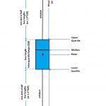
Figure 1: A Typical Boxplot
A typical box and whisker plot is shown in Figure 1. The width of the box is the interquartile range (IQR). The inner fences are defined as the distance of 1.5 times the width of the box (IQR) in either direction. Numbers that are within the inner fences are considered “reasonable.” The whiskers mark those values which are minimum and maximum unless these values exceed 1.5 * IQR. The whiskers go to the farthest numbers that are within the fences. The outer fences are defined as the distance of 3 times the width of the box (IQR) in either direction.
Often, some of the most interesting points of a data set are the points that do not seem to fit, i.e., they seem to differ by a considerable amount from the rest of the data. These points are called outliers. These are every so often points that may need to be investigated further in order to understand why they diverge. Such points can contain important information about the data. Any observations outside the fences are flagged as potential outliers. Numbers between the inner and outer fences are outliers, and numbers outside the outer fences are extreme values. Outliers (values between the inner and outer fences) are generally denoted by empty circles, and asterisks are used to represent the extreme values (values outside the outer fences). Note that in the example shown in Figure 1, the maximum value is classified as an outlier, while the minimum value is an extreme outlier.
The box length gives an indication of the variability of the data sample, and the line across the box denoting the median value displays where the sample is centred. The position of the box in its whiskers and the position of the line in the box also convey to us whether the sample is symmetric or skewed, either to the right or left. Thus, the boxplot is a very useful tool which can be used as an indicator of centrality, spread, symmetry and tail length.
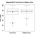
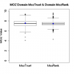
For this analysis example, the Moz Top 500 list of the top 500 registered domains (ranked by the number of linking root domains) was selected, together with the corresponding Majestic TrustFlow and CitationFlow Metrics. The boxplots for each of these metrics is shown in Figure 2 below,and the corresponding summary statistics are displayed in Figure 3.
Figure 2 : Boxplots showing Spread of Quality Scores from Link Analysis Providers
|
MajesticSEO |
MOZ |
|||
|
|
TrustFlow |
CitationFlow |
MozTrust |
MozRank |
|
Minimum |
18.00 |
20.00 |
4.09 |
4.31 |
|
1st Quantile |
64.00 |
70.00 |
7.07 |
7.19 |
|
Median |
77.00 |
77.00 |
7.50 |
7.45 |
|
Mean |
73.87 |
76.44 |
7.56 |
7.46 |
|
3rd Quantile |
86.00 |
84.00 |
7.94 |
7.75 |
|
Maximum |
100.00 |
100.00 |
9.37 |
9.62 |
Figure 3: Summary Statistics for the Metrics
Conclusion
In conclusion, it can be inferred from the basic example above that the distributions of the metric values seem to display some symmetry. Note that the outliers are denoted by individual points. An interesting feature is that outliers for the MajesticSEO metrics lie totally at the bottom of the range value, while for MOZ, they occur at both the upper and lower ranges (An outlier is any value that lies more than one and a half times the length of the box from either end of the box). Also, in the case of MajesticSEO, the maximum values of both the Citation and Trust Flow metrics lie below the upper inner fence.
I hope this very basic example has shown the reader that boxplots can be a powerful analysis and visual tool for descriptive and exploratory statistical analysis.
- Ranking of Top Data Scientists on Twitter using MajesticSEO’s Metrics - August 19, 2014
- Measuring Twitter Profile Quality - August 14, 2014
- PageRank, TrustFlow and the Search Universe - July 7, 2014


Wow, Neep, this is really interesting. You’ll have to talk more about this sometime!
December 4, 2013 at 4:32 pmI am not an expert in statistics but I suppose the messages are
– MajesticSEO is more versatile
– MajesticSEO is as good as Moz (maybe better)
I personally like MajesticSEO because of its accuracy when it comes to check spammy back links.
Moz sometimes give high trust/rank to a domain just because there are links coming from high PR sites, but those links could be low value in terms of passing link juice.
December 18, 2013 at 7:01 pmActually – I think Neep wasn’t saying one was better than the other – just how to compare data sets in this way.
December 20, 2013 at 10:29 amGood comparison. But both data coming by public stats of a website. I’m considering both for analysis but most of the time doing factorial calculation manually.
January 9, 2014 at 7:15 pm