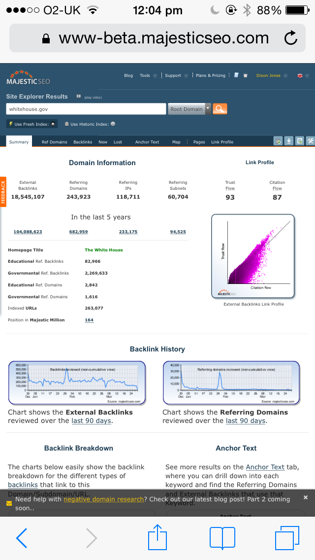
 With all our UX launches yesterday, we did not have time to tell you that we have now launched a MOBILE version of our website, designed to give you the functionality that you need to be able to get instant insights and make quick decisions on the go.
The mobile URL is at https://www.majesticseo.com/mobile.

Rather than trying to give you EVERYTHING that is available in the main site, the mobile version has concentrated on what you are most likely to be in need of, when on the go. Our main “use case” when we were thinking this through was that you are most likely wanting to go into a meeting (or maybe you are in a meeting) and your customer or boss has thrown in a curve-ball about your site. Being able to hit that curve-ball out of the park could save you an immense amount of time following up later.
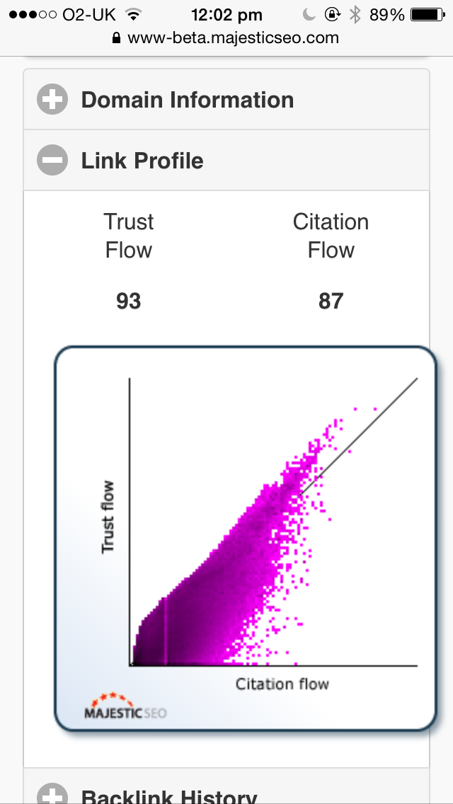
For this reason we have given you the main elements of Site Explorer at your fingertips, with the option to flip back to the full desktop version if you find a need to drill down further. For example – a quick visualisation of a site’s link profile and Flow Metrics:

We also let you drill down and see the main back links, of course and the site allows you to log in and stay logged in to give you access to the main Site Explorer options available on the main site.For each of the links, we’ll give you similar details about each link as we do on the main site, but we don’t clutter the screen with all the details like the last crawl date.

What’s in the Mobile version of the site?
most of Site Explorer and some of Search Explorer can be accessed from the mobile site, Including:
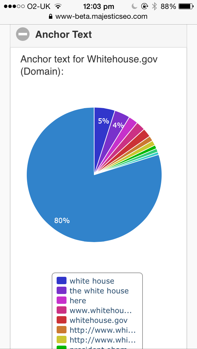
- In the Site Explorer Summary: Link Profile, Backlink History charts, Follow/Nofollow (and Deleted) Breakdown charts, The top to anchors and the top 10 links as well as the top ten pages on the site.
- In the Search Explorer: The top 20 search results for a keyord, with the SERPs showing the search score, Trust Flow and Citation flow for each result as well as Domain and Link counts.
- A quick link both at the bottom of the page and in the menu (top left) to the full desktop site.
Show me some more screenshots!


Why don’t you use Responsive Design?
It’s a fair question. SEOs tend to advocate responsive design for mobile sites, but that assumes that the way you use a site on a phone emulates the uses on a desktop. Unlike most websites, Majestic’s users really need the full desktop site to properly crunch through large amounts of data. Trying to do a full site audit from a phone is not a likely use case. For a start – one of the most popular tasks on the desktop site is a raw download of every link for use in Excel. Well that’s not likely on an iPhone is it?
So as a result – most pundits are saying that for most sites, mobile use will exceed desktop use in 2014. For Majestic, we have a much higher proportion of desktop users than most sites – due to the way in which users engage. So if we want to make our site more meaningful to mobile users, we need to think about when and how they would be wanting to use our data. That means different functionality for different occasions and we are considering entirely new features for mobile users if this launch increases mobile access to Majestic’s data.
In addition, most SEOs advocating responsive design are not having to pay attention to a site in 9 languages… in particular languages that run right to left instead of left to right. the number of extra variables involving scale, together with the use case questions, means that we have decided to go for separate URLs for the mobile content and we have incorporate “rel=alternate” style tags to help the search engine properly navigate users to the correct content.
- How Important will Backlinks be in 2023? - February 20, 2023
- What is in a Link? - October 25, 2022
- An Interview with… Ash Nallawalla - August 23, 2022


This is great!
Will there be an app too?
April 2, 2014 at 8:56 pmWe have OpenApps… does anyone want to write one? we are pretty busy over here with our own roadmap… but the technology is there for others to add a value layer. Koozai have an app with a basic integration of our data, but a proper OpenApp integration is what is needed. Until then – the Mobile site should be pretty neat.
April 4, 2014 at 12:22 pmGreat stuff, people!
Nice to have Majestic data always with me.
April 2, 2014 at 9:30 pmCool ! I can use Majestic on my mobile ! Sorry for my language, but i’am a french custumer of your tool.
April 3, 2014 at 9:23 amNice work folks, that’s awesome!
April 3, 2014 at 1:33 pmHey guys, why not have a qr code on this page?
April 6, 2014 at 10:12 amDoh! Thanks & added!!!
April 7, 2014 at 11:18 amIt is great! I like it. Let try for best, Thank you
April 6, 2014 at 6:30 pmIt is great. If your website design is responsive then it will be reflactive for SERP’S.
April 29, 2014 at 6:54 amThanks. Google seems to have worked it out very nicely for SERPs without using responsive design. We used rel=alternate instead and this is better for our use case.
April 29, 2014 at 7:49 amPerfect, i’m going to test on my tablet, greetings
April 29, 2014 at 7:24 amHi Dixon,
Very innovative idea, sounds greatly useful ..i wish i have such great such great trust and citation flow as in your screenshot..
April 29, 2014 at 7:43 amNice work.
April 29, 2014 at 8:06 amjust seems Page title and Page URL could benefit from full width…
Not sure why but I was not really able to find it in the App Store. How do I get it installed on my iPhone?
April 29, 2014 at 9:32 pmIt’s a mobile website. Not a mobile app. There are a few apps that use our data. Perhaps one day an app developer will take to building more.
April 30, 2014 at 9:30 am