Review of Previous Parts
In Part 1, we described how two datasets can have strong, weak or no correlation depending on how the points in the resultant scatter plot are located relative to one another along a straight line. In keeping with conventional practice, the two variables are often referred to separately as X, with sample values x1, x2, … , xn, and Y, with sample values y1, y2 , … , yn. We looked at how positive or negative correlations occur when an increase in the value of one variable X leads to a corresponding increase or decrease respectively in the value in the other variable Y. In Part 4, we showed how the Pearson correlation coefficient is calculated, and how it is used to identify and test the strength of the linear relationship between two sets of data. All of the above examples however, assume a linear relationship between the two variables. In this part, we will focus on datasets that may exhibit a nonlinear association between the two variables.
Association vs. Correlation
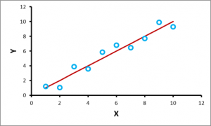
It is important to note that, although the terms association and correlation are frequently used interchangeably, this is not, strictly speaking, an accurate description. An association exists between two variables if knowledge of the value of one variable provides us with an assessment about the probable value of the other. There is correlation between the variables if the association is linear; this can be represented by a straight line on a scatter plot. This situation is illustrated in Figure 1.
Figure 1: Correlation between two variables X and Y
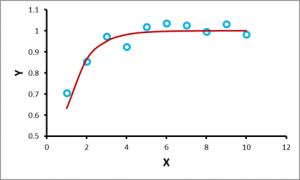
Now let us consider the case shown in Figure 2. This situation is sometimes referred to as “non-linear correlation”, but this is not technically correct; the right description would be “non-linear association” or simply “association”. In the linear case, the correlation coefficient gives a measure of the strength of the association; the closer the points lie along a straight line, the stronger is the correlation.
Figure 2: Nonlinear Association between two variables X and Y
Monotonic and Non-Monotonic Associations
A linear association between variables implies that the relationship can be modelled best by a straight line. This is illustrated in Figure 3.
Figure 3: Different Types of Association
The datasets of Figure 3 (a) and 3 (b), where the points are distributed more closely around a straight line, will in general exhibit a higher degree of correlation than the dataset shown in Figure 3 (c), where the points are more widely scattered. The dataset in Figure 3 (a) is said to be monotonically increasing, i.e., an increase in variable X in general leads to an increase in the variable Y, but never to a decrease. Figure 3 (b) shows a monotonically decreasing association between X and Y, i.e., as X increases, Y generally decreases, but never increases. Lastly, the association shown in Figure 3 (c) is non-monotonic — as X increases, Y sometimes increases and sometimes decreases.
A monotonic relationship is thus one in which Y moves in only one direction (either up or down) as X increases, but the relationship is not necessarily (but can be) linear. A monotonic association is more general than correlation, since correlation implies an underlying linear trend, while, for example, the exponential and logarithmic functions are also monotonically increasing functions but are nonlinear in nature. Nevertheless, it is still possible to obtain positive correlations from them. Figures 1 and 2 are also examples of monotonic relationships.
We will recall from Part 1 that perfect correlations occur when all the points on the scatter plot lie on a straight line. Now consider the “perfect” nonlinear associations displayed in Figures 4 (a) and (b). We designate this association perfect because an increase in X always leads to a corresponding increase (Figure 4(a)) or decrease (Figure 4(b)) in variable Y.
Figure 4: “Perfect” Nonlinear Association between X and Y
While the associations are monotonic, in addition, the relationships shown in Figures 4 (a) and 4 (b) are respectively strictly monotonically increasing and decreasing, i.e., an increase in the value of X is always accompanied by an equivalent increase or decrease in the corresponding value of Y.
In Figures 4 (a) and (b), since the relationship between X and Y is not linear, this does not result in a perfect Pearson correlation, since all the points do not lie along a straight line (although the association is “perfect”). It is therefore natural to ask if there is a simple way of assessing whether a strong non-linear association between two variables can be transformed into a linear relationship, so that the correlation coefficient can be calculated. Fortunately, a statistician named Charles Spearman developed a clever method to achieve this.
Spearman Rank Correlation
Spearman used the ranks of the items rather than their actual values. There are many scenarios when the only data available are in the form of ranks, as for example when judges rank competitors in order, 1st, 2nd, 3rd , etc. but do not assign any other data values, such as scores or points, to them.
Using ranks rather than data values yields two new attributes (the ranks). These fulfil the conditions for the use of the description “correlation” since their relationship is linear. The Spearman’s correlation coefficient, (ρ, also signified by rs) measures the strength of association between two ranked variables. Let us illustrate this concept with an example:
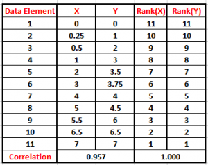
Consider two datasets X and Y shown in the table in Figure 5, and graphically displayed in Figure 6 (a).
Figure 5: Spearman Table for X and Y showing Rankings
Figure 6: Plots of (a) Original values and (b) Ranks
Note that X and Y have a strictly monotonically increasing relationship. The first step is to calculate the rank of each element of X, i.e., we assign a value of 1 to the highest value in X, a value of 2 to the next highest, and so on until all the elements of X have been ranked. This is shown in the fourth column labelled Rank(X) in Figure 5. Once all the elements of X have been ranked, the exact procedure is applied to the elements in dataset Y, and the values are shown in the fifth column labelled Rank(Y). Observe that although the association between the data points of X and Y is nonlinear, the points on the plot of Rank(Y) versus Rank(X) all lie on a straight line as shown in Figure 6 (b), indicating a perfect correlation. In fact, if we calculate the Pearson correlation coefficient between the original values of the datasets X and Y using the method described in Part 4, we obtain a value of 0.957, which already indicates a high level of linear association. However, if we perform the same calculation using the ranks instead of the original values, we get a value of +1, which indicates a perfectly positive correlation. The Pearson’s correlation for this data does not reflect that there is indeed a perfect relationship between the data. Spearman’s correlation for this data, however, is 1, reflecting a perfect monotonic relationship. Thus, a Spearman correlation coefficient of +1 or -1 results, when the two variables being compared are strictly monotonically, increasing or decreasing, even if their relationship is not linear.
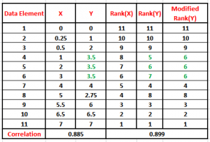
But what about the case when the two datasets are not strictly monotonic or have duplicate (repeated or tied) ranks? Again, let us look at an example. Two datasets X and Y are displayed in the table in Figure 7. The corresponding plots are in Figure 8. Note the monotonic trend of the data as shown by the red line.
Figure 7: Spearman Table for X and Y showing Modified Values for Tied Ranks
Figure 8: Plots of (a) Original Values and (b) Modified Ranks
Look carefully at the three values of the dataset Y that have equal values of 3.5 (highlighted in green in the third column in Figure 7). Notice their joint modified rank of 6 in the sixth column. This is because when there are two or more identical values in the data (called a “tie”), it is necessary to take the average of the ranks that they would have otherwise occupied. We do this as, in this example, we have no way of knowing which score should be put in rank 5, 6 and which score should be ranked 7. Therefore these three ranks have been averaged ((5 + 6 + 7)/3 = 6) and assigned to each of these “tied” scores. Figure 8 (b) shows that the scatter plot of Rank(X) versus Modified Rank(Y) no longer forms a straight line, although the level of association still remains high. In fact, the Spearman coefficient has a higher value than the Pearson coefficient.
In the case of distinct ranks without ties, a general formula exists for the calculation of rs. We shall not go into the mathematical details in this post, but interested readers can look it up here.
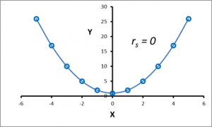
Note that Spearman’s correlation coefficient is a measure of a monotonic relationship and thus a value of rs = 0 does not indicate that there is no relationship between the variables. For example, in the scatter plot shown in Figure 9, rs = 0, which implies no (monotonic) correlation; however, a distinct perfect quadratic relationship exists.
Figure 9: Perfect Quadratic Relationship
Conclusions
In conclusion, Spearman’s rank correlation coefficient is a statistical measure of the strength of a monotonic relationship between paired data, i.e., the Spearman’s rank correlation coefficient allows you to identify whether two variables relate in a monotonic fashion. A monotonic relationship is an essential underlying assumption of the Spearman rank-order correlation. Spearman’s correlation is suitable for analysis of two datasets if a non-linear relationship exists, and the relationship is monotonic. It is also important to recognize that the assumption of a monotonic relationship is less restrictive than a linear relationship (an assumption that has to be met by the Pearson product-moment correlation).
- The value of rs always lies between −1 and 1.
- A positive Spearman correlation coefficient corresponds to an increasing monotonic trend between X and Y.
- A negative Spearman correlation coefficient corresponds to a decreasing monotonic trend between X and Y.
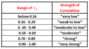
The interpretation of the Spearman coefficient rs is similar to that of the Pearson coefficient r, i.e. the closer rs is to ±1, the stronger the monotonic relationship between the paired data. Correlation is a measure of effect size, and this enables us to describe the strength of the association using the following guidelines shown in Figure 10 for the absolute value of rs:
Figure 10: Correlation Strength as a function of rs
Similar to the Pearson r, a negative value of rs indicates a negative monotonic relationship between the datasets. The Spearman correlation is also less sensitive than the Pearson correlation to strong outliers in the data.
- Ranking of Top Data Scientists on Twitter using MajesticSEO’s Metrics - August 19, 2014
- Measuring Twitter Profile Quality - August 14, 2014
- PageRank, TrustFlow and the Search Universe - July 7, 2014


