


As one of this year’s Summer interns at Majestic, I had the opportunity to add some additional tools to the 2016 labs page which is full of new visuals and concepts when viewing the Majestic dataset. I produced an Isometric projection for backlinks, a site host map to show trends in the Majestic Million and worked alongside fellow intern Tom Goodman on the Page Link Network. Details below…
Isometric backlink history
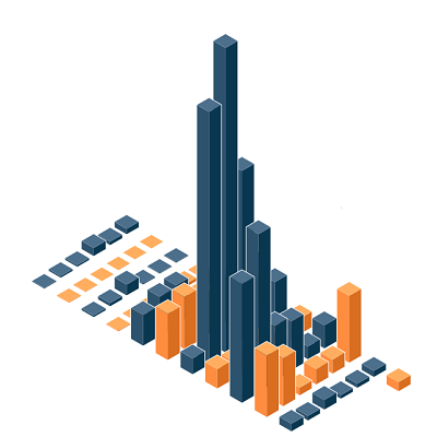 While scouring through the Majestic API suite of commands, I came across one that you can use to fetch the backlink history for an arbitrary site. This was an intriguing start and all I then had to do was to find a visually appealing way to represent the data. An isometric projection (a view perspective that resembles a 3D bar-chart) seemed perfect for this. I knew it would pair very nicely with the data that I got from using the Majestic API. However, I realised that the outer layers of the projection sometimes hid the inner layers, and so I implemented a slider that cuts away the outer layer to reveal those behind; which could help in tracking the site’s backlink history and comparing months.
Each step in the slider cuts away 6 month’s worth of data (one row in the projection) and the next part that I chose to implement was the alternating Majestic colours on the rows, which was a vast improvement on the previous arbitrary colour assignment that instead depended on columns.
The biggest challenge that I had was adding another slider that would cut away columns but I realised that it wouldn’t bring much functionality and use to the page and so I opted to abandon it in favour of other features. All in all, I feel that the end result is a nice and useful tool for seeing a site’s backlink history over a long period of time.
Site host map

After I had finished the backlink history page, I was thinking about what to make next, and went to the Majestic site for some inspiration. I stumbled upon the Majestic Million and thought it would be interesting to see if there were any trends in what countries the Majestic Million sites were hosted in. To visualise this I had to construct a map of the world, and then process the top sites from the Majestic Million to find out what country each of the sites were hosted in.
To show the number of sites that each country hosted, I decided to assign each country a colour ranging from a light to a dark shade of blue. The results were quite astounding (but not shocking) in that the US hosts more than 87% of the top 1000 sites in the Majestic Million, with China and various European countries lagging behind. I then added a slider that changes the minimum number of sites that a country must host for it to be given a colour and not appear in plain white.
Overall, I’m proud of these additional tools and hope they help to display and understand the Majestic data.
- Backlink history and site host map – More Majestic experimentation - September 21, 2016
As somebody who is constantly planning to much better understand SEO and ways to generate more traffic to my site, I actually value this details. Do you have any pointers on how someone like me that wants to find out more can do so better?
http://ms[Linkremovede]r.tumblr.com
October 12, 2016 at 8:46 pmPlease don’t put links in your comments. In answer to your question, we have a whole bunch of training videos at https://blog.majestic.com/how-to-videos/ and a list of training partners at https://blog.majestic.com/training-courses/ which you are welcome to investigate.
October 17, 2016 at 5:42 pm