


Data Visualisation has always been one of Majestic’s passions, so when faced with the open-ended brief “Use the D3 library to showcase what Majestic do”, it would come across as a mammoth task for many a programmer – let alone one that had just started. This was the position that Sam, Christoph and I were in just six weeks ago…
In the Beginning
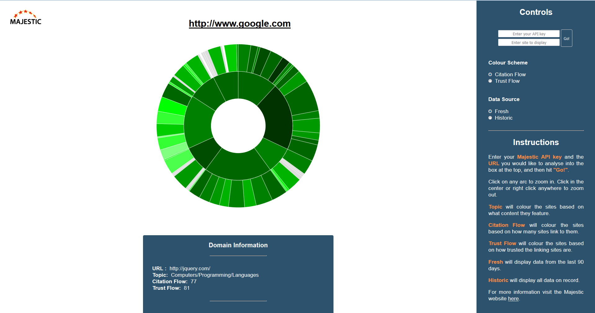
As the current summer interns, we decided to draw on inspiration from the work of our counterparts from last year. Having seen the Social Explorer that last year’s interns produced, we decided to start work on a similar visualisation that took the same tack, but applied it to backlinking sites rather than Twitter accounts. The finished result, though functional, didn’t seem to really do justice to Majestic’s data. Sure, it displayed it, but as we soon found out it’s often not just about displaying the data, but also how you display it.
At this point, Christoph unfortunately had to leave, but we were all extremely grateful for everything that he contributed.
Onwards and Upwards
Despite losing one of our team, Sam and I were still determined to act on the advice that we were given, and represent the data in a new format – as a force-directed graph.
The force-directed graph approach made much more sense for a couple of reasons:
- Each link on the graph represented a backlink, so it makes it much easier to visualise how backlinks work.
- It is possible to view a much larger set of data in one go, without having to navigate the visualisation as much.
- There are many more aspects to the visualisation that can be used to represent data (e.g. line colour, node size, node colour etc.)
After weeks of experimenting with and playing around with the data, we are finally able to show you what we have been able to create.
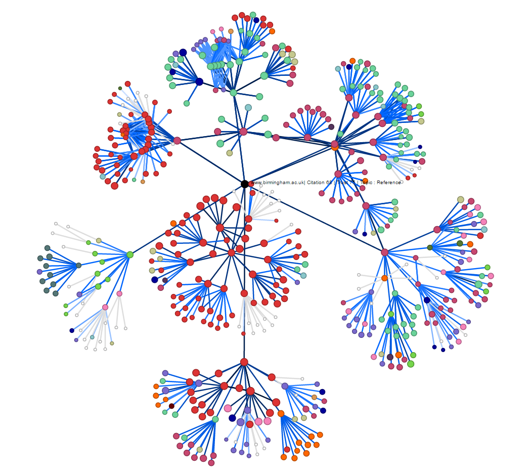
Page Link Network – What is it?
“Starting with a central site, the page link network shows the main backlinks pointing to the site, and the backlinks pointing to these neighbouring sites and so on.”
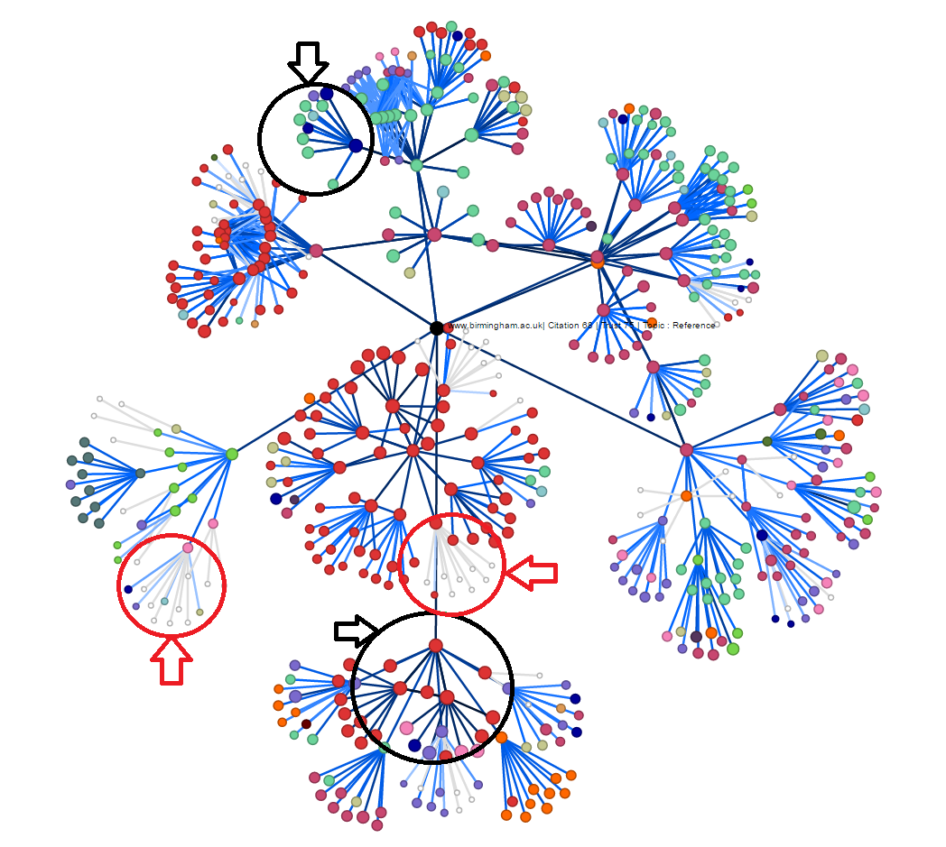
The page link network is brilliant not only for visualising how sites are linked together, but also for identifying the source(s) of a site’s trust flow. The line colour represents the Trust Flow of the backlinking site (the darker the blue, the higher the trust) so it is possible to identify clusters of high (or low) trust sites by simply looking at these colours. On the right, examples of low-trust clusters are circled in red and examples of high-trust clusters are circled in black.
We would love you to try the tool for yourselves, so we have provided some data from sites of the following universities:
- University of Birmingham
- Aston University
- Birmingham City University
- Massachusetts Institute of Technology
- University of Cambridge
- University of Oxford
- Imperial College London
If you would like to try the tool out, head on over to the labs site, and navigate to the 2016 interns page using our snazzy new landing page!
We are planning on rolling out a few more updates in the next couple of weeks, so definitely keep your eyes peeled!
Save
Save
- Mapping the Internet – Majestic Experimentation - September 8, 2016
On an iPhone nothing happens when I tap "visit page" on the labs page.
September 9, 2016 at 10:13 amThis is because of JavaScript not working on iOS devices (at least iPhones)! Have you tried it on a laptop/computer?
September 9, 2016 at 2:59 pm