No doubt you will have noticed that MajesticSEO has world class data, but hardly world class “look and feel”.
In true new world order style, we are going to get our customers to help fix that. We have got three strong designs for you to vote on and the winning design will be used to create the new look and feel of MajesticSEO.com and also this blog moving forward. We feel all of the designs are considerably stronger than our current look and feel – so it’s over to you to help us decide. There is a POLL on the right of this page, which we hope you will vote on and we’ll also listen to comments that you may have.
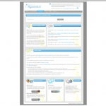
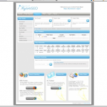
You can see the designs HERE (New Window) and we have selected just a few for you to vote on.
The gallery above just shows sample Control Panel pages for our site, but each designer shortlisted has also shown us a home page as well.
Please vote and give us some feedback… we can’t wait to improve our look and feel!
- How Important will Backlinks be in 2023? - February 20, 2023
- What is in a Link? - October 25, 2022
- An Interview with… Ash Nallawalla - August 23, 2022


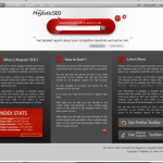
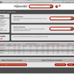
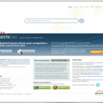
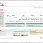


i dont find any of them 1005 on the MJ spirit i mean very clear design but i like this one http://99designs.com/contests/23763/entries/47
btw this blog look awesome
July 3, 2009 at 1:15 pmI really like #39
-Moose
July 3, 2009 at 10:10 pmI prefer the work done by art@work, but the should be improved.
July 4, 2009 at 4:30 pmThe Art@work design is by far the most up to date.
Murray
July 6, 2009 at 4:00 pmDefinitely prefer #1, the red and dark tones contrast nicely.
July 7, 2009 at 11:29 pmI would go for Art@work.
July 10, 2009 at 8:13 pmive just jump into masjestic seo… this tool is sooooo great. thanks !!!!
July 13, 2009 at 9:22 pm