


As we mentioned in our previous blog post, we have been very busy working on a structural overhaul of the Majestic site. This project helps deliver a more contemporary look and feel as you access our backlink data, and gives us a better platform to continute to build more best-in-class Link Intelligence tools.
We’re delighted to announce that our new-look navigation is now live. PLUS we’ve also sneaked out some updates to address minor legacy UX issues and UI inconsistencies.
What has changed?
Moved the main tool navigation to the left side
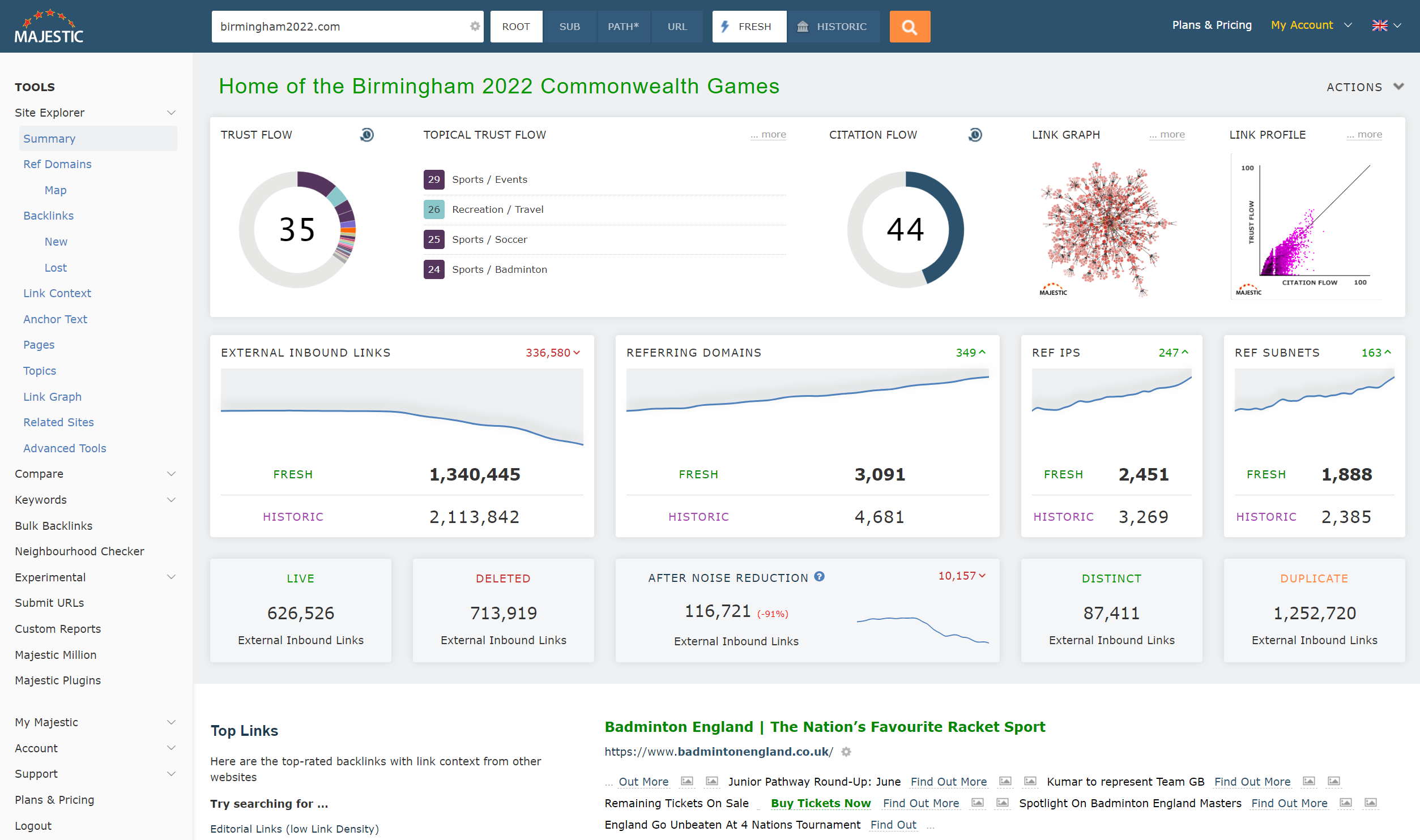
When you take a first look at the updated majestic.com, the initial thing that should jump out is the new navigation. We’ve replaced the old, cramped, and sometimes-confusing horizontal navigation with a fresh menu, containing all the links you’ll need on your Link Intelligence journey.
It’s easier to move between tools
We’ve improved the persistence of search terms across each area of the site. Making it far easier to keep your primary search as you jump from one tool to the next. If you are looking at Site Explorer for a certain website, then click on Compare, we’ll carry over your search term so that you don’t have to type that long URL in again.
You can use more screen real estate
While we have long supported small devices, our organic site architecture has never really taken advantage of the extra space offered by wider screens.
Majestic now adapts better to contemporary, high resolution desktop monitors, letting you work with your preferred screen width.
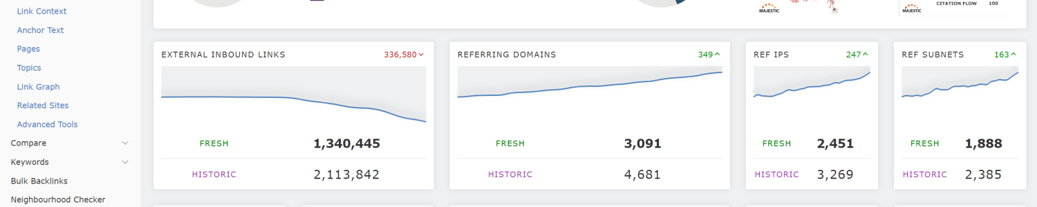
Streamlined Site Explorer components
We have taken this opportunity to give Site Explorer summary a bit of a polish, and standardised many page components. To make it faster to find important info, we’ve brought our Live and Deleted counts to the top of Summary.
Additionally, we have taken this opportunity to tidy and standardise some of our legacy Site Explorer Summary components.
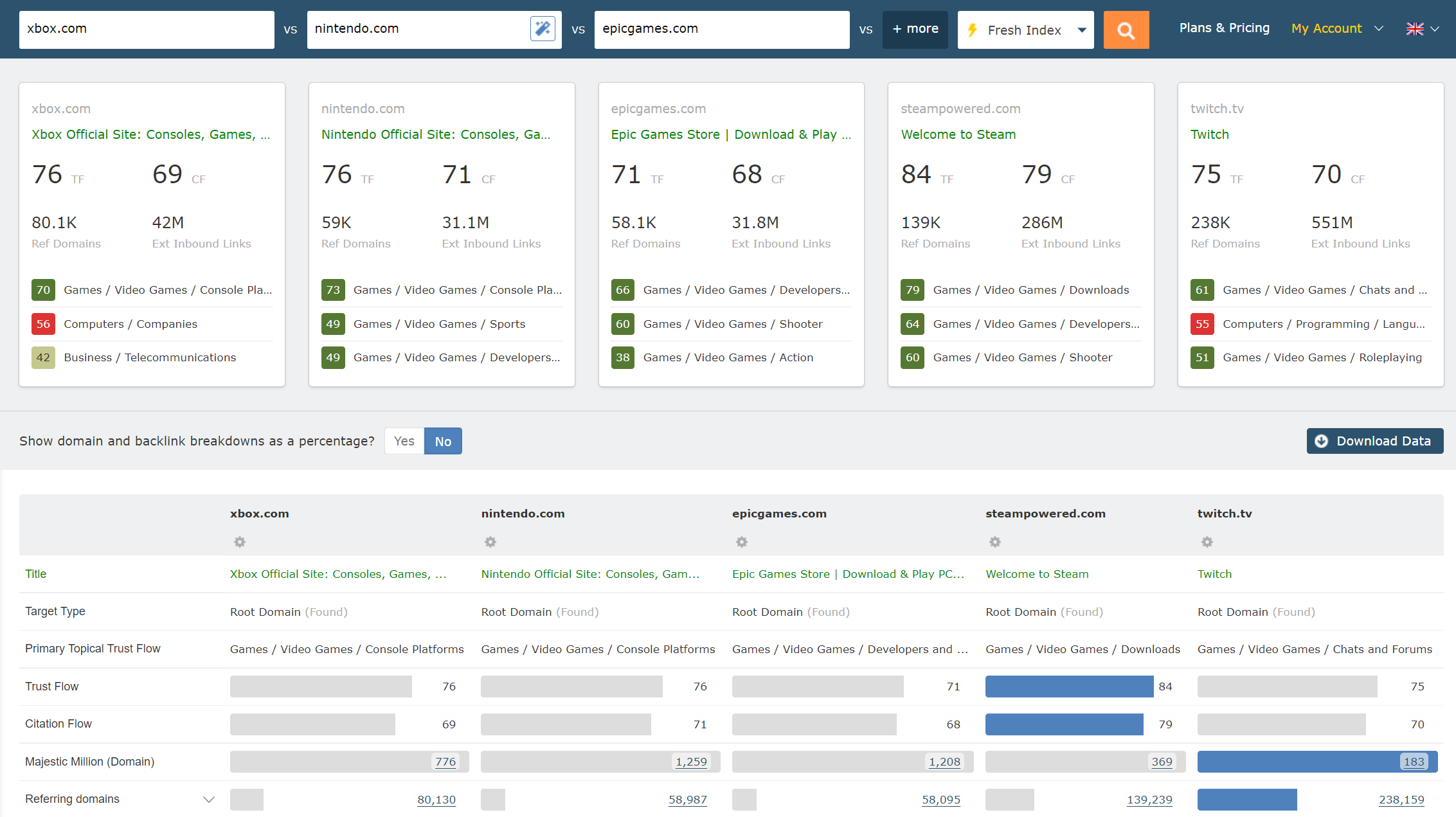
Compare Summary now shows summary cards
To highlight key differences when comparing sites or URLs, we’ve added some at-a-glance cards to the top of Compare Summary.
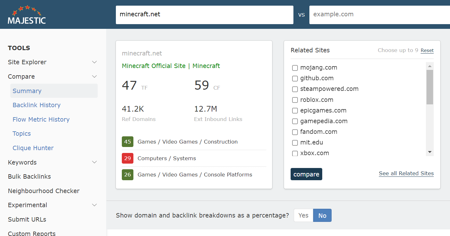
Increased Related Sites awareness in Compare Tools
Now that it’s easier to arrive in our Compare Suite with a pre-populated previously-used search term, we have added a more obvious way to compare that search item with related sites.
No longer do you have to know who to compare against, just choose up to nine domains from the list, and click Compare.
Improved menu UX. Vastly improved mobile and responsive menus
Our menus had become fragmented and unintuitive, and this was particularly visibile on mobile. Links for actions and tools hid behind a variety of navigation buttons. Menu items are consolidated into a single menu across all devices.
Old
New
Building a platform for future innovation, development and new features.
We really hope that you enjoy the new pathways through Majestic tools and data. And apologies for the minor muscle memory discomfort that some of you may feel while you get used to the new layout.
We appreciate that you, our customers, have jobs to do – and sometimes have urgent data to gather. You don’t want to have to re-learn a new interface each year to download the reports that are important to you. It is because of this that we have strongly resisted the temptation to introduce more regular fundamental changes to the way that Majestic looks and feels.
This one, however, was different. Firstly, we had reached the limit of Site Explorer tabs and tools, creating an artificial ceiling across our toolset; and secondly, we needed to fix the fractured mobile menu user experience. These updates have given us a far better platform for futher enhancement, and to provide you with exciting new tools and reports.
These changes have been tested extensively and feedback has been overwhelming positive. We have been delighted to receive some insightful constructive criticism in addition to kind and generous compliments! If you’ve found time to click, consider and contribute feedback then we offer our sincere appreciation and heartfelt thanks.
If you find anything that looks odd, please let our Customer Service team know. Throughout the extra-extended Beta period, they have worked closely with our developers to ensure your comments and observations are seen by the product development team
Thank you for reaching the bottom of this post, the new majestic.com navigation is now Live, and you can check it out here, if you haven’t already.
To get in touch with any feedback, please visit: https://majestic.com/help/contact-us?subject=New+Left+Navigation&Topic=feedback .
Alternatively, if you would like a walkthrough of the new site, or a chat with one of our team to see how you can make the most of your Majestic subscription, please feel free to book a one-to-one demo with one of our great customer service representatives.
- N-grams Near Links: Identify recurring phrases in the context around your backlinks - April 29, 2026
- TLD Checker – New for 2026 - February 26, 2026
- Welcome Hub – Improving the final step of your login journey - September 9, 2025
This new look awesome as compared to the older one, I like the linkgraph and duplication things.
August 11, 2022 at 10:44 amThanks for the compliment. Unfortunately links are not allowed here.
August 15, 2022 at 4:23 pm