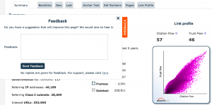
 We hope we are helping the SEO world… so we would love some help back if you have 3 minutes.
We made it easy…
We now have a feedback button on the MIDDLE-LEFT of every page on the main site. If you have a suggestion as to how we can improve the user experience on the page, just press the Feedback tab and jot us a line.
You won’t leave the page or lose track of any of your data. Quicker than an email and we track the page you are talking about, so you just need to tell us what is wrong and how we can fix it.
Maybe some icon is missing that you are used to seeing elsewhere, or there is a phrase that needs explaining, or a BIG RED BUTTON that you think should always have been there buy we somehow missed it.
Over recent years, the mantra “Majestic isn’t easy to use” has calmed down considerably from those early days and we now get as many users saying they find our site easier to use than others as we do saying our UX needs work. So here is your chance. Apparently the Feedback button is only available for a limited time (lest it gets confused as the support button) but in that time we really hope to get good ideas on how to improve our layout and usability.
Please tell us that thing that has always annoyed you, by pressing the feedback button. Please hurry! Majestic needs you!
Can’t find the button?
It is on every page except the home page. When you find it, tell us how we should have done the feedback button better too! 🙂
Is there a Prize?
Yes – we all win by having a better site.
- How Important will Backlinks be in 2023? - February 20, 2023
- What is in a Link? - October 25, 2022
- An Interview with… Ash Nallawalla - August 23, 2022


