


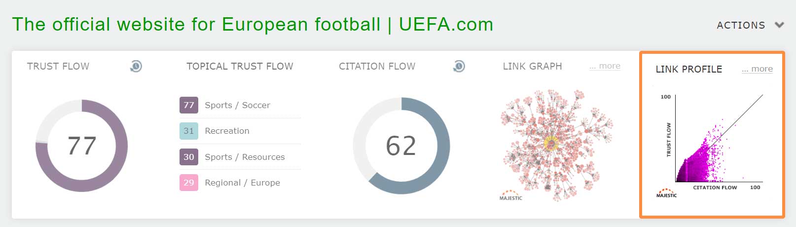
… and instantly evaluate backlink profiles.
Much of Majestic has evolved since the release of Site Explorer over a decade ago. But one constant, almost since its inception, is the humble Link Profile Chart. Many of you probably see the chart every time you visit, but have perhaps never been introduced to what it’s for, and just how much it can help to evaluate a website’s immediate inbound link profile.
What’s a Link Profile Chart?
The chart is a way of visualising the distribution of the quality of links that point to a website or web page. By organising inbound URLs like this, we can compress (up to) billions of links into a single image.
How do you read one?
A Link Profile Chart has lots of dots. They are arranged in a grid of 101×101, with Citation Flow along the bottom (0 to 100 on the x-axis), and Trust Flow up and down the side (0 to 100 on the y-axis).
On that grid, we plot the Trust Flow and Citation flow of each external URL, in a very similar way to a scatter graph.
So, if you have an inbound link that has a Citation Flow of 20, and a Trust Flow of 10, we show a dot at [20, 10] on the chart.
If you have TWO links with CF 20 and TF 10, then we overlay one dot on another. As a result, the dot at [20, 10] will be ever-so slightly darker.
And if you have one million links stacked on top of each other at CF 20 and TF 10, then the dot will become very, very dark.
Essentially, a dot represents the number of inbound links* that exist at each Trust Flow and Citation Flow combination.
Dots that are HIGHER on the chart come from links that have a higher TRUST FLOW
Dots towards the RIGHT of the chart are from links with a higher CITATION FLOW
Dots that are DARKER show that there are more external inbound URLs at that spot.
Top-right dots are high TF and high CF links, and bottom-left dots are low TF and low CF links.
*Note: While this article talks about inbound links, bear in mind that the charts can also be used to see the Flow Metric scores of Referring Domains. More on that later.
What’s the Diagonal Line?
Many SEOs and Digital Marketers use some kind of TF/CF ratio to find quality links that have higher Trust Flow than Citation Flow (or a CF/TF ratio to look for poorer links). The diagonal line that runs from bottom-left to top-right shows the point where TF and CF scores are equal.
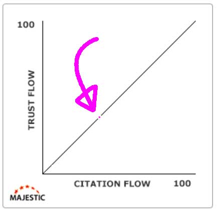
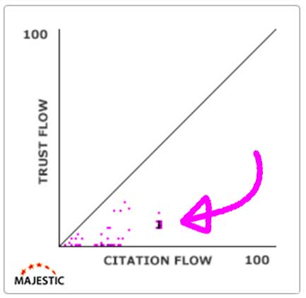
To show how this works, imagine a website with one link. That link has a Trust Flow of 30, and a Citation Flow of 30. It is perfectly balanced. We can plot that single link at the point [30, 30] on the chart.
As the TF and CF scores of the link are equal, the dot has landed on the 45-degree line.
Here is the same hypothetical site, but with two more added links.
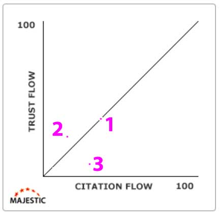
One of the new links [#2, above] is above the 45-degree line, showing that the Trust Flow for the inbound link is higher than Citation Flow. This would suggest a link of slightly higher quality.
The other new link dot [#3, above] is below the 45 line, so TF is lower than CF, suggesting a link of slightly lesser quality.
Essentially, the diagonal line is there to help your brain work out how many links are above and below the spot where Trust Flow and Citation Flow are balanced.
Typical Link Profile Charts
Link Profile Charts work by building up and layering links, until they are all mapped in a single chart.
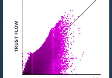
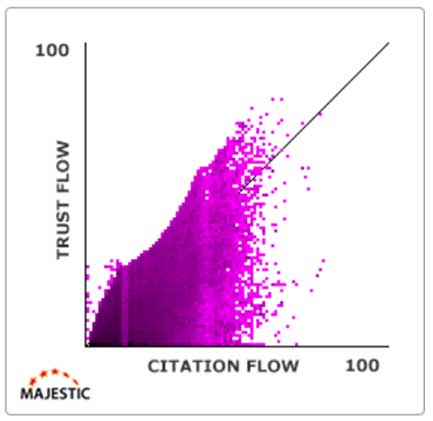
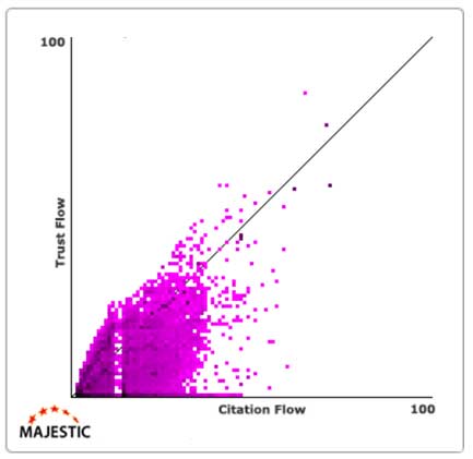
Here is an example of a site with 1.7 BILLION backlinks, all stacked on top of each other. It has lots of hallmarks of a great natural link profile…
- The colour resembles a flame, where bottom-left is far darker than the top right
- Most of the links are below the TF/CF 45-degree line
- There are no major gaps in the flame
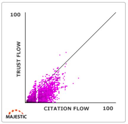
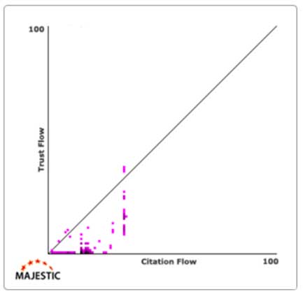
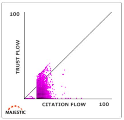
Here is another good example of a nice Link Profile Chart, but for a smaller site.
Again…
- It’s fainter (as there are fewer links), but the colour still resembles a flame, where bottom-left is far darker than the top right
- Most of the links are below the TF/CF 45-degree line
- There are no major gaps in the flame
Note, that slim vertical gap is normal. We’ll cover that later.
Why should the chart resemble a flame?
If you think about a natural set of backlinks for your own website…
What percentage of your own links would you consider to be great links? For instance, links from reputable news websites, established scientific research sites, or government sites?
And for each one of those great links, how many ‘normal’ or ‘poor’ links do you have? Maybe a batch of links from old forum posts, or directory sites, or even from your old MySpace profile! If you are like almost all organically-grown sites on the planet, then you will have way, way more of this second type of link than the first.
A normal Link Profile Chart should always reflect that imbalance and show far more ‘poor’ links at the bottom-left side of the chart than ‘great’ ones.
If a site only has great links, and no poor ones, that can suggest that something odd is going on.
When do charts NOT resemble a flame?
At the start of this article we shared our belief that a Link Profile Chart is one of the key ways of instantly visualising the quality and quantity of links that point to a website or web page.
Here is why we think this.
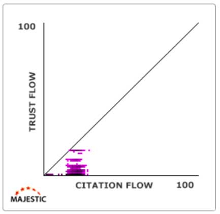
If you were to look at the basic headline stats, this following website has 6,911 Referring Domains, and over 3 million external inbound links.
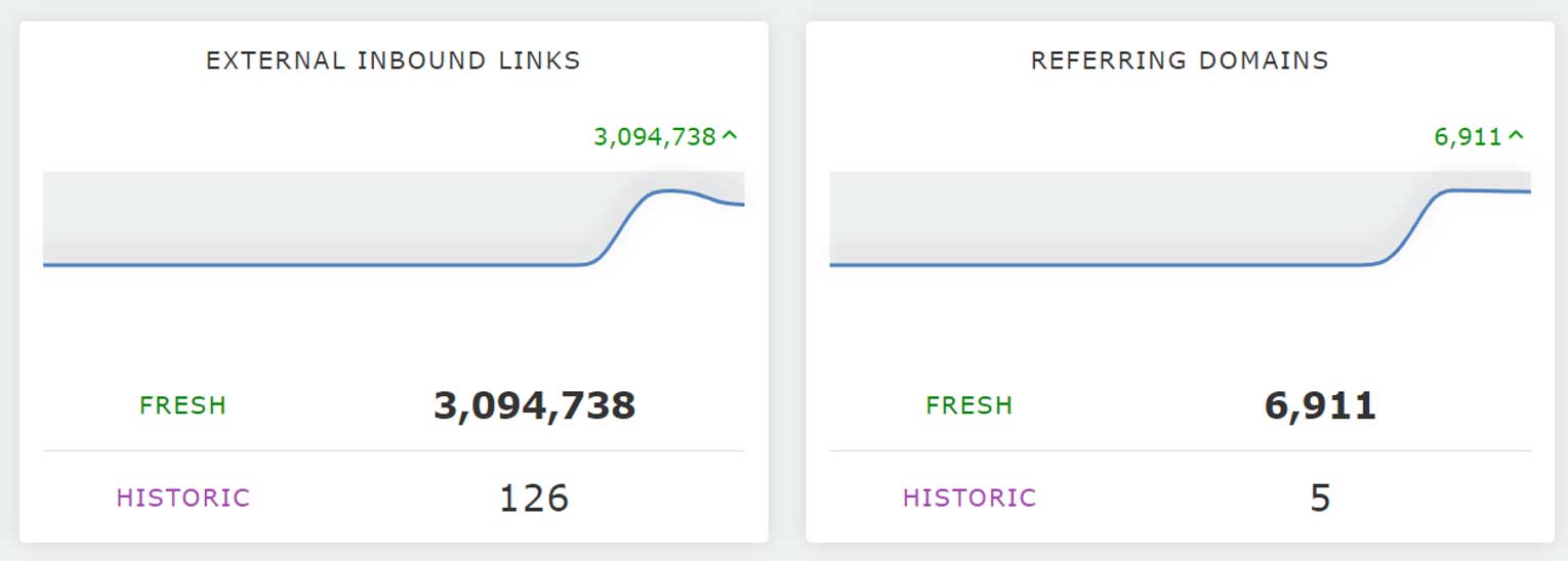
On the face of it, you may think that this is a good link profile… almost 7,000 referring domains is good, right?
Well, when we take all of those 3,094,738 inbound links and plot their individual TF and CF scores on a Link Profile Chart, you can see that there is a MAJOR problem with this site’s backlinks.
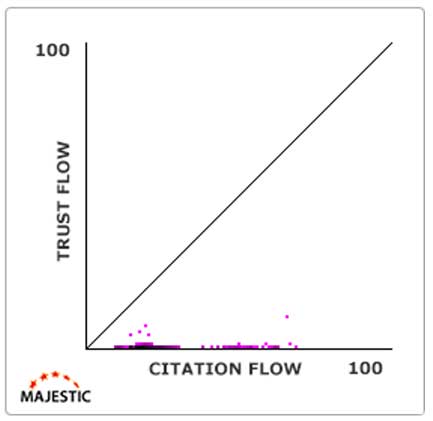
… apart from one or two dots with some (albeit minimal) Trust Flow, almost all of those three million links have a Citation Flow of just 0 or 1, producing a very clear flat line in the chart.
This is not a site with a healthy and natural profile.
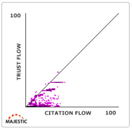
Another hint for ‘bad’ charts: Watch out for Islands
It is very rare for a healthy chart to have isolated dark-coloured islands. If you look again at the example above, you may notice that there are NO inbound external links in the immediate bottom-left of the chart. The purple line of dots doesn’t seem to start until about 7 or 8 CF (on the x-axis).
It’s extremely unnatural for a site with over 3 million links to have ZERO inbound URLs with a Citation Flow of less than 7 or 8.
For another example, take this Link Profile Chart…
There is a very dark cluster of links, just above the N in ‘Citation Flow’. The very dark colour means that there are likely tens of thousands (perhaps even hundreds of thousands) of isolated links that point to this website with almost identical Trust Flow and Citation Flow scores. And because that blob is so dark, it means that nearly all this site’s inbound URLs have almost identical Trust Flow and Citation Flow scores.
We can’t think of a reason why this would happen naturally, and we would suspect that this domain is part of a connected link network that has the same TF and CF recursively duplicated throughout all of its interlinking web pages.
Here are some more examples of unnatural clusters of websites.
This one looks like a network where its operator has bought a batch of domains that have a Citation Flow above 25!
As we covered, a healthy Link Profile Chart should almost always resemble a flame.
Now, when you are dealing with almost every website on the internet, there is obviously the chance of an outlier of a normal profile with these islands. But, (on the most part) when you are looking through domains and see these clear high-volume clusters representing links with near-identical TF and CF scores, you should take these as a suggestion that it would be wise to have a look at the entire Link Profile for this site.
Note: Don’t worry about this one specific data gap
There is one gap that you don’t have to worry about.
Occasionally a vertical band or lighter zone, like the one below, may appear in this position. Often this is nothing to worry about, it’s just an artifact of our extreme amount of processing.
However, if you see something like this example, below, where there is a very large space between the bulk of the flame and the left-hand side, then this is NOT a result of our calculations. This would indicate that there is something suspicious about this link profile.
And with that, that is you now up-to-date with the basics of Link Proflie Charts.
Now you know how these graphs work, and have seen some good and bad examples of how you can use them to identify areas of potential concern.
Picking the data type that suits you
This post has talked about plotting inbound links for domains, but you should know that you are not limited to looking at domains. There are multiple different data sets you can use with Link Profile Charts.
- View for an entire domain
- View for an individual subdomain
- View for a single URL
- Plot data points of inbound external URLs
- Plot data points of incoming Referring Domains
- Use Fresh Index data
- Use Historic Index data (Pro and API subscribers)
No matter which you choose, you are in control of the way you use Link Profile Charts.
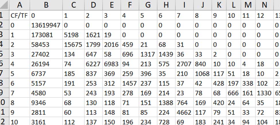
You can even download the underlying data
If you would like to see the number of domains at each data point in a Link Profile Chart, you can click on any chart in Site Explorer Summary to link through to the Link Profile page.
From there, you can request a data extract.
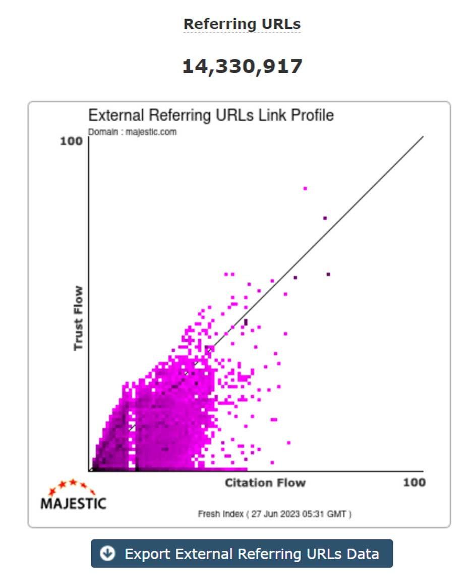
You will be able to request an XLS, CSV, or Google Sheets extract with the number of data points at each TF/CF step.
You can even combine them with Link Graphs
Now that you have learned more about Link Profile Charts, you should check out our Link Graphs article. In there you will find out how you can combine both charts at the top of Site Explorer Summary to give you an immediate feel for both the breadth and depth of a site’s Link Profile.
How do you get them?
Fresh Index Link Profile Charts are available for ALL Majestic customers on ALL subscriptions. Pro and API subscribers will additionally have access to Historic Index charts.
Inbound Links charts are at the top of Site Explorer, and you can click through at any time to see bigger versions of both the link and Referring Domains charts, side-by-side.
If you’re not a customer, you can have a go with our current demo site. Or even check out both the Referring Domains and External Inbound URLs charts for example.com.
We hope that you enjoyed this run-through of Link Profiles Charts and, as always, you can always get in touch if you have any questions. And if you want to find out more about Majestic features you’d like us to explain, we’d be delighted to offer you a walkthrough demonstration.
- N-grams Near Links: Identify recurring phrases in the context around your backlinks - April 29, 2026
- TLD Checker – New for 2026 - February 26, 2026
- Welcome Hub – Improving the final step of your login journey - September 9, 2025
Thank you, Steve! Most helpful. Any chance we could get a new series of YouTube videos for Majestic?
June 29, 2023 at 4:20 pmHey David.
Thanks for the feedback. I’m very glad that you found the article useful!
I’ve sent your request for some new YouTube videos over to my colleagues.
Very best wishes
Steve
June 30, 2023 at 2:31 pmGreat article! Very insightful and good examples.
July 24, 2023 at 1:59 pmThank you!