*EDIT – THIS IS NOW LIVE!*
Today at Majestic we are announcing some great improvements to our Site Explorer tool and some usability enhancements due to go live early next week.
We are introducing three new tabs for Site Explorer, an Anchor Text tab as well as a New links and a Lost links tab. These are the link tracking tools that everyone has been waiting to see!
At Majestic we not only offer our customers the largest link intelligent database on the planet, but in a way that is useable, to allow you to get the most out of our data.
New Links Tab
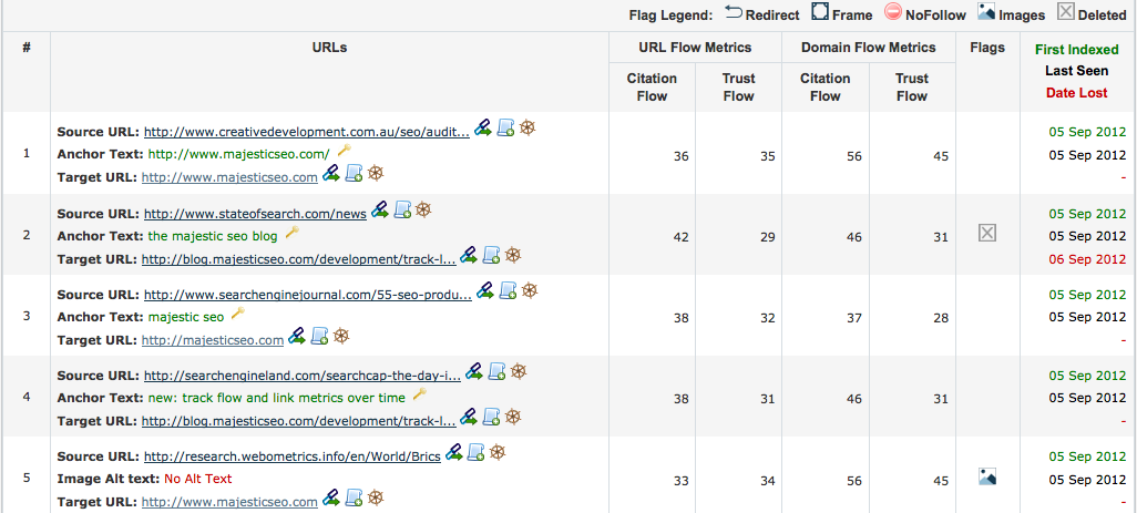
Our new links and lost links tabs, allow you to see how many new links a site is acquiring compared to the number of backlinks that are lost. There are some other tools out there that are trying to do this, but we wanted to do it better! So by giving you this information in one great image, you can see how well or badly your link building efforts are going.

We are aware of other products showing new/lost links, but in order to be accurate, the Historic Index must be measured in years rather than in days or weeks, making our Historic New and Lost tabs accurate and extremely useful. However the build time for our huge Historic Index is so large that it is not possible to update this data more frequently, so for speed of service the information is also available in our Fresh Index too. The problem with determining if a link is new is due to the goldfish memory of a fresh Index. If a crawler finds a link that hasn’t been seen before in the Historic Index then every Fresh Index the link will appear ‘new’ as the Fresh Index is only a limited windows thus the link will be rediscovered. This can produce spikes of discovery of older links which on the day of Index will look new (This also is the same with our competitors’ products). This is why we have limited some of the dates at the start of a crawl.
Lost Links Tab
This tab shows you the new links as well as the links that have been lost on a date basis as well as giving you a reason why, such as the link no longer exists, there is a 404 error or the call has been denied by the crawlers. This chart enables you to do some really cool things, and by selecting a date range on the chart you are able to see tabular information about the links broken down, allowing you to zoom into a day so you can see how your link building efforts are developing over time.
Anchor Text Tab
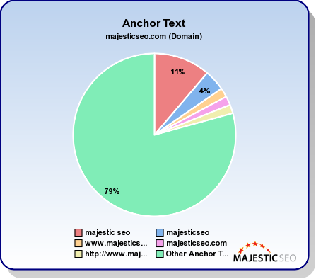
We recognise that anchor text is an important feature for many, so developing on our keyword tool, anchor text is now included in the Site Explorer summary page. This allows you to see the most popular anchor text to a domain visually, to give you a great glance at the data.
This chart shows the top 5 anchor text to the site, along with the percentage of text that they make up, as well as all the others grouped into one ‘wedge’.
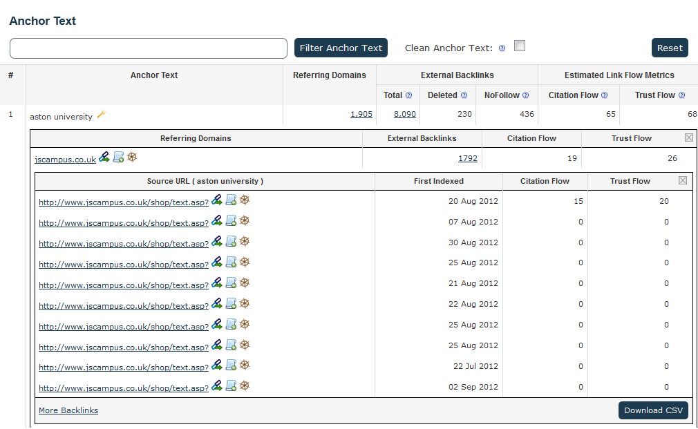
The Anchor Text tab will show you all of the anchor text that links to the domain in order of the number of referring domains linking to the site, showing the total amount of backlinks for the phrase, how many of these are no follow and deleted as well as the Flow Metrics of the text!
If that wasn’t great enough, as well as seeing the weight of different anchor texts you are also able to look even deeper at the backlinks that are using this anchor text.
By clicking on ‘total links’ it will show you all of the backlinks using this anchor text, so you can drill down at domain or anchor text level. You can also look at all the referring domains, and even see the individual pages from that domain, so you can drill down even further to a second level see the individual backlinks. This gives you a great idea of how the pages flow and link together, and allows you not only to analyse your own site or a competitor’s backlinks but backlinks of backlinks too! This tab also lets you to filter the anchor text to include a specific phrase and see the backlinks and Flow Metrics for certain anchor text, and all this data can be downloaded to CSV. Phew!
The purpose of the Site Explorer tool is to provide the user with a feel of the data – a summary – and if further analysis is required then tools such as Majestic’s Standard and Advanced reports can be used to get a better analysis of the data. We believe at Majestic that our Historic Advanced reports are the most comprehensive reports available to customers giving you an amazing amount of data. It is important to remember that every Site Explorer- including Majestic – makes assumptions in order to provide a speed of service, however it is a brilliant overview and starting block to analyse your site.
- Actionable SEO – Top Pages and Link Profile - January 22, 2013
- Actionable SEO: Using Referring Domains Information - January 9, 2013
- Actionable SEO – The Fresh and Historic Indexes - December 29, 2012


We can’t see any of this data yet, is it not live yet?
September 14, 2012 at 5:50 pmIt’s in beta testing right now but it won’t take long time for it to be launched – we hope!
September 14, 2012 at 6:06 pmThis is quite interesting, such analysis could also become interesting for academic studies. Perhaps some day statistical Analysis of fulltext content would be possible ?
September 14, 2012 at 8:40 pmwhat would be even better is to get daily e-mails and look at historic data for your site and set automatic alerts for too many lost links – or a huge increase in identified links (sabotage SEO).
September 15, 2012 at 2:18 amOne needs to build the technology before the features! Last month we introduced tracking reports. This month integrated daily new/lost links into the dashboard. We won’t stop innovating, I can assure you 🙂
September 15, 2012 at 8:03 amSo let me get this right, you announced something on your site that none of us can access?? That makes me sad, from not on just wait until I can actually use it 🙂
September 15, 2012 at 4:14 amSorry Wil, but this announcement coincided with Brighton SEO and a live announcement and live demos to 1500 people could not be passed up! 🙂 but as Alex says, we’ll be letting people see live data very soon. In the meantime, check your mail 😉
September 15, 2012 at 8:00 amAnchor text chart is what I was waiting for! But I think top 5 isn’t enough, top 20 sounds better 🙂 If this chart will work only for domain-level or for url-level?
September 15, 2012 at 1:20 pmThere will be more than Top 20 😉
Anchor text will work on all levels: URLs, subdomains and root domains.
September 15, 2012 at 1:42 pmThanks for continuing to make your tool a valuable resource for us. I can’t tell you how much time this saves! Thanks!
September 15, 2012 at 5:26 pmthanks my friends but i can’t see any of this data, is it not live ?
September 16, 2012 at 6:22 pmIt’s in our beta testing – we plan to release very soon, just bear with us …
September 16, 2012 at 7:02 pmI too am bummed, I thought you had this available but noooo, you’re just teasing. This will be a great feature when you get it running.
September 17, 2012 at 1:32 amROLLING OUT LIVE NOW!
September 17, 2012 at 4:55 pmRefreshed the page and suddenly it was live! Great news I no longer have to visit that other website :).
September 17, 2012 at 5:21 pmBY all means compare the two! … Feel free to Blog your honest opinion. I think you’ll be pleasantly surprised as will your readers.
September 17, 2012 at 5:45 pmGreat improvement – would love to see a “Linked Domains” tabs which shows pages that are referenced by the currently analysed domain as well.
September 17, 2012 at 8:03 pmWhen is this going to be live? 🙂
Glad to hear you like our new features, and thanks for suggestion – we’ll consider it alongside with other ideas that we’ve got. 🙂
September 17, 2012 at 11:35 pmWow, what a GREAT addition to your tools!
One thing I’m not certain of is the significance of color assignments you’ve chosen of any specific sequence in how you arrange them. It might be helpful if all ‘naked’ hard-coded URL anchors were in a similar color range (i.e. yellow, peach, orange, red) and grouped together in the chart, perhaps Top Keywords in Blue-Purple, Greenish for ‘Other’.
Perhaps there’s still refinements that could make ‘at a glance’ assessment show what’s really ‘Top-Heavy’ in the upper half of the chart – or ‘Under-Weighted’ in anchor text ratios at the bottom…
September 18, 2012 at 6:22 amI am not entirely sure I understand your suggestion. I guess we could make more use of colour to differentiate between over competitive and non-competitive. If there’s a clamour for this then we would have a look – but it’s a feature rather than a bug – so may not be on the top of the priority list. We have some more great developments planned and Alex and Steve won’t want the Dev team distracted. :)>
September 18, 2012 at 12:59 pmI do like the new features but now I can’t find the old feature that used to be on the Summary page in the same location where you now put the Anchor Text graphic. Would it be possible to get that back in on another tab somewhere?
September 18, 2012 at 1:39 pmThanks,
Adam
Just click on the “domains” tab. It is all there.
September 18, 2012 at 2:46 pm> Ah, okay on the Ref Domains tab.
September 18, 2012 at 6:40 pmThanks for the info.
we can’t see more data yet
September 18, 2012 at 2:41 pmThis cannot be us – it is now live worldwide.>
September 18, 2012 at 2:47 pmMassive leap forward in Link analysis.
September 20, 2012 at 2:12 pmMaybe I am seeing bad data, but the Lost links tab – basically every single link is still there. Fresh Index.
September 20, 2012 at 4:39 pmHi Jeff, please contact us with details via support system to check it.
September 20, 2012 at 5:42 pmThis tool will be very useful I have been thinking about subscribing now it looks like the decision is clear.
September 21, 2012 at 2:16 amThank all of you guys at the MajesticSEO for implementing such powerful features representing specially with these new 3 tabs!
I always dreamed of using services with features at this such advanced and helpful levels, these new tabs here alone makes someone to subscribe for you forever!
Regards,
September 21, 2012 at 10:30 pmThis will be very useful for site migrations
September 23, 2012 at 11:44 pmThis is amazing job! You change my way of seo-thinking. Majestic Milion is also a great tool 🙂
I’d like to see anchor text percentage data in your amazing api 🙂
Regards,
October 17, 2012 at 9:41 amSzymon