


In Part 1, we looked at how correlation can be used to examine relations or associations between variables in a data set. We described the different types of correlations, and presented the advantages and disadvantages of the correlation technique to analyse data. This part will attempt to ease the reader into methods of quantifying correlation.
Correlation Coefficients
Up till now, correlation has been defined as a measure of the relationship between two or more variables and their dependency. A correlation is a distinct number, often denoted by r, that defines the level of association between two variables.
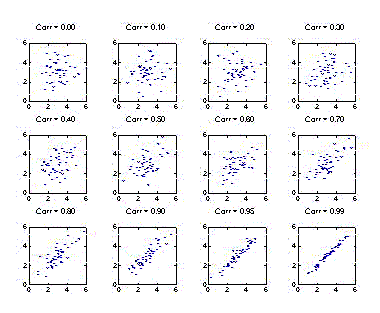
Correlation coefficients are a numerical way of conveying a linear relationship, or a consistent technique to describe how the variables vary with respect to one another. Correlation coefficients are expressed as a number between +1 and -1. As we saw in Part 1, zero correlation indicates that there is no relationship between the variables. A value of r=+1 indicates a perfect positive correlation (the variables always move together in the same direction, i.e., when one variable increases, the other also always increases), and a value of r=-1 indicates a perfect negative correlation (the variables always move together in opposite directions of each other, i.e., when one variable increases, the other always decreases). As a general guideline, correlation coefficients between 0.1 and 0.3 imply a small strength of association between the variables, values between 0.3 and 0.5 indicate a medium relationship, and correlation coefficients between 0.5 and 1.0 denote a relatively large effect, as shown in the figures below.
Correlation coefficients can be of several different types (e.g., Pearson’s, Spearman’s and Kendall’s) and they all lend themselves to different interpretations.
But where do these numbers come from? How are they derived? In the next part, an attempt will be made to answer these questions. But first, a few definitions are in order regarding some measures one can perform on a data set. This might seem technical at first, but it is well worth it for analysis purposes if one is to discover what they tell us about the data.
In statistics, it is usual to deal with a sample of a population. Note that we have introduced two new concepts. A population describes any entire collection of individuals, flora, fauna or other entities from which data may be collected, and which we wish to describe or draw inferences about. A sample, on the other hand, is a subset of the population, i.e. a group of units carefully chosen from a larger collection (the population). It is expected that valid conclusions about the larger group can be drawn from a study of the sample. It is therefore important to have a sample that is representative of the entire population.
Examples:
1. A utilities company wants to see if the average weekly electricity consumption for single-family dwelling units in the UK changes with the income of the family.
Population: the weekly electricity consumption for all single-family dwelling units in the UK
Sample: the weekly electricity consumption for a selected group of single-family dwelling units in the UK
2. A climatologist wants to estimate the average length of time until the recurrence of a certain precipitation pattern.
Population: the times until recurrence for all incidents of that particular precipitation pattern
Sample: the times until recurrence for a selected group of occurrences for that particular precipitation pattern
3. A dietician wants to know if the average weight of adult men in India changes with age.
Population: all men in that age range in the India
Sample: a selection of men in that age group made from the population in India
4. In a survey, American citizens were asked how they feel about a particular celebrity figure.
Population: All citizens of the United States
Sample: 500 US citizens, for example, selected randomly from each state
Pitfalls:
The sample selection strategy should be unbiased, i.e., every entity in the population has an equal chance of being selected for the sample. One method to achieve this is random sampling, which implies that no influence is exerted regarding which individuals are chosen from the population, and consequently there is no organized preference towards certain entities or particular conclusions of the study; it is purely an issue of chance.
It may be noted from the above examples that we can only draw certain inferences about the parameter of interest in the population, because there will be some uncertainty and inaccuracy involved in drawing conclusions about the population based upon a sample. This should be evident: because there are fewer members in the sample than in the population, some information will therefore be lost.
It is essential to recall that the sample that is drawn from the population is only one from a large number of possible samples. If the same population was studied by a number of researchers, drawing their own samples, then they may arrive at different conclusions.
Some Data-Driven Illustrative Examples
In this section, we look at two examples:
- The correlation between two datasets is small: the Majestic Million rankings and the corresponding Alexa rankings for 1000 randomly selected domains, which we shall regard as the population. Note that the use of the term “population” in this case is a misnomer, because the total number of domains far exceeds 1000. However, in order to clarify certain concepts, we shall assume for the moment that the 1000 domains constitute the whole list of available domains.
- The correlation between two datasets is high: the Majestic Million TrustFlow and the corresponding Google PageRank for 55 Twitter Profile domains, which we shall regard as the population.
But first, we define a statistical measure, namely the mean, that can be estimated about a data set. As an example, consider the data set consisting of 5 numbers:
X=[6 7 8 4 5]
Here, the symbol X is used to denote this entire set of numbers. An individual number in this data set is referred to by using subscripts on the symbol X to indicate a particular number, e.g. X2 refers to the 2nd number in X, namely the number 7. Also, the symbol n will be used to represent the total number of elements in the set X. In our example, n=5.
The mean is merely the arithmetical average of all the members of the data set. This value is obtained by adding together all the elements in the data set, and dividing the resulting sum by the total number of elements. Therefore, in our current example, if we add up all the five numbers in the data set X, a total of (6+7+8+4+5)=30 is obtained. Dividing this sum by the total number of elements in the data set, in this case 5, we get the mean of the data set: 30/5=6. Therefore the mean of the data set X is 6.
In the figures below, we display scatterplots for two datasets: the Majestic Million Rankings versus the Alexa Rankings for the entire population of 1000 entities, as well as plots for random samples drawn for the population of size n = 200, 400, 600 and 800.
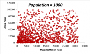
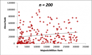
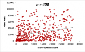
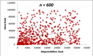
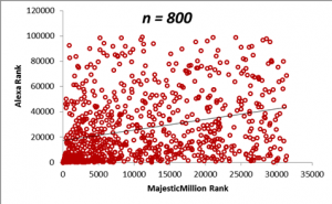
The table below demonstrates how the sample means for the Majestic Million and Alexa rankings behave as the sample size n is increased. Do not worry right now about the values in the correlation column. We shall come that in due course. For the moment, it will suffice to note that a sample size of n = 400 is sufficient to provide a good estimate of the statistics of the population, as seen from a comparison of the values of the means and correlations with that of the population. The calculation of the optimum sample size from a population is a complex topic and will be described in detail in a later section. From the criteria described in the previous section, we can see that the correlation between the Majestic Million Rankings and the Alexa Rankings is low (< 0.3).
| Sample Size (n) | Majestic Million Rank Mean | Alexa Rank Mean | Correlation |
| 200 | 11876.42 | 24816.91 | 0.17 |
| 400 | 11731.31 | 26394.27 | 0.29 |
| 600 | 12082.24 | 26428.90 | 0.28 |
| 800 | 11554.92 | 27146.35 | 0.29 |
| Population = 1000 | 11741.13 | 26983.77 | 0.29 |
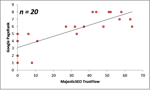
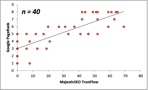
Next, we consider the correlations between the Majestic Million TrustFlow and the corresponding Google PageRank for 55 Twitter Profile domains. The scatterplots are displayed below for the population, as well as for sample sizes n = 10, 20, 30 and 40.
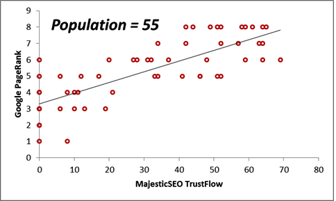
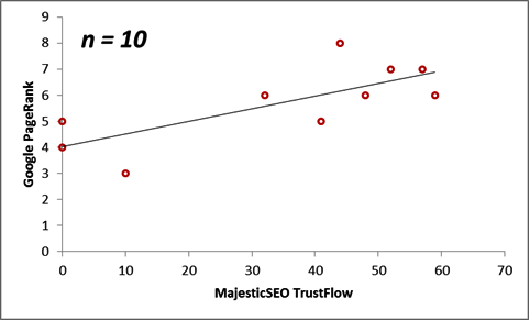
The table below illustrates the behaviour of the statistical measurements on these two datasets.
| Sample Size (n) | Majestic Million TrustFlow Mean | Google PageRank Mean | Correlation |
| 10 | 34.30 | 5.70 | 0.74 |
| 20 | 31.65 | 5.55 | 0.80 |
| 30 | 33.37 | 5.53 | 0.76 |
| 40 | 30.38 | 5.25 | 0.82 |
| Population = 55 | 31.20 | 5.35 | 0.79 |
In summary, we see that Trust Flow correlates better with Page Rank than it does with Alexa Rankings.
- Ranking of Top Data Scientists on Twitter using MajesticSEO’s Metrics - August 19, 2014
- Measuring Twitter Profile Quality - August 14, 2014
- PageRank, TrustFlow and the Search Universe - July 7, 2014
Comments
Comments are closed.