


Majestic is delighted to announce the launch of Link Graph, a visual map of the immediate network that surrounds a website or URL. This is a backlink game-changer for Digital Marketers, SEOs and domainers.
Read on to find out how Link Graph will help you…
- find how close your sites are to Link Networks
- check the authenticity of the network around potential domain name purchases
- see which of your competitor’s 2nd and 3rd Tier links are working best
- find which deleted backlinks were bringing most link juice
- use filters to choose your own Link Graph view
Update: Since this launch post, we’ve added…
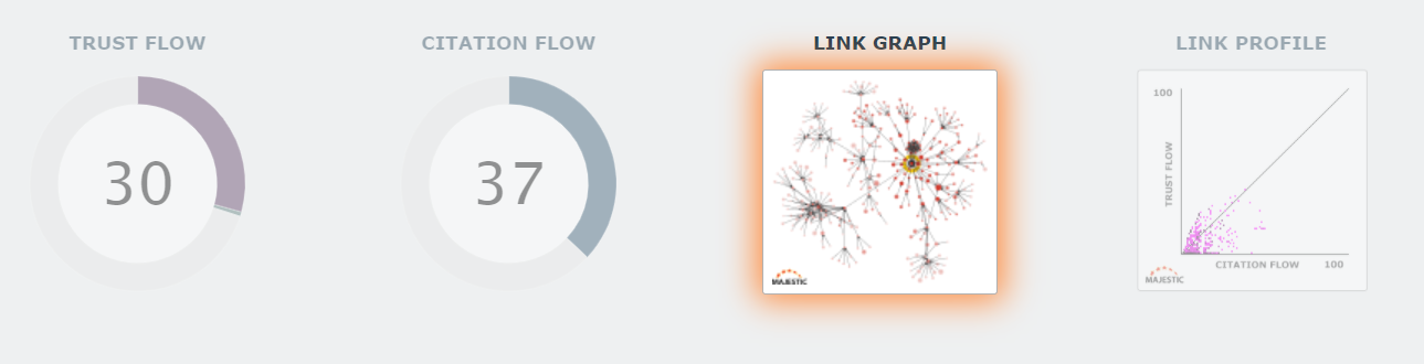
Link Graph Update #1: a table view of your Link Graph data.
Link Graph Update #2: link direction arrows, mutual domain links, selection filters, CSV export and a freehand domain select lasso.
Link Graphs are available today, on all Majestic paid plans.
How close are you to a link network?
Link networks are everywhere.
Some of them are benign – imagine corporate sites with footer links to subsidiaries. Or a single website translated into many languages, with each one on a separate TLD.
Others are toxic. There are many link networks out there that are so inorganic – knowing you belong to one would result in a rush to check your SERPS for a Google penalty every time you hear of a new update.
But, they can be difficult to spot. Usually you’ll need a combination of a hunch with detective work, OR have downloaded the top backlinks for a site, then all the backlinks for those backlinks, then all the backlinks for those backlinks… before cobbling together some programming to work out who links to whom. Think of the processing power needed to do that for one site, never mind for each client site you look after, or for each domain name you may buy.
Luckily for you, an incredible new Majestic tool will help you to find out if your best links are close to a network.
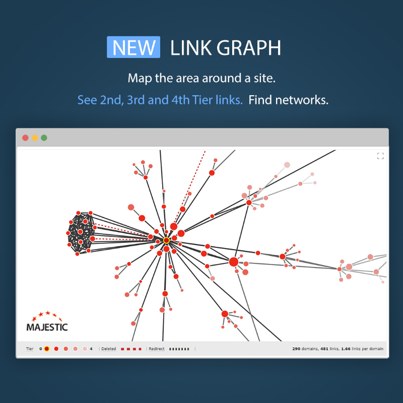
Majestic Link Graph
Link Graph builds a visual network map of the external links that point to any website, subdomain, or URL. It does all the hard work for you, and you won’t need Excel or Python scripts.
In its simplest form, the Link Graph will take the Top 50 sites that point to a domain or URL. It will iterate over 4 levels, collecting the Top 10 links for each discovered URL in that network, then work out which of those sites all link to each other.
Most remarkable is that, despite having to look at backlink profiles for thousands of websites, results generate in real-time. It’s an amazing feat of engineering.
Once done, you will have a map of the area around your website or URL. This will help you check its surroundings, and see how close it may be to link networks. The graph appears on the Site Explorer Summary page for your search.
Of course, Majestic doesn’t guarantee that we will show each link in a network. We don’t claim to find all nearby networks, but the Link Graph does give an instant insight into the top external links (or lack of them) that surround any website, subdomain, or URL.
Link Graph Examples
Let’s look at some examples.
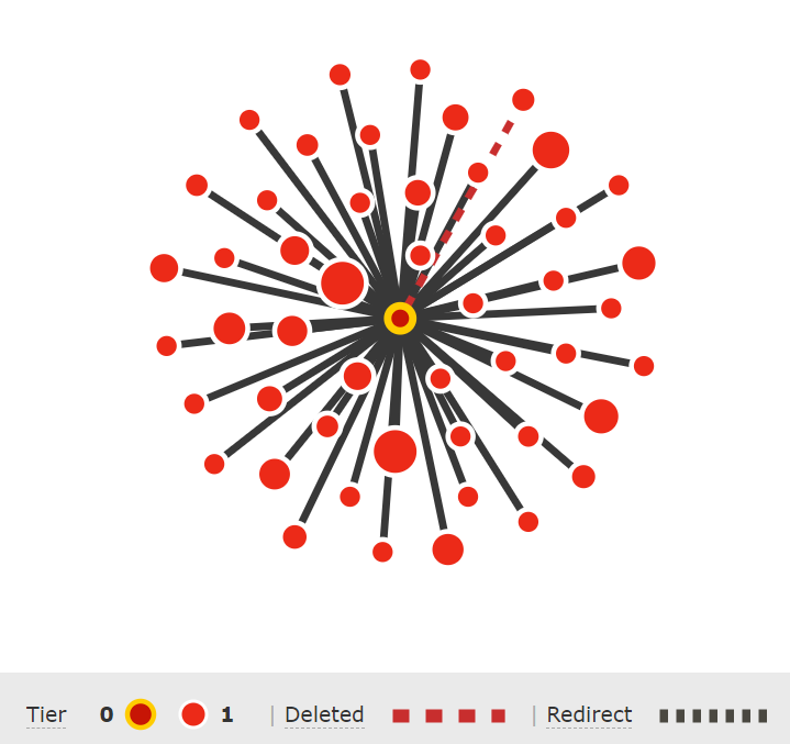
Here is a website with a natural network surrounding its Top 50 links. Each red dot is either a URL or domain, and each dark line is a link. Lighter dots and lines are URLs and links that are farther away from the website in question. A red dot’s size is related to the Trust Flow of its domain.
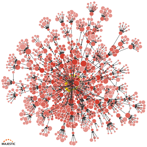
You can see that this Link Graph has lots of backlinks, each with their own fan-like backlink profiles. If you look close, you may see some sideways lines cutting across the branches, suggesting that there is a small amount of interlinking in the network. This is normal.
–
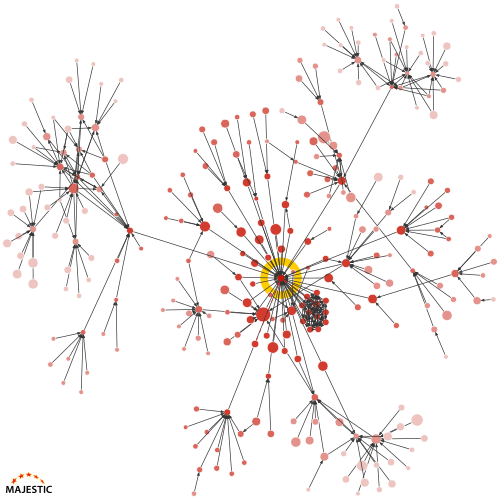
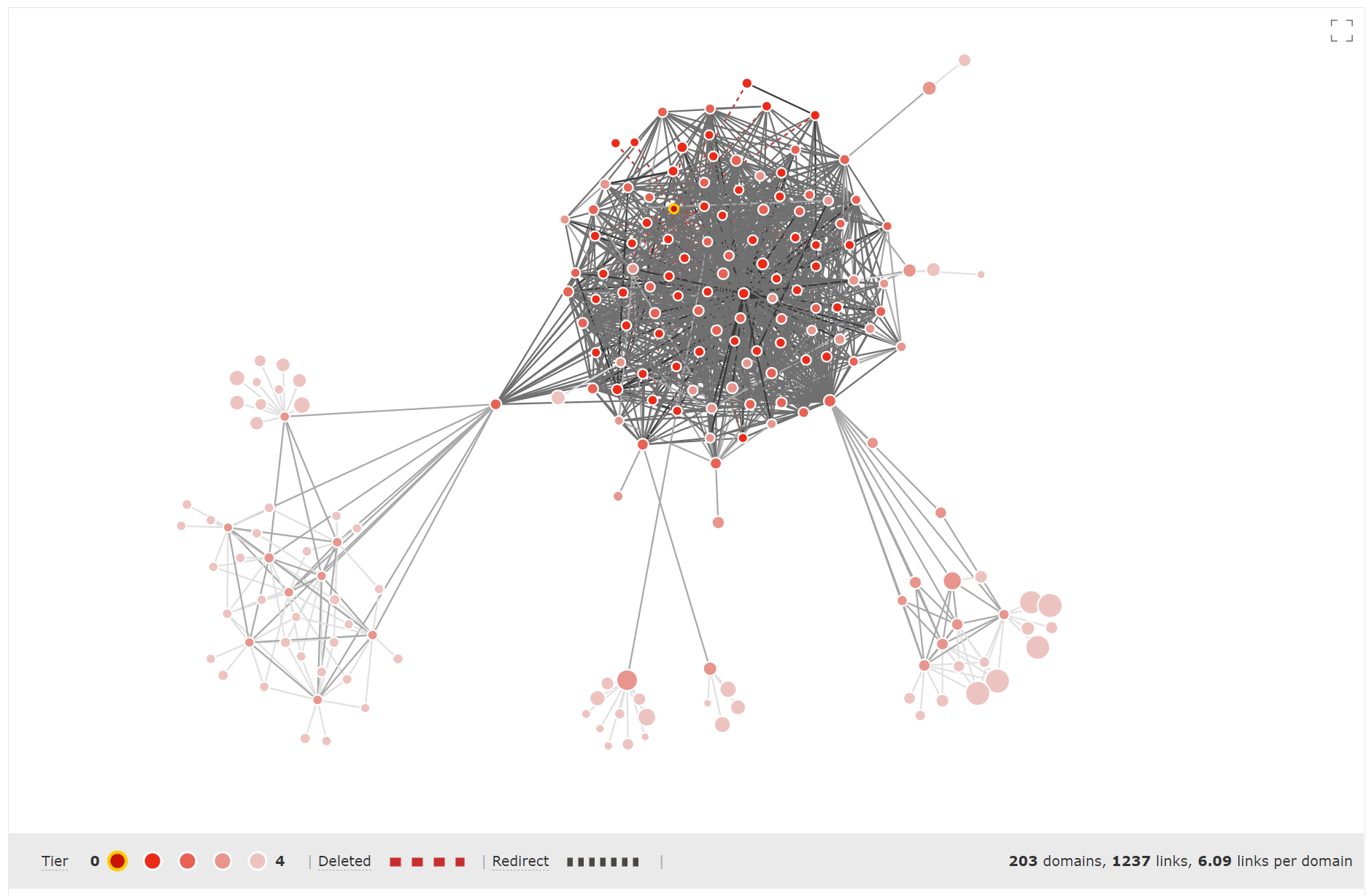
Next, below, is a website that is completely engulfed by a link network.
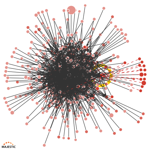
Look at that huge cluster of link lines in the middle. The big yellow circle highlights the core website, and it is so drowned out that it is difficult to spot.
In addition, those red dotted links on the right are all marked as deleted. It’s unusual to have such a high proportion of deleted links in a healthy site’s Top 50 backlinks.
–
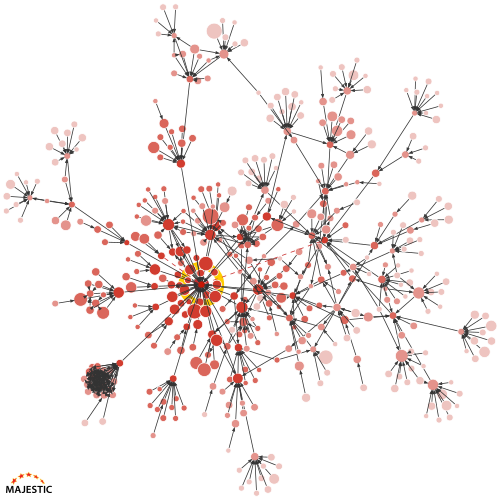
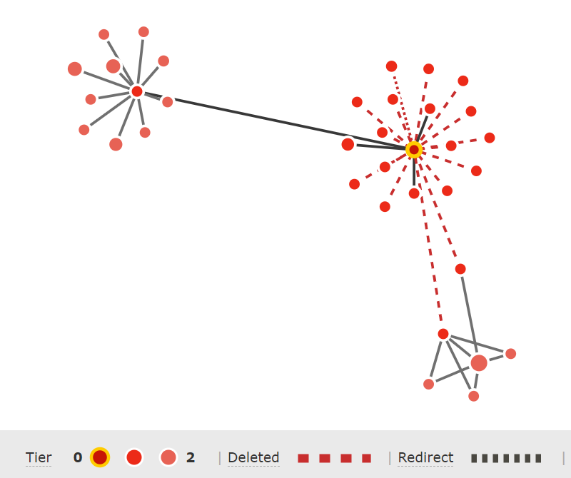
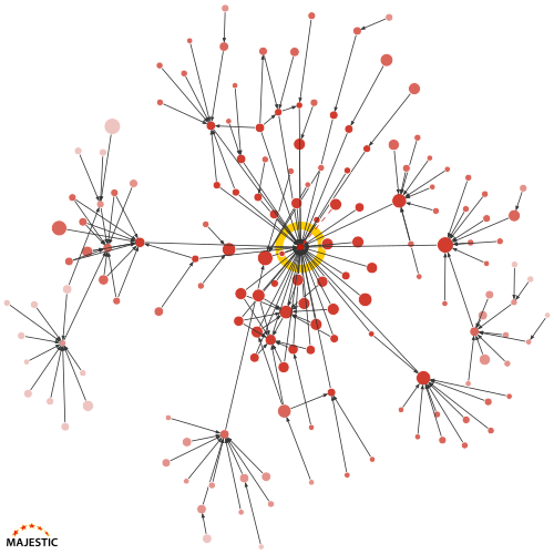
Here is the Link Graph of a site that sits somewhere between both examples.
There’s more white-space on this graph, so there are fewer links in the network. Most of them look fine. But, you may notice that there are a few small clusters of sites, and one of them is very close to the searched website.
Drilling-in: Investigating links and URLs
The static link graph images are designed to give you an at-a-glance feel for a web graph. They are a way to quickly evaluate a batch of websites.
But, what do you do when you find something of interest? There isn’t much point in telling you that a cluster is nearby without adding a way to find out more.
Majestic does that with interactive Link Graphs.
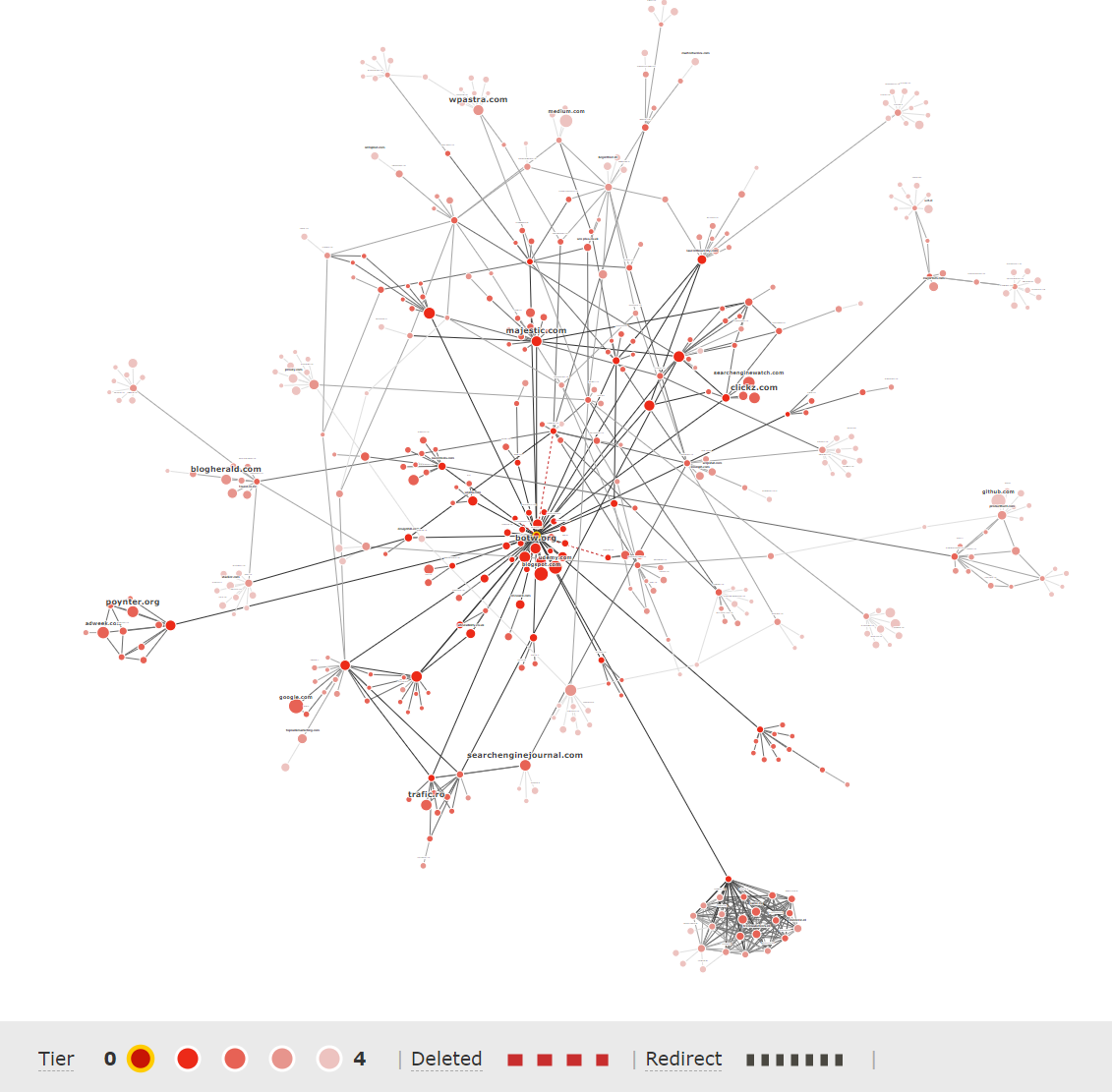
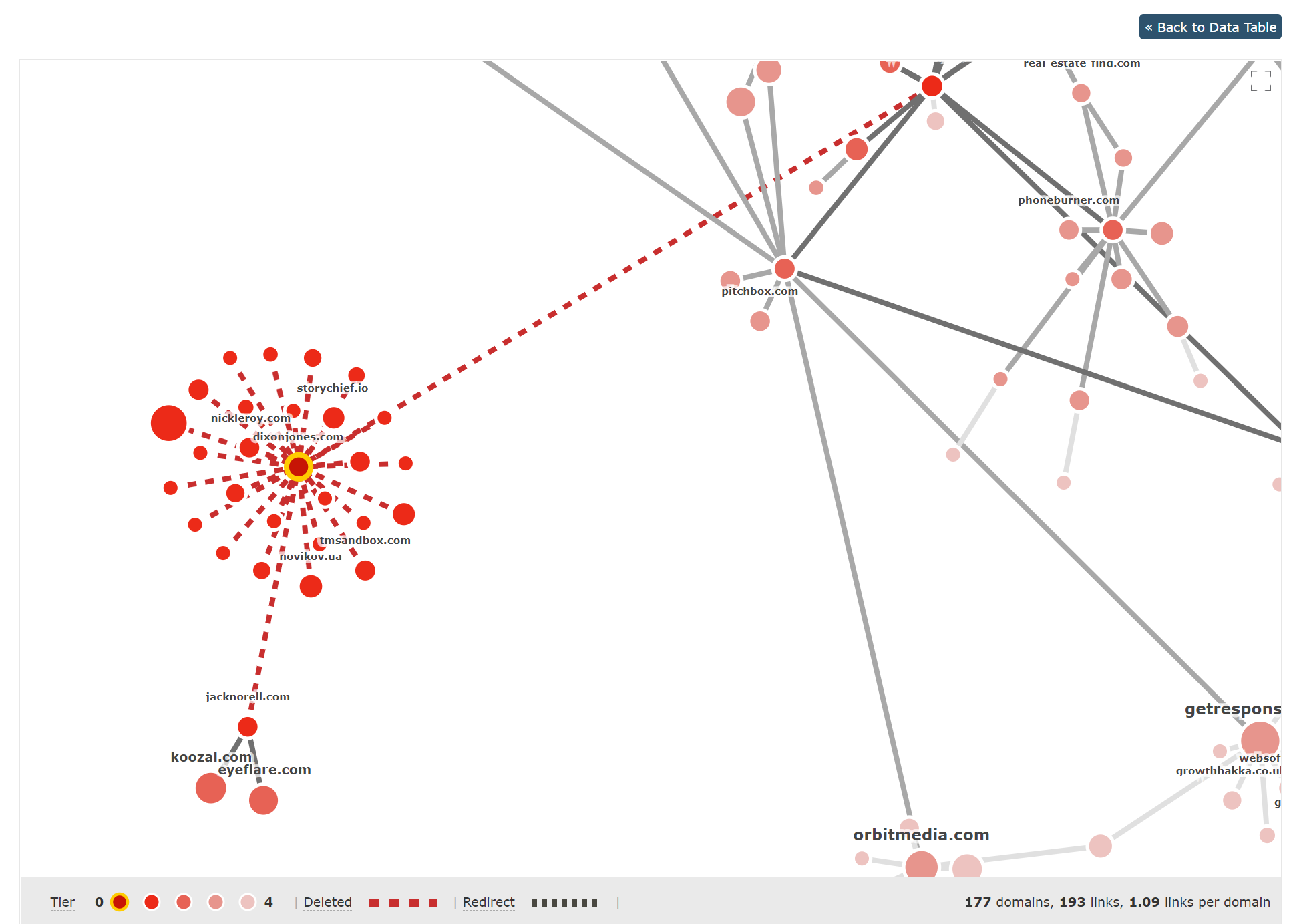
Here is the summary image for the personal website of Majestic Global Ambassador, Dixon Jones.
This is a great example as, by now, you’ll be able to notice that most of Dixon’s Link Graph looks to be organic and spread out. There are some sideways lines that show interlinks, but a definite area of interest with this graph is the dark cluster of links and sites, bottom-left on the image.
To check how worried Dixon should be, you can click from the static image to the new interactive Link Graph tab in Site Explorer.
Here is the interactive graph for his website.
This is a clickable and zoomable version of a link graph. Every URL circle can be hovered or clicked to find out more, and lines will show the exact Source and Target links that join URLs.
As interactive charts render in a different way to the static images, the interesting cluster is now to the bottom-right. Don’t worry, it’s the same network of sites. You can zoom in to check it out.
Here’s that exact cluster of websites.
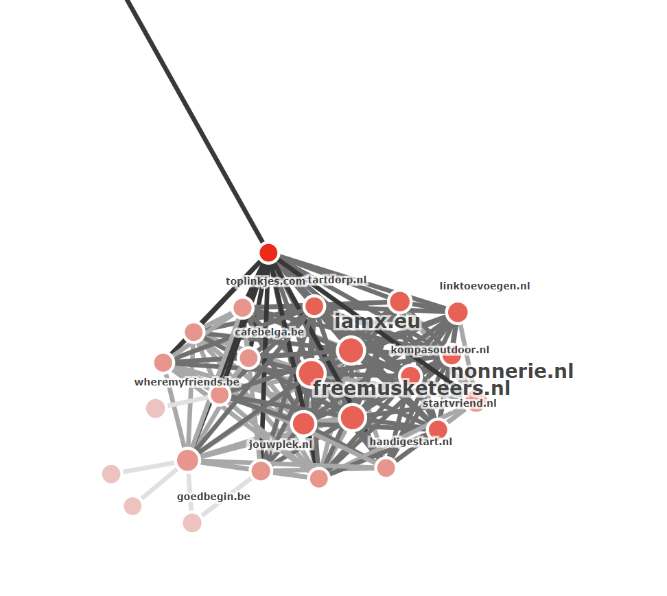
From the domain names, it looks like lots of sites from the Netherlands and Belgium, with a single URL at the top that links the network to Dixon. You can hover over the dark link line to find out more.
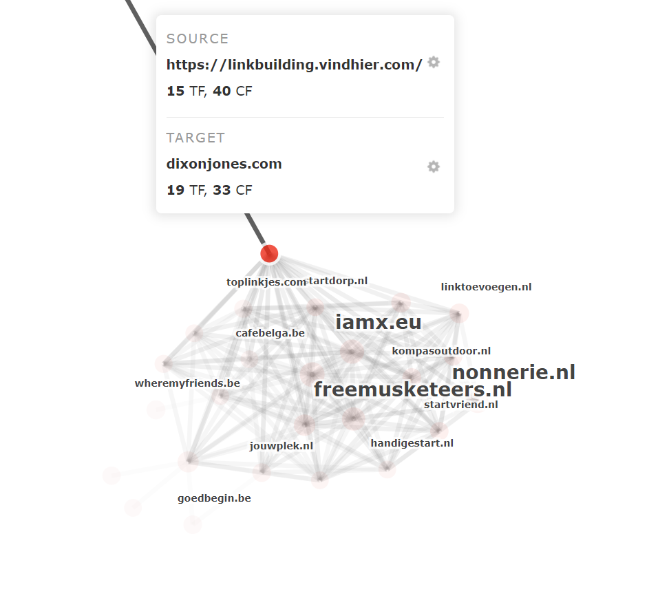
If you choose the cog menu for the source URL, then “Go to URL,” you can visit the site.
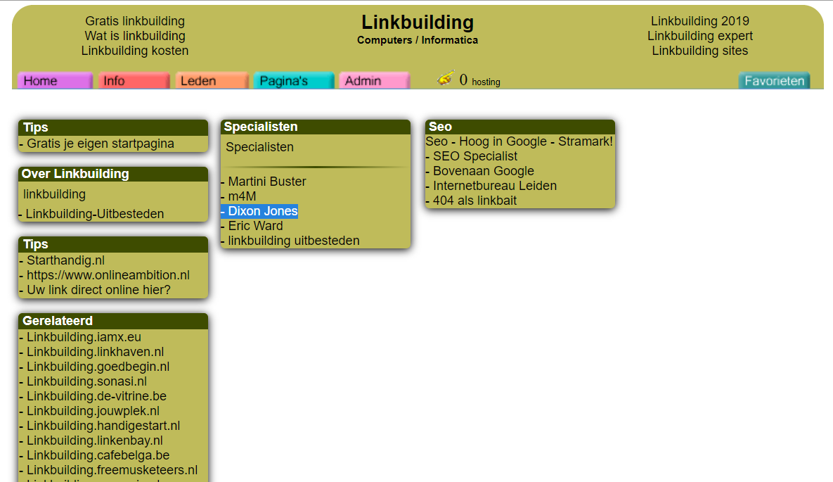
It looks like Dixon’s link is coming from a single Link Building directory page on this network of sites. We shared this news with Dixon, and he did stress that this was a huge surprise, and he had nothing to do with it!
The interactive Link Graphs will let you zoom in and investigate any site in your network. If you find a URL of interest, you can even hover over a circle and choose to build a new Link graph for that site.
That’s a big cluster!
Evaluate domain names with Link Graph
During development, a great source of test data for Link Graph were lists of expired domains. We used those to see if we could spot trends that may help domain name brokers decide whether the metrics of a potential target are artificially inflated.
If you are a domain name trader, here are three Link Graph patterns that we think you should look out for.
1. No Tier 2 backlinks
Each of these red dots is a URL that points to our middle target website.
What is striking is that this expiring domain has at least 50 backlinks (the most that Link Graph uses to create Tier 1), but there are no Tier 2 links.
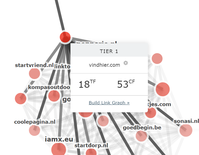
If a URL has a link to the centre site, it is called a Tier 1 link. When a Tier 1 URL has a backlink of its own that does not point to the middle site, that is called a Tier 2 link. And so on, to the maximum Tier 4.
This means that none of this site’s best backlinks has any backlinks of its own.
This would be a huge red flag if I were looking to buy this domain. If you look at the site’s backlinks, they all have the type of URL you would expect from comment/forum spam.
2. Recently Deleted Links
Domainers have to look out for the old bait-and-switch. As Link Graph shows recently lost or deleted links as red dotted lines, it’s simple to spot when a domain has lost most of its best links.
Here is the Link Graph for a domain that was due to expire last week. Of its 20 Tier 1 links, only four are not marked as deleted in the most recent Fresh Index. If it’s a great domain, it may still be worth an investment, but there may be enough here to suggest that you should take a close look at those metrics.
3. Belongs to a huge network
With domain parking pages, it’s expected to see network clusters around some domain names. But if you find a network you were not expecting, then it may be a red flag that the domain’s metrics are not genuine.
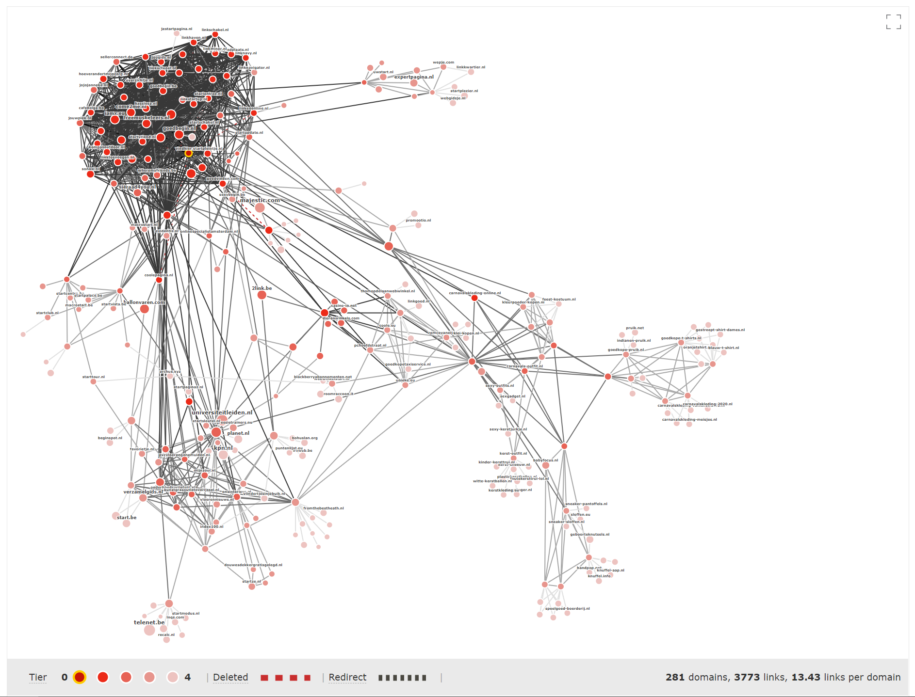
Here is the Link Graph for another site we found on an expiring domains website. The site is in the middle of an interlinking network cluster that is so large it’s almost impossible to see the centre domain.
These are three examples that we found when looking through the link graph for expiring domains. We’d love to hear if you find any other indicators of odd or inorganic domain name backlink maps.
Which of your competitor’s 2nd and 3rd Tier links are working for them?
Whether you call it Trust Flow, Domain Authority, or even Link Juice, it’s clear that the links that point to your backlinks are crucial if you want a great Link Profile. It’s from those parent (and grandparent) links that metrics are calculated.
It is reasonable to assume that if your competitor’s link building is going well, it’s a result of them tapping into an area of solid 2nd Tier and 3rd Tier link juice.
Link Graph brings these best links to you.
To demonstrate, let’s take a look at a Mark Rofe’s new festive site, christmastrees.co.uk. Here is the static Link graph image that shows some solid link-building for such a young domain.
When you go interactive, you can see that many of these links are from UK news websites (The Sun, Express, Daily Record). Mark is a master at finding his way into these pages. There is even a nice cluster, bottom-left, of local newspaper websites.
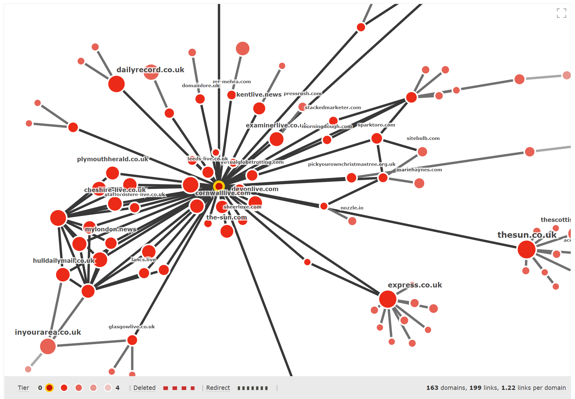
But, I’d like to focus on this collection of links to highlight some exceptional link-building.
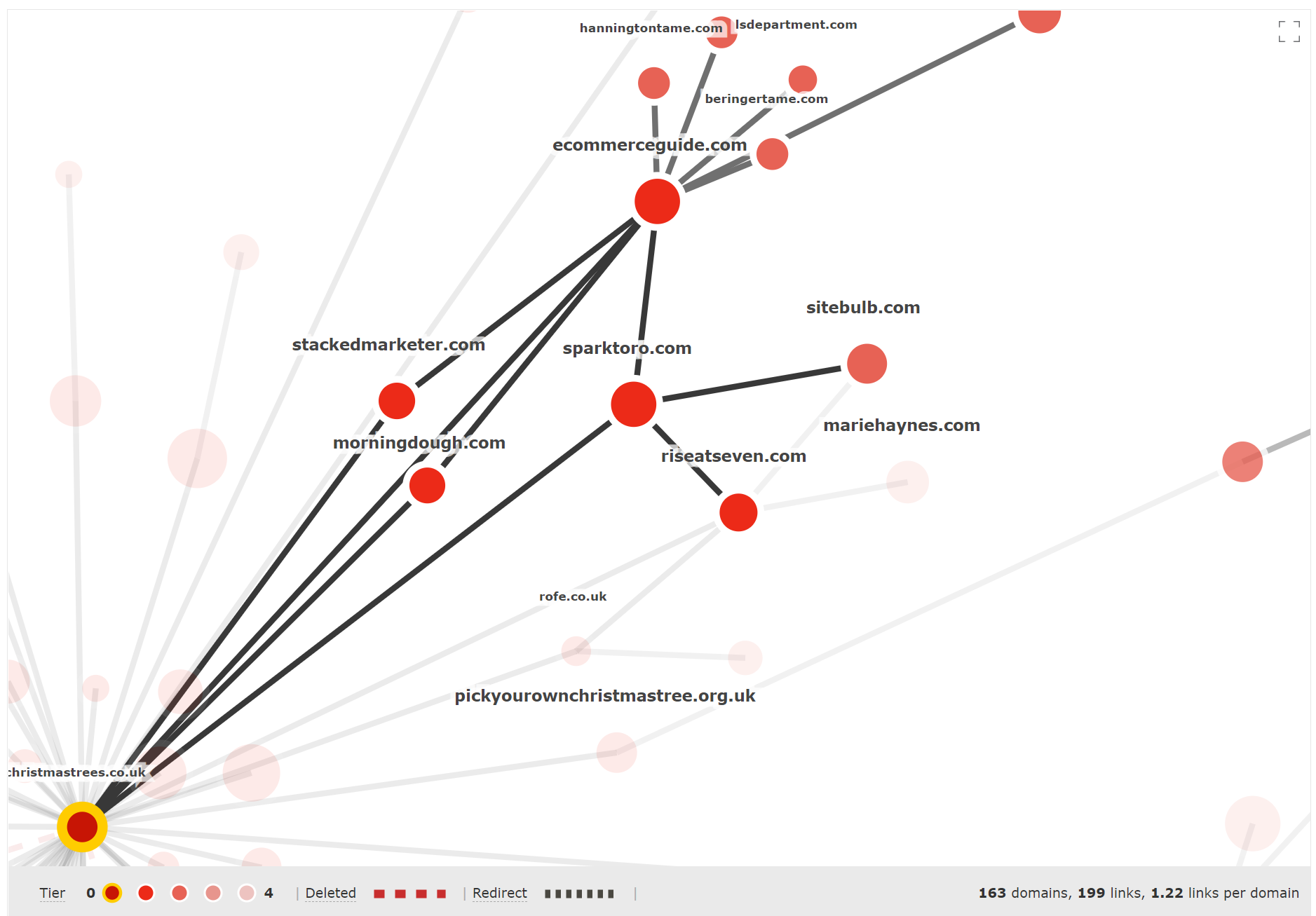
This article on ecommerceguide.com appears to be the key. It links directly to christmastrees.co.uk.
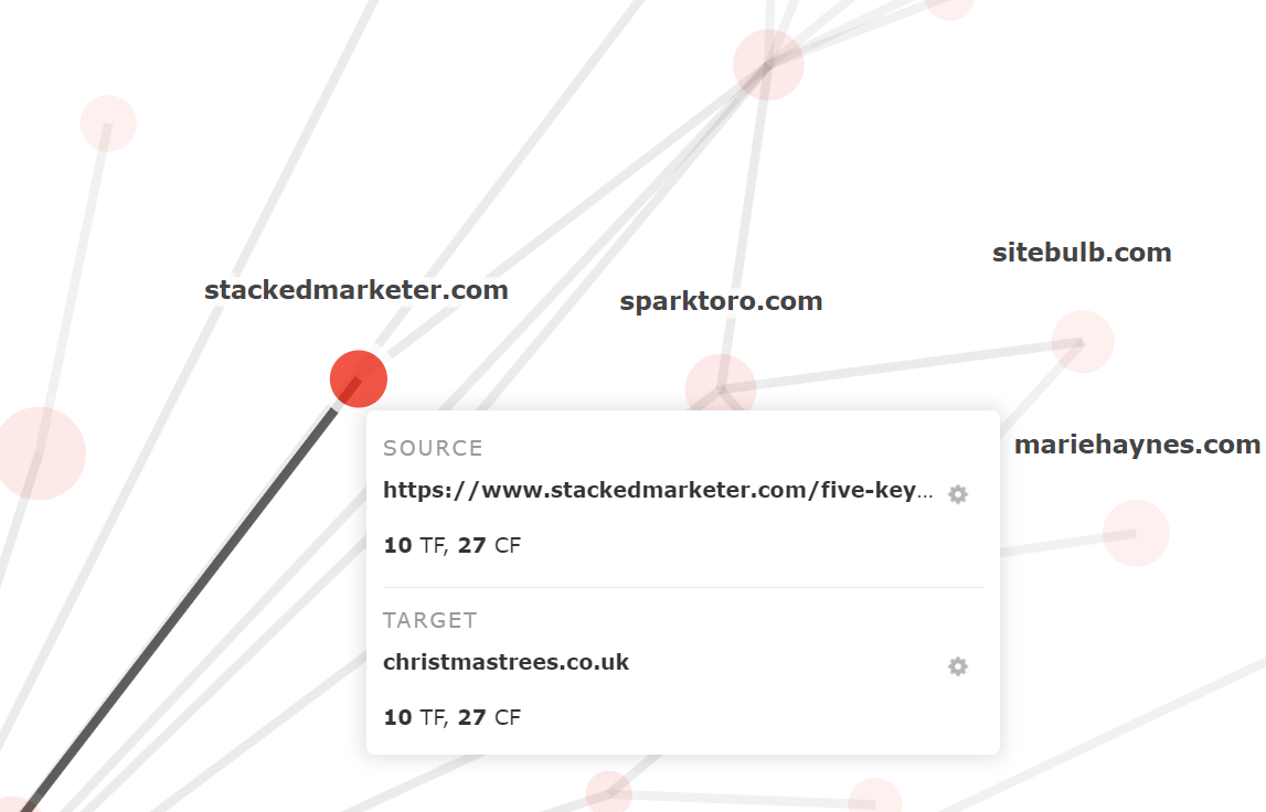
There are three surrounding sites, Stacked Marketer, Morning Dough, and Rand Fishkin’s Sparktoro that all do something cool… they all link to that ecommerceguide article AND back to Mark’s home page (from the same URL).
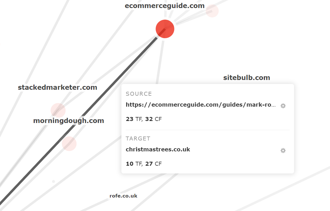
Here is the URL in question on the Stacked Marketer site. The first screenshot shows the link to the ecommerceguide article.
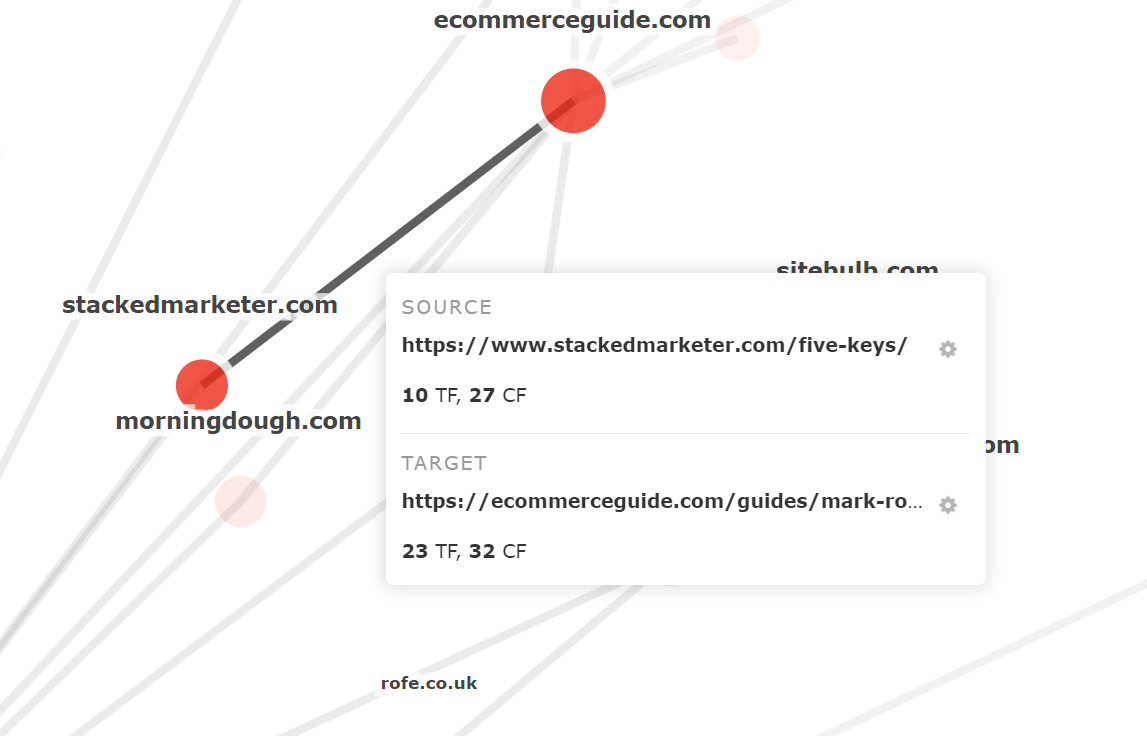
And this second link shows a link from the same page to Mark’s Christmas Tree home page.
Link Graph is a great way to see the tight organic networks that your competitor builds up, but why does this section talk about Tier 2 and Tier 3 sites?
Use Tier toggles to evaluate Tier 2+ sites
Link Graphs can be very noisy. That’s the nature of the internet.
To explain, here is the Link Graph for the brightonSEO 2020 subdomain
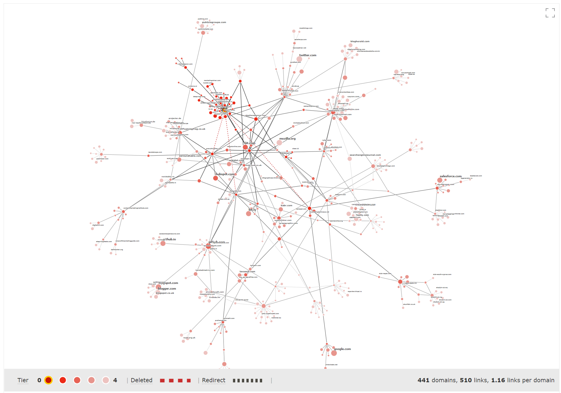
We try our best to dampen the pixel overload, by reducing colour saturation as you drift farther from the centre. We don’t show every single label. But it’s still very LOUD.
And sometimes you only want to concentrate on a part of the map. This is where Tier toggles come in handy.
By clicking on the Tier circles at the bottom-left of the chart, you can toggle individual Tiers on and off. Usually we try to show four tiers (unless a network is so large that it would break your browser, and we shut the graph off at Tier 3).
Here are the Tier 1 links for the brightonSEO subdomain – these all have a direct link to the subdomain.
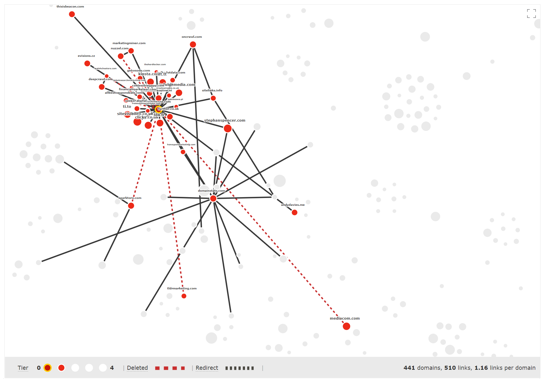
There’s not too many “big” Tier 1 links. That’s understandable for a subdirectory for a traditionally in-person conference in a year like 2020.
When you toggle out to Tier 2 links, some big names appear.
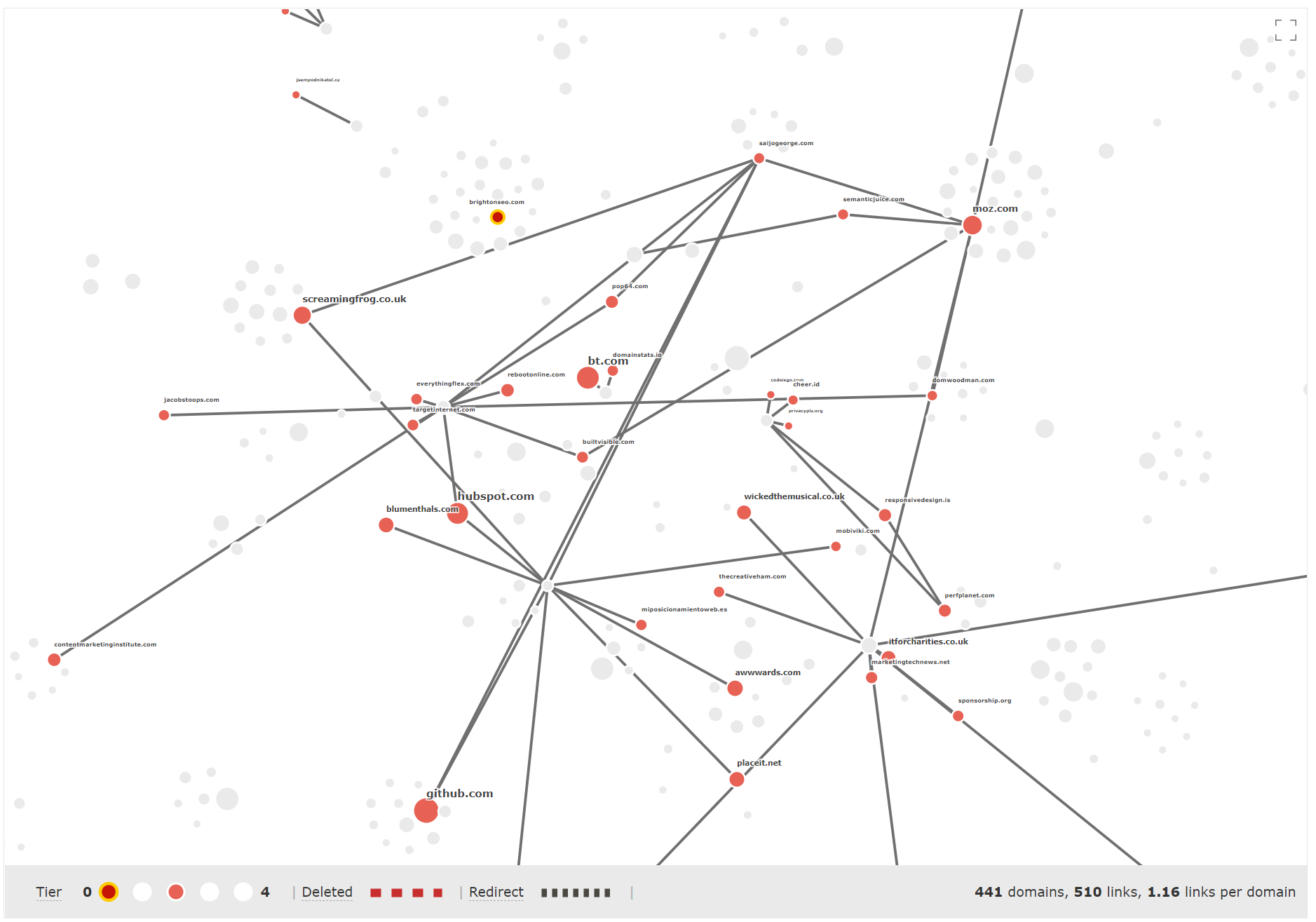
Sites like moz.com, github.com and screamingfrog.co.uk are Tier 2 links, that is, “they have a page that links to a URL that links to 2020.brightonseo.com”.
These Tier 2 links do not show up in regular backlink searches, and are usually invisible unless you have enough processing power to go through all your backlinks. These links are critical to the flow of Link Juice to your end site.
Tier 3 links are similar.
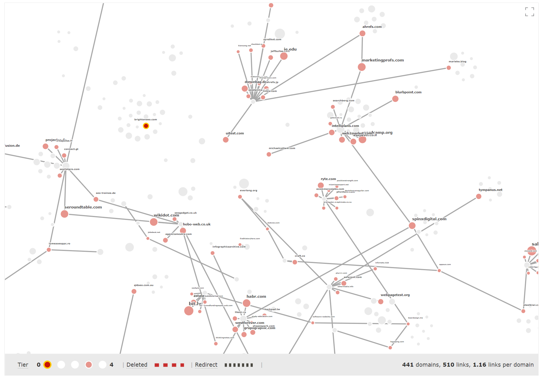
In Tier 3, links from sites like Search Engine Round Table, IE University, Lavasoft, YCombinator and Salesforce appear. These are grandparent links (they link to a URL, that links to a URL, that links to your website).
Mozilla and Search Engine Journal are among the Tier 4 links.
Only by looking through all tiers of your Link Graph, and the graph of your competitors, can you start to get a holistic view of where a site lives on the internet.
Majestic gives you this immediate and incredible access for any good quality website, URL, or subdomain that you choose.
Filter your Tier 1 sites (AKA, find out which deleted links you should worry about)
Each example you’ve seen so far has used the top backlinks for each domain search. These are the first batch of links that you’ll see if you go to the Backlinks tab.
Link Graph takes (up to) the Top 50 of those links, and builds the rest of the map from there. We found that this gives a consistent benchmark so that you can compare different sites or URLs against one another.
Sometimes, you’ll want to influence which Tier 1 sites you would like to use as your initial seed. While testing, we found a desire to build bespoke graphs, based on things like…
- Links that matched a certain Topical Trust Flow
- The impact of redirects
- Competitor links that appear next to your links
- The map around our links with “spammy” anchor text
And, most importantly…
- Which of my deleted links brought most Link Juice?
To get all the answers to these questions, Link Graph is also available from inside the Backlinks and Context tabs. You can use your usual Majestic filters to narrow on the batch of Tier 1 backlinks that are most relevant to your task.
As an example, let’s go back to Dixon’s website, this time via the Link Context tab.
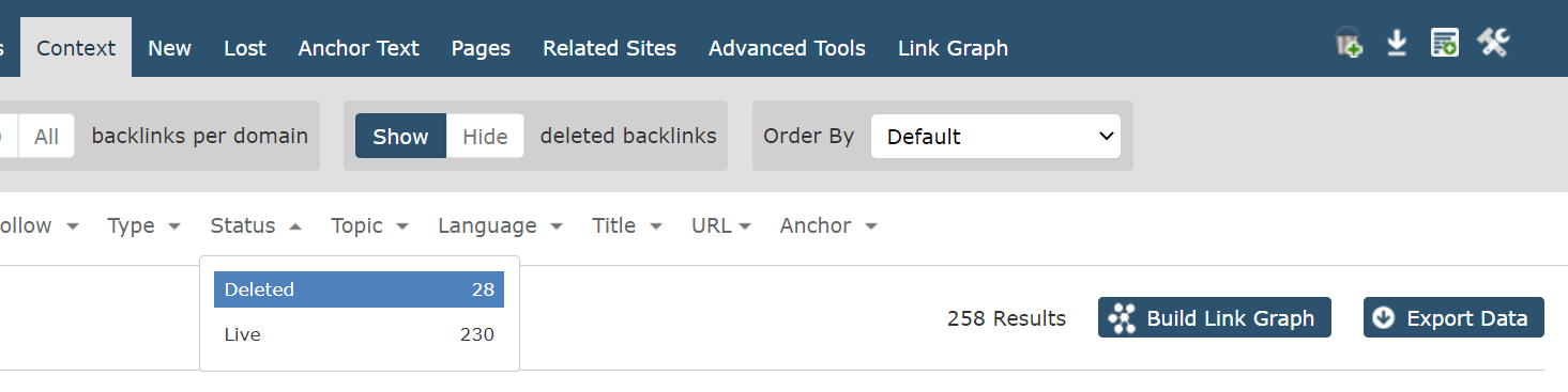
You can ‘SHOW’ deleted backlinks from the top scope bar, and choose “STATUS > DELETED” from the backlink filters. Then press the “BUILD LINK GRAPH” button on the right.
Dixon has 28 deleted backlinks, let’s look at their Link Graph.
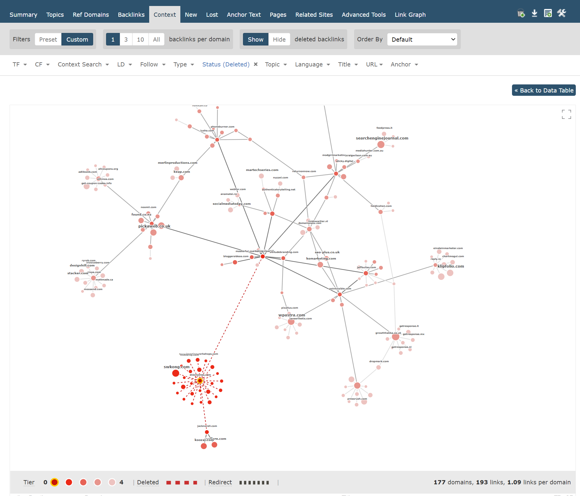
Wow. And zoomed-in…
There’s a very clear picture here. Of the 28 deleted links, only TWO come from pages that have their own backlinks. And one of those (at the top), links Dixon’s site to a huge amount of Link Juice.
Additionally, one of the URLs (on the left of the group around Dixon’s site in the middle) has a large circle size, meaning that it’s domain has a higher-than-average Trust Flow score for those sites. If I were Dixon, those are the three deleted links that I would have a look at first.
With filters, you can bend and shape the centre of your graph (your Link Graph Tier 1 sites) in whichever way you choose.
I hope that you’ve enjoyed this first peek at Link Graph.
All through development, we have been so excited to get this release out to you as soon as possible and can’t wait to see what you do with it. We believe that access to this depth of high-fidelity data, available for any good site or URL you can think of, is completely unique among our peers.
The new Link Graph is available to all Majestic paid subscribers, no matter whether you are a Lite, Pro, API, or legacy customer.
Check out our plans to see how you can join in with Link Graphs. Genuinely new customers can enjoy a 7-day money-back guarantee.
If don’t yet have a subscription, and you’d like to take a dive into data, here are links to check out Link Graph and Site Explorer with our free showcase site…
- Link Graph summary images for our showcase site
- Interactive Link Graph for our showcase site
- Showing deleted links in Link Context for our showcase site
We are already working on the next version, and have an extensive feature wishlist. If you spot something that would make your life easier, please get in touch with our great support team.
- TLD Checker – New for 2026 - February 26, 2026
- Welcome Hub – Improving the final step of your login journey - September 9, 2025
- Site Explorer – Advanced Query Filters BETA - August 28, 2025
Great addition team, have been thinking about this for quite some time.
I can’t help but think one of those link graphs look like corona, but I can live with it.
December 15, 2020 at 2:16 pmThis are actually very nice visualisations to be presented to customers to explain to them what needs to be done 😉
December 15, 2020 at 3:31 pmIncredible…indeed a game changer.
December 15, 2020 at 9:49 pmLooks great. What about internal linking graphs?
December 15, 2020 at 10:59 pmHi Raj. I’m afraid that while we log and take into account internal links for calculating Trust and Citation Flow, we do not store them in our indexes. Majestic Support
December 17, 2020 at 12:30 pmGreat feature indeed and maybe I will switch from Ahrefs to Majestic again for my website <a href="https://naturetrust.us/"> title="naturetrust">.I will need to get some trials/Do majestic offer some trials which will show this feature also.
December 15, 2020 at 10:59 pmHi Orlando. We don’t do free trials, but if you are new to Majestic, you can take advantage of our 7-day money back guarantee on Lite and Pro for new clients.
December 17, 2020 at 2:49 pmVery good insight tool.
December 16, 2020 at 12:41 amLet us have the same ability as GOOGLE.
This is super incredible feature. I believe now we can measure and assess backlinks profile more better way rather than any other SEO tools. It makes me super happy to see and would love to subscribe the majestic tool very soon
December 16, 2020 at 7:51 amGreat addition, really helpful. Would love to see this for internal links as well.
How should we interpret the alert in the link charts section?
<b>Example:</b>
Your Link Graph shows that there are 1188 links joining 456 domains, giving a ratio of 2.61 links for each domain.
This is a high number of interlinking sites, and may suggest that this site is close to a link network.
December 17, 2020 at 10:42 am