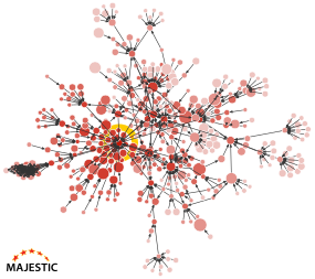
In December 2020, we brought you Link Graph, introducing a game-changing way to evaluate websites. Link Graph takes the top 50 sites that point to a domain or URL, then looks through the top 10 links for each of those sites. It continutes to iterate through those links, eventually building a network of sites that can be as far as four links away.
Since the initial Link Graph launch, we added data views, then filters, selects and link graph exports.
Today, we’d like to share with you how you can use Link Graph side-by-side with Link Profile to instantly evaluate any site in our Fresh Index.
Link Graph and Link Profiles Charts, the power of two
Link Graphs and Link Profile charts are a fantastic 1-2 way to appraise a website. They are both available on Site Explorer Summary, for all Majestic customers who have a paid subscription.
Link Graph is a classic network graph. It shows the deep interconnections around your best links
Link Profile is like a weather radar. It charts the Trust Flow and Citation flow values of all incoming links.
By combining both, you have a truly unique way to simultaneously evaluate the breadth and depth of a website’s inbound links – one that we don’t believe you can find anywhere else.
Some Examples
A well-established website
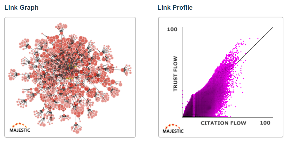
Here is the Link Graph / Link Profile combination for a well-established and well-linked-to website.
Looking at the Link Graph, on the left, you can see that this chart is overwhelmingly red (or shades of red). Each red dot is a website. The size of the dot shows that domain’s Trust Flow, so a chart with a dominance of red is usually a healthy chart.
Complementing the network view is a great Link Profile flame. It has a well-distributed base of smaller sites, and almost all of the larger sites (near the top) are on the healthy side of the TF/CF 1:1 ratio line.
A clear link network
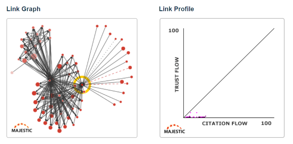
In comparison, here are the two charts from a lower-quality website.
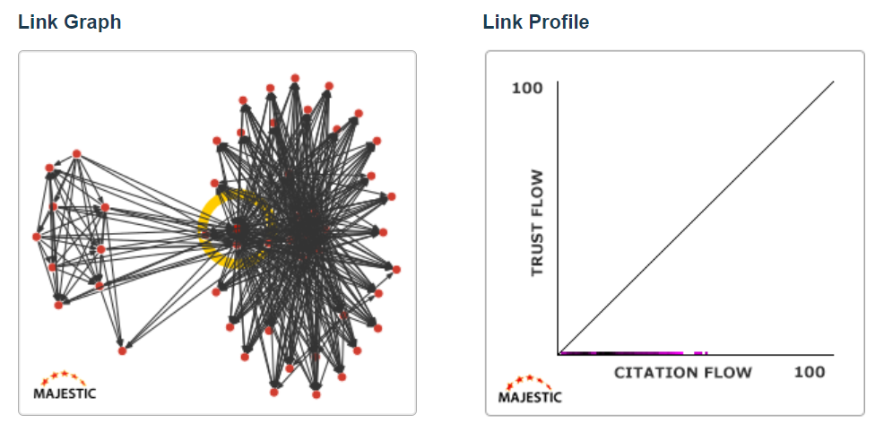
When the colour of a Link Graph is mostly black, like this one, that means that there are more links than websites in the graph. The website you see here is clearly connected to a link network. Additionally, there are not many 3rd and 4th Tier links, so this is likely to be a closed network.
If you glance at the Link Profile on the right, you may see that this domain has a second problem. Only two of its incoming links seem to have any kind of Trust Flow. As you examine these charts together, you can safely come to the conclusion that this is not a healthy link profile.
An isolated site with no Tier 2 links
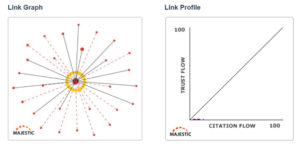
This next example has a very sparse Link Graph. This graph has no Tier 2 links, meaning that none of this website’s Top 50 links has any backlinks of their own. Not one. Additionally, those red dotted lines show deleted backlinks.
This domain was on a list of domains for sale. While this domain does have backlinks, around half of those links are now deleted. None of its top links have their own backlinks, and all incoming links have 0 Trust Flow.
I don’t think I’d buy this domain name.
A site with two link networks
Here is another site with a terrible profile. This domain is feeding from two different link networks, one larger than the other. The Link Profile shows a 0TF flatline for incoming URLs.
Only Majestic lets you instantly evaluate any site or URL like this, at this scale.
Using Link Graph to double-check a Link Profile
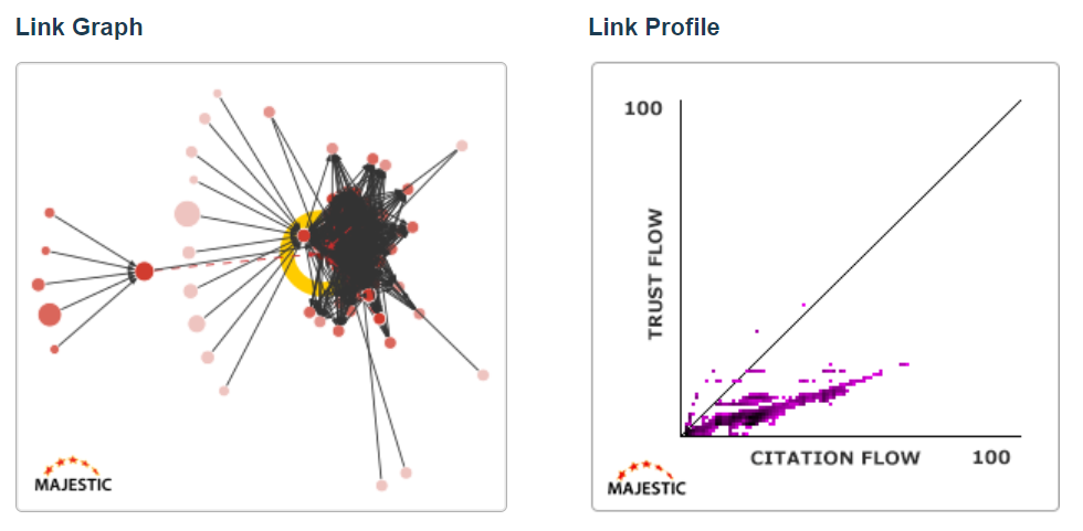
Here’s an example where a Link Profile chart (the one on the right) may look, “okay.” While the Trust Flow / Citation Flow ratio isn’t great in the Link Profile, there are some nice links in there.
However, when you look at the same domain through a Link Graph, you can see that the purple line in the radar is being caused by, what looks like, a packed network.
Suspicious Link Profile clusters
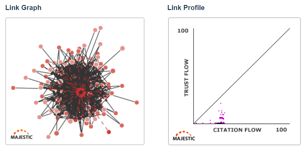
This Link Graph shows that there is a clear problem with this website’s profile. The domain is lost in the middle of a huge, single link network. However, there is a more subtle indicator to consider.
As you seen in the very first example, a healthy Link Profile flame, even for the biggest sites, tends to start at the 0:0 point of Trust Flow and Citation Flow. Looking at the Link Profile chart on the right, you can see that most of this site’s referring URLs all come from a tight cluster of similar Citation Flow scores. This is not typical and, even without the terrifying Link Graph, would be a strong indicator of an unnatural Link Profile.
Link Graphs and Link Profiles are available, side-by-side, in Site Explorer for all subscribers.
If you’d like to find out more about how you can use Link Graphs to increase web authority, you should check out this three-part Link Graph webinar series by Bill Hartzer and Brooke Sikora from Inseev Interactive.
Link Graph Art
In almost a year, we’ve seen some great Link Graphs, and as a reward for reading this blog post we’d love to share some of our favourites with you!
Please remember that each one of these is procedurally generated from the immediate links surrounding some websites, or URLs.
See if you can spot the central root website in each one… it’s the red dot with the yellow outline.
Link Graph Examples
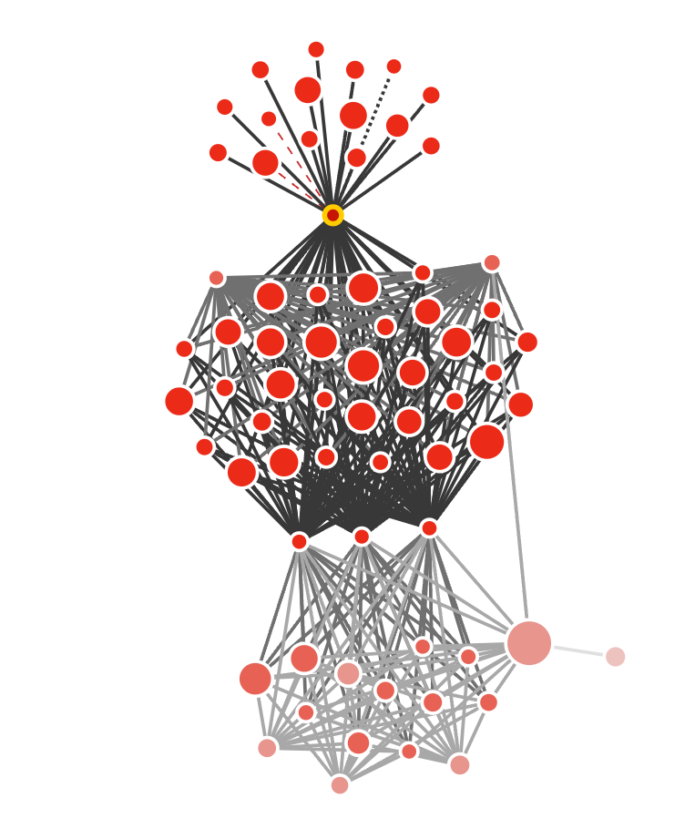
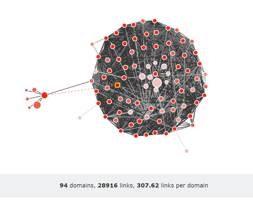
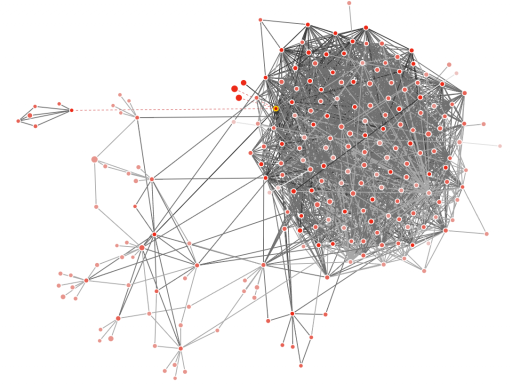
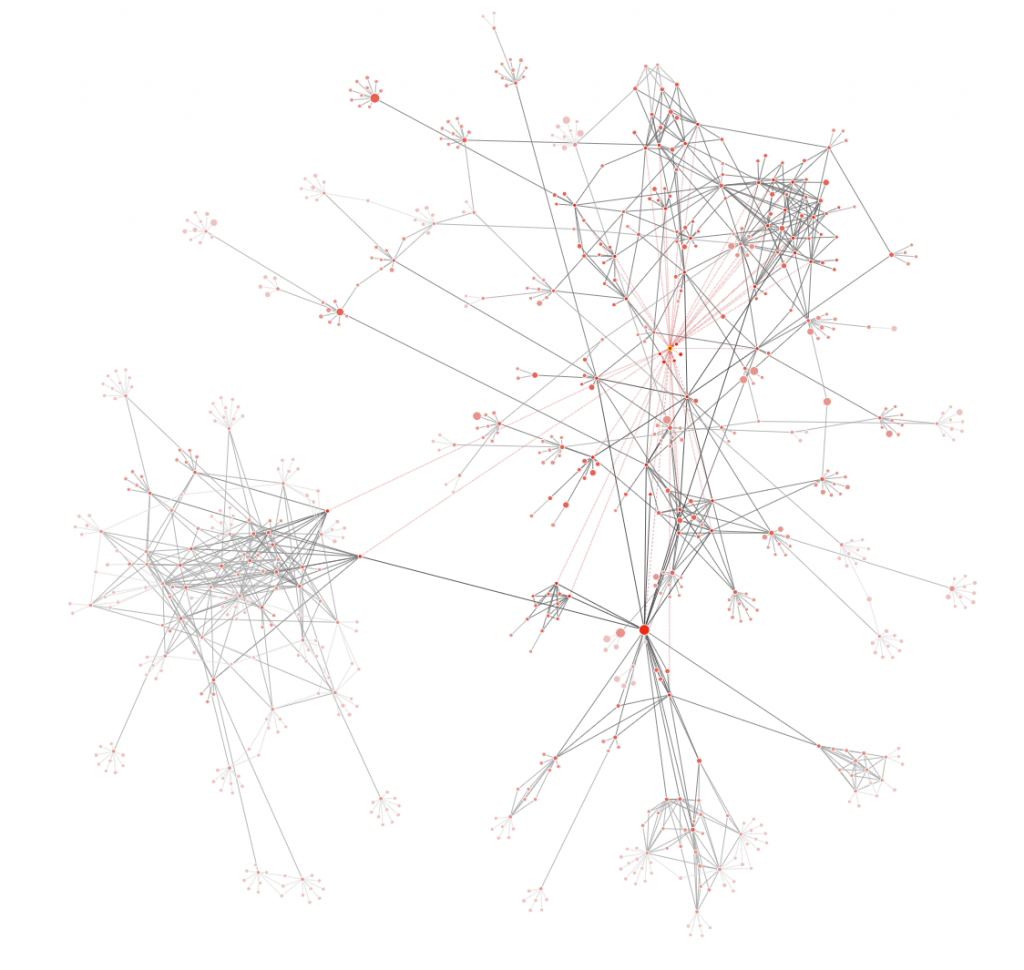
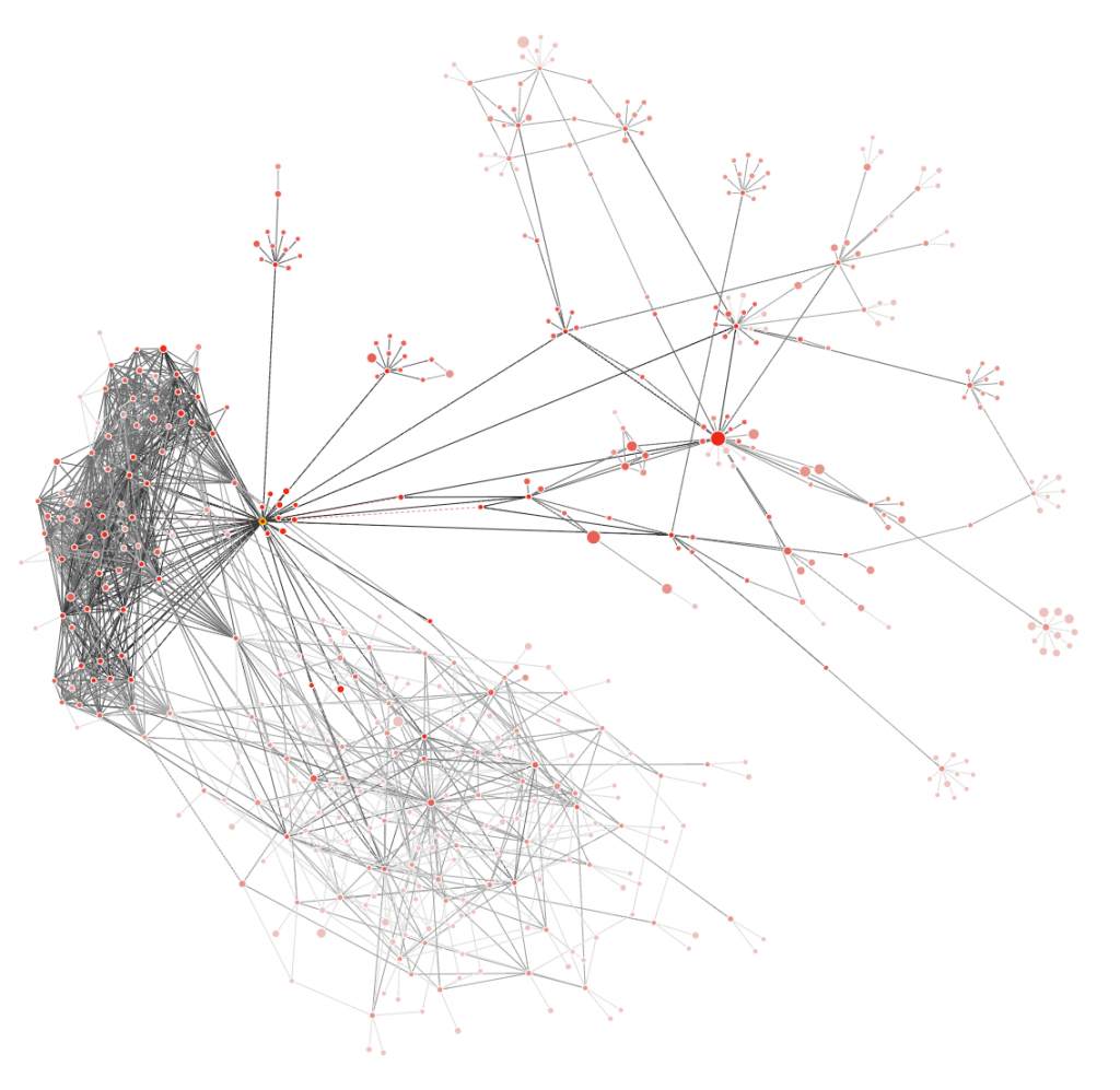
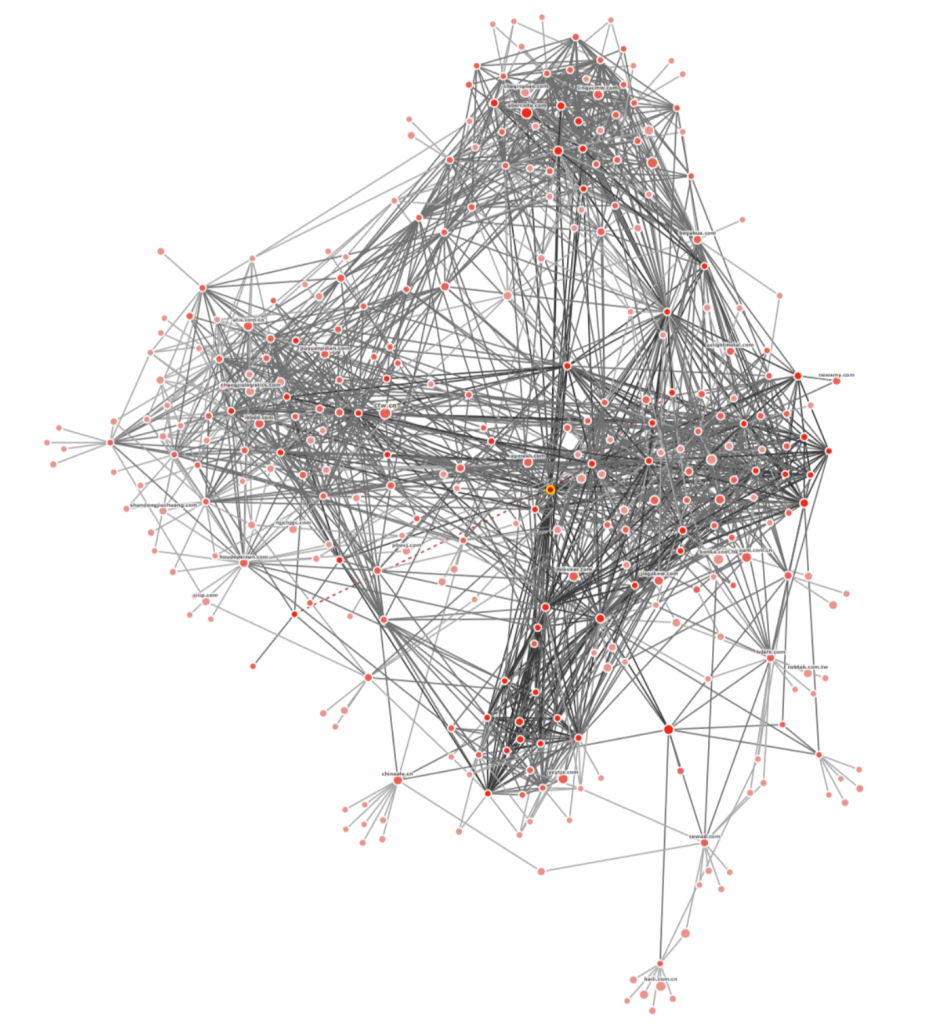
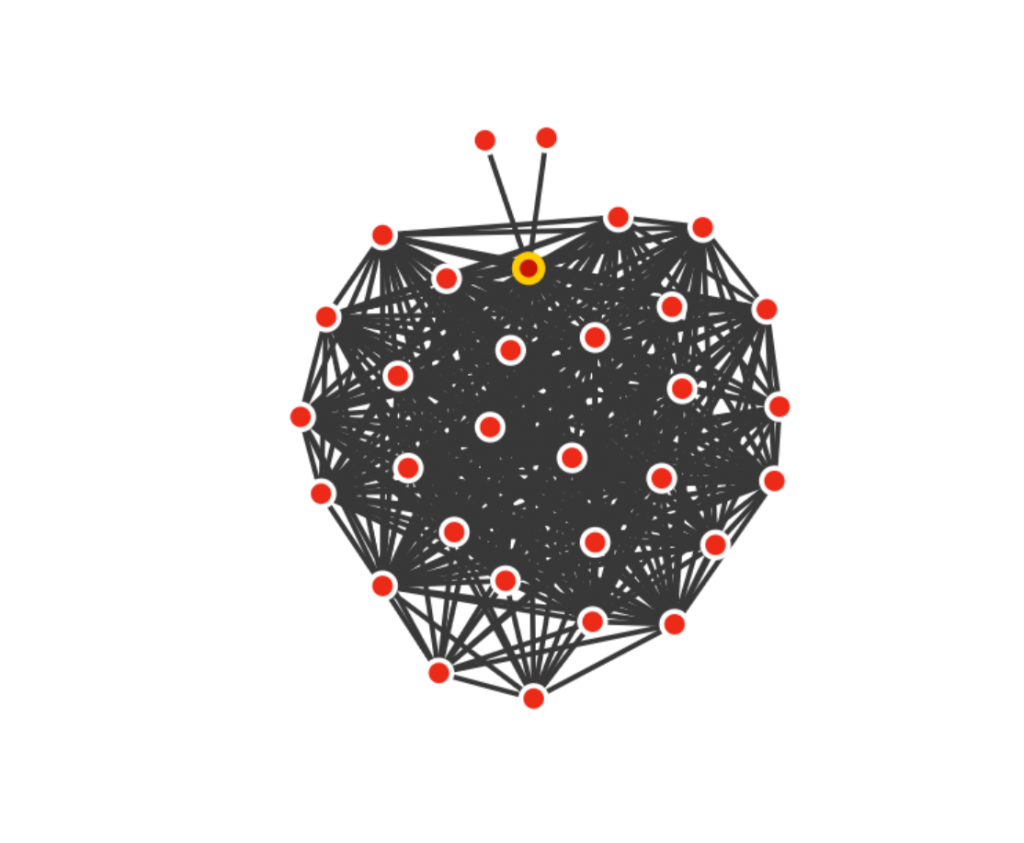
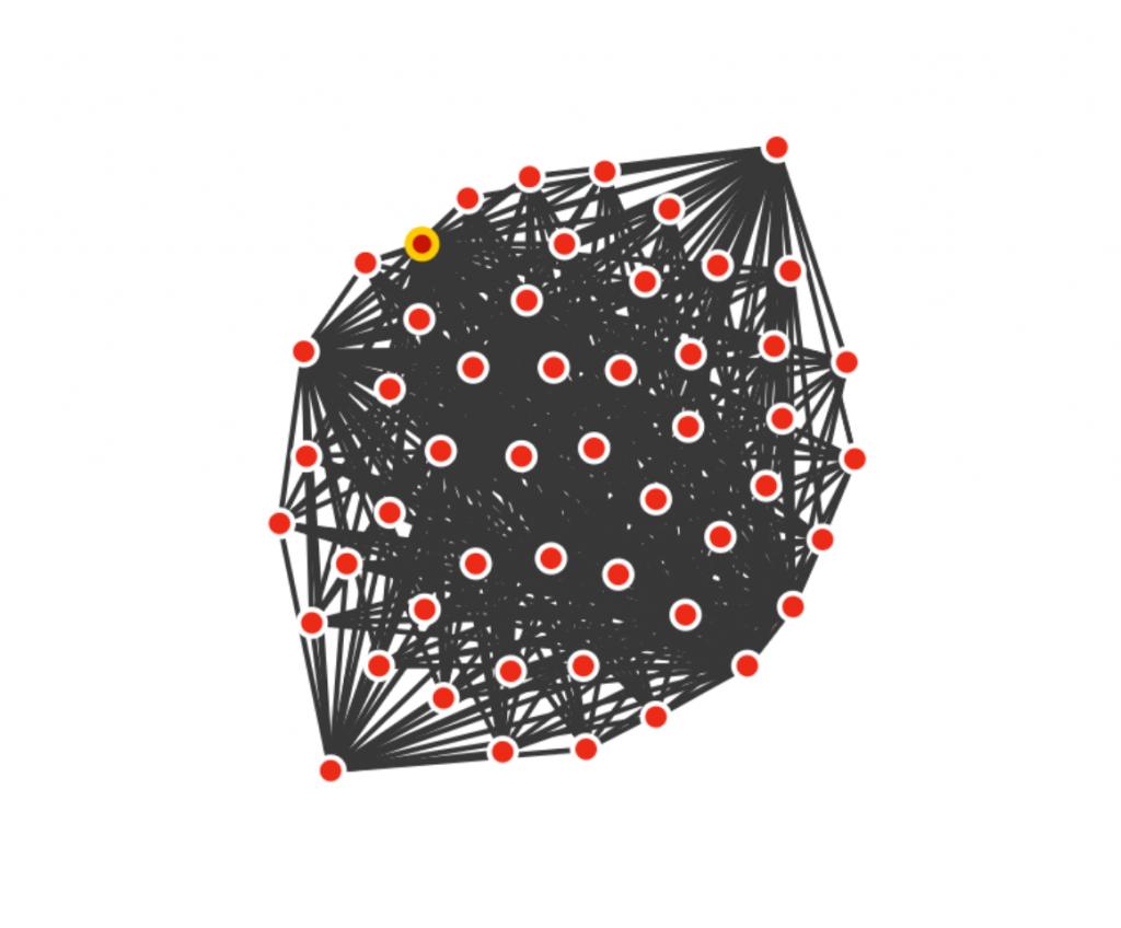
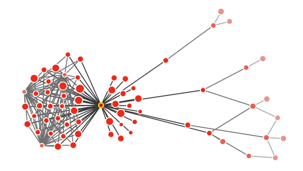
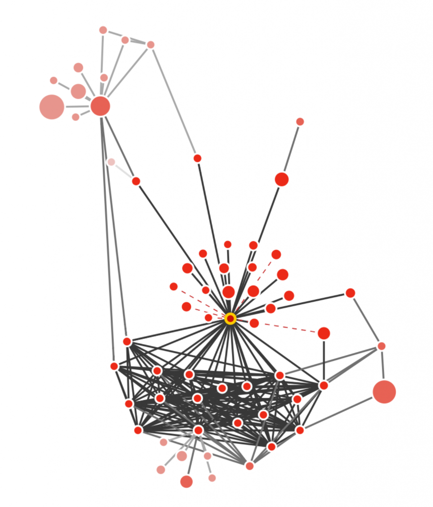
Thanks for letting us share some of our favourite Link Graph renders with you. If you find any of your own, then PLEASE share them with us, we love seeing fantastic ones. Tag us on Twitter with #LinkGraph.
As far as we know, instant Link Graphs are not available on any of the other major Backlink tools, and are unique to Majestic. Despite their incredible insights, they are available on all paid subscriptions – not just the more powerful plans.
If you’d like to make your own link graphs, click through to find a price plan that suits your needs.
- TLD Checker – New for 2026 - February 26, 2026
- Welcome Hub – Improving the final step of your login journey - September 9, 2025
- Site Explorer – Advanced Query Filters BETA - August 28, 2025


