


Today Majestic is proud to bring an interactive “Sankey” chart into both the Clique Hunter tools and an interactive Word Cloud into the Anchor Text tab of Site Explorer. These visualizations bring data to life and I was especially impressed when I saw the new Clique Hunter visualization because you can click on elements to more easily visualize how hubs of authority are linking to both you and your competition. The blog post sadly has static images, but I’ll do my best to explain what you are seeing.
Example: Comparing 5 Premiership Football League teams
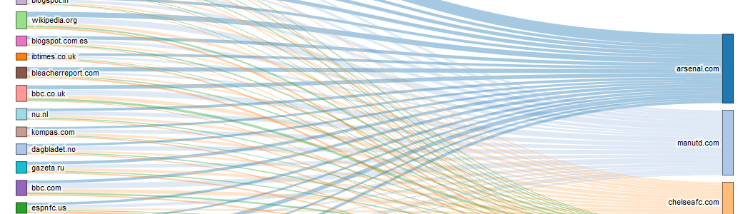
Clique Hunter compares up to 10 URLs (domains, subdomains or page level URLs) and shows hubs of authority by listing sites that link to Multiple competitors. It has a lot of data, but numbers are hard on the eye. So now when you enter a set of sites (say five football teams) then you initially see a “squashed” chart like this above the table of data:
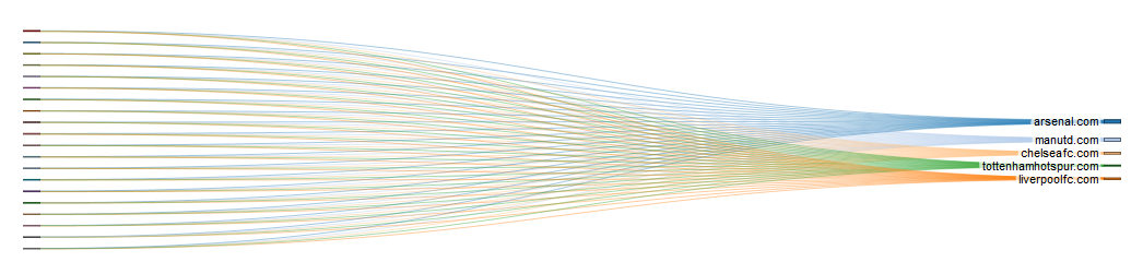
The nodes on the right are the five football teams and the nodes on the left are sites linking to more than one of the teams. To the top right of the chart, you can expand the chart and in doing so we will try to remember your preference for next time because what you see when it expands is awesome:

The visualisation is packed with data. On the left you can see the hubs of authority… they are authoritative with respect to the football teams we chose, because they link to several sites in our list of football clubs. They are also authoritative because they are listed initially by Trust Flow, although you can change the priority of what you consider to be important. Changing the priority will update the table of data below the chart, but the chart is clever enough to reorganise itself to show the same data as the table in the visually most appealing order. The height of the node on the left represents the Trust Flow of the site (relative to the others in the list). The colour doesn’t represent the primary Topical Trust Flow, but instead default to the visually most appealing layout. The category and the thickness of the bars coming out if the nodes represent the percentage of links headed for each competing site on the right. All this means that we can then weight the sites on the right – not by pure Trust Flow (as this is something you can get elsewhere) but in a sort of loose representation of the collective weight of trust flows from the hubs of authority on the left.
In other words – it’s very easy to see which sites are most influenced by the hubs of authority.
Pretty cool huh?
Now – there’s a LOT of data here, so click on a bar or node and the colours subtly change so that the connections to/from that node start to stand out. Unfortunately, I can’t show you that in the blog post, but anyone with a paid subscription can use these Sankey charts to their heart’s content. (Don’t have an account? Shame on you!)
Cooler Than Your Average Word Clouds
Today we also launched a better visualisation of the Anchor Text table.
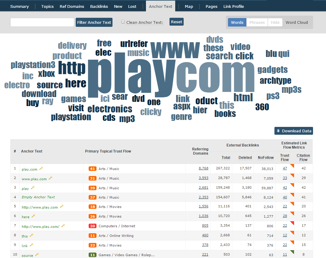
Again, you have a few ways to toggle the data. I’ll leave you to play “click on the word” on the live data, but in the top right you have the option to switch between a raw word cloud and a “phrase” word cloud. The filter works well with the “phrase” tab, because you can see all the phrases that include (say) the word “MP3”.
What’s Next?
Well tomorrow we are launching something even bigger, especially for Android users. Guesses welcome.
- How Important will Backlinks be in 2023? - February 20, 2023
- What is in a Link? - October 25, 2022
- An Interview with… Ash Nallawalla - August 23, 2022
I’ve been having a play and it’s pretty cool. Struggling to know what to do with the visualisation though? Is it useful in any way?
July 14, 2015 at 9:28 amFor me I think what is really useful is to see that it is not always VOLUME of links that count, but their power. I put Majestic and its competitors in and I see a much fairer assessment of who the real players are than I do with other metrics. Moreover, I can see why, because I see where the link equity comes from clearly.
But another good use case would be to analyse all the posts that say "Top 10 tools for…" or "Top 10 Blogs about…" style posts. There is usually one joker in those lists, the one that the writer has a direct interest it. Not always, but I suspect a load of those posts could get "busted" when the chart overlays the list.
Lastly, the chart is a representation of the Clique Hunter data table below it, which has itself been used heavily for years for identifying strong links within a niche. These are the sites that are giving kudos to two or more of your competitors and if you don’t have any activity on these, you could well be missing out in your niche.
July 14, 2015 at 10:06 amHello, iIf it is difficult to show, you could make a video demonstrating it.
July 14, 2015 at 10:44 amGood plan!
July 14, 2015 at 10:46 am