


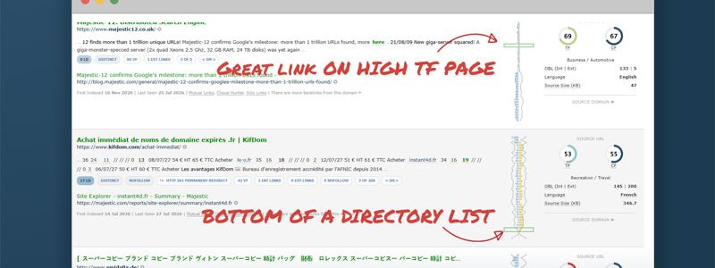
Instantly evaluate link distribution and placement on a web page
Link Density Charts give you an immediate high-level view on how links are distributed across each web page in our index. At-a-glance, they can help you to distinguish between directory and editorial content, find which of your links are near the top of web pages, and maybe even help you spot opportunities where there are no links on higher Trust Flow pages.
Unlocking Link Density Charts will turbo-charge your link evaluation activities.
Where do you find them?
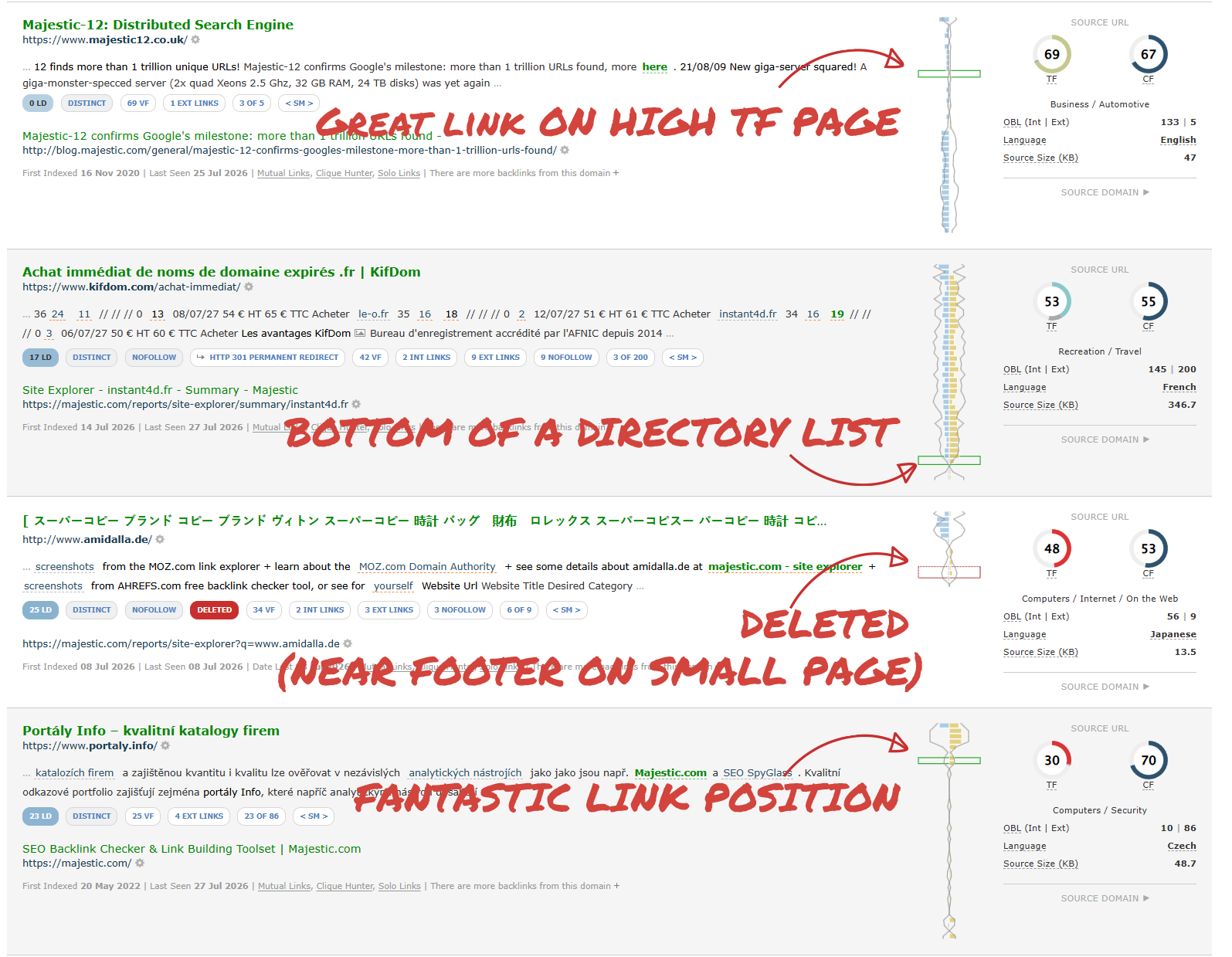
The charts launched alongside Link Context in 2019. Wherever you see a backlink in our Link Context section, the accompanying chart provides a rapid way to evaluate links as you scroll down the page, without having to think about any page titles, URLs or anchor text.
How do you read a Link Density Chart?
Note: As you can see above, Link Density Charts are vertical, reflecting the order of presentation in a web browser. The start of the page is the top of the chart, and the end of the page is at the bottom. However, for this explainer, we have flipped them onto their side.
Imagine the HTML source of a web page as a straight line. It has a beginning, middle, and end. Or, in web terms, a Header (on the left), Footer (on the right), and some content (the middle bit).

The name “Link Density Chart” suggests a focus on the concentration of links on a webpage, so we wanted to find a way to represent the volume of links in a page.
Our solution was to split each page up into segments. That is, divide up the page into lots of equal-sized parts. We then count and plot the number of links in each segment of the page.
This gives a nice overview of not just the number of links on a webpage, but where these links are concentrated. A typical page may look a little like the diagram below.

The image suggests most links are split between the header and footer. The header can be seen at the start of the chart. The concentration of links here usually reflects the volume of navigation items at the top of webpages, which is increasingly common in modern web design.
We can also see a cluster of links at the other end of the chart. These represent the the footer.
A few links are scattered between. These may be editorial links, but there’s a possibility it could suggest something like a secondary navigation panel.
Compare link structures, without having to visit the site
This simple representation of the link volume of a webpage turns out to be very powerful. In skilled hands, like yours, it gives the you the ability to quickly compare the linking structure of lots of pages.
As well as showing where links are, the image above shows which sections of the page are link-free! Those flat lines with no blue bars are usually paragraphs of text that contain no links at all.
As an SEO or Digital Marketer, what could you do with this information? Imagine finding a high Trust Flow page in your niche, with prime no-link paragraphs… maybe even one with a mention of your competitor farther down the page?
Not all links are equal – considering Internal and External Links
Hopefully you already see the advantages of visualising links in this way. When reviewing a site’s backlink profile, you may have to wade through hundreds or thousands of rows of link data. Being able to get an at-a-glance assessment of the link structure of source pages can be a real time-saver.
However, for a meaningful analysis, it’s important to separate out internal and external links. Long sections of content with a handful of external links suggests quality editorial referrals. A page full of internal links with an external one buried in the footer may have less value to your client.
Fortunately, Majestic Link Density Charts recognise the difference between internal and external links.
Here is the same chart, again, but this time with external links in yellow, and internal links on top, in blue.

That’s interesting. To make it easier to compare the counts of different sorts of links, we can separate the internal and external links. One way is to plot the external links on top, and the internal links underneath. Like this.
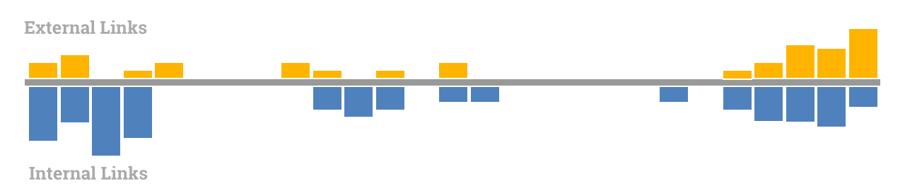
While the chart above is an illustration you might see a distribution like this on a blog or article site; where headers will usually have a very high internal link count, but footers can be more mixed (think of bottom-of-the-page links to social networks and partner websites).
If we stopped there, you can already see that a Link Density Chart is a very quick way to visualise the distribution of internal and external links on any web page.
But we’ve got two more things to add, Link Density and Link Position.
Link Density
It’s perhaps an odd way to go about this blog post… talking about Link Density Charts before explicitly talking about Link Density. In fact, we haven’t covered Link Density at all, so far we’ve just counted and plotted links.
Link Density answers, “how tightly packed are links in this segment of a page?” And while it seems like this is the same as the group counts of links you’ve seen above, there is a very slight difference.
To explain, consider this part of the Wikipedia entry for ‘SEO‘

With four external links on the first sentence, an internal link below, and six footnotes, a chart that counts only links may give the impression that this is a tightly-packed section of a page with lots of links and very little plain text between. But that’s not the case, as the segment clearly has more unlinked paragraph text than links.
Here’s another slice of the same page. The footer this time.

There’s a similar mix and count of internal and external links, but crucially there is NO unlinked editorial text between them. It is just a list of links.
This is where Link Density comes in. It tells you how closely links are crammed together.
Imagine a section of a page that contains exactly 500 characters.
- If 250 of those characters are inside links, then that segment will usually have a Link Density (LD) of around 50.
- If each and every one of those 500 characters are anchor texts in a directory of links, the LD will be near the maximum of 100.
- If there is just a single link in that segment, the LD will be around the minimum, 0.
To summarise… if you want editorial links, look for a low LD. If you’re looking for directory links, search for a very high LD.
Going back to the chart, when we overlay this moving number on each segment, you can find out the density at each point of the page.
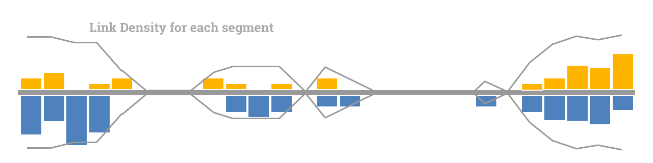
The Link Density overlay immediately tells you whether a link is in a saturated part of the web page (wide link density lines), or in a piece of the page that is mostly text (the narrower density lines).
As an aside, we realised during early testing that a line on one side of the chart would suggest that Link Density is attached to either External or Internal links. It is in fact target-agnostic, so we felt the best way to share that information is to mirror the line on both sides of the axis.
Let’s check out some examples to see how you can use this information. For this, we’ll flip the charts back on to their feet, so that you can see them in the way they are shown on majestic.com.
Real Life Link Density Chart Examples
Here are a variety of some real-life examples of Link Density Charts for a few well-known and different web pages. You may have seen this image before as we collected these examples to show chart variety when we launched Link Context in 2019. Bear in mind that there’s a chance that any or all of the pages will have changed since then.
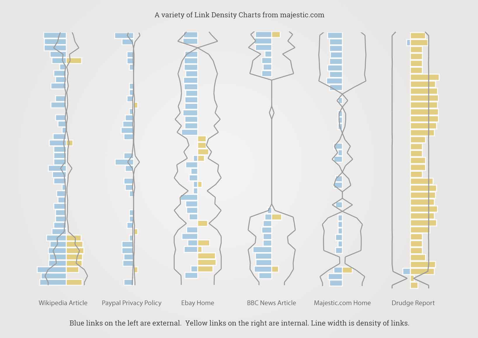
Taking each of the charts, left-to-right…
The Wikipedia article has lots of links in narrow editorial text in the middle, with densely-packed citation links below. This is a great example of how a site can have a large number of on-page links, but still keep a low Link Density with well-crafted editorial text. However, with the blue internal links vastly outnumbering the yellow, it may be difficult to place an external link in this middle section.
Paypal Privacy Policy is another page with mostly internal (blue) links. As you’ll know by now, the slim Link Density line shows that the links are the paragraph-style text you would expect to see in a Privacy Policy, and not in a list or directory. It looks like the page only has around three external links.
Ebay Home link density lines are way wider than the link counts. This is usually a hallmark of an image-heavy homepage, with lots of links attached to images – but not much text between.
In the BBC news article, you can probably spot a visible header and footer with that wide standing-lamp-esque shape of the link density line. In the middle there is a huge piece of paragraph text that contains a single link. This is a fantastic example of the type of editorial link that an SEO dreams of.
The Majestic.com Home chart shows a typical home page for a service provider, with a wide header at the top (almost exclusively internal and navigational links), some support text in the middle, and an internal discovery footer with a small amount of external social links
Drudge Report homepage is almost entirely links, with very little commentary or non-linked text in between. Most of the links are external, and the link density line is nearly maximum width for the whole site. If you’re trying to find a directory full of external links, this is the shape you should look for.
If you like this type of thing, further examples can be found on the Link Density Chart PDF we hand out at conferences.
Good work. With just a few scrolls of a blog post, you can now read a complex chart that crams in…
- Distribution of links in each segment of a web page
- Ratio of internal to external links
- Places on the page where there are no links at all
- Which areas are saturated with links
But before you update your link audit and outreach workflows, there’s one more thing to add. Rather than looking at distribution across a whole page, let’s think about specific links.
Link Position
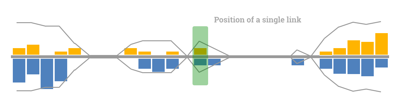
When we show a Link Density Chart beside a specific link, we will add a small green box to show where that link is placed.
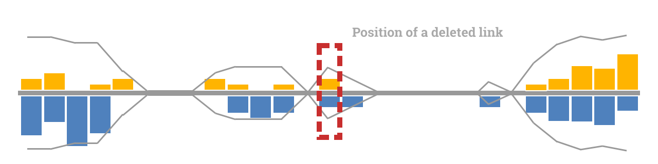
If a previously-spotted link has been removed, we will instead show a dotted red box in the place the link was last found.
The boxes, via their colour and position, now give you the power to rapidly scan down a list of hundreds of links, picking out the ones that deserve your most immediate attention.
Use Link Position to your Advantage
The following Link Density Chart is taken from a news article on a world-famous website. By now you’ll be able to recognise the header links at the top, the huge bulge of footer links at the bottom of the page, and what looks like another navigation element half-way between them both, perhaps a sidebar or ‘further reading’ section?
Note: Link Density Charts only use the raw source HTML of a page to decide relative position. They do not apply any CSS or Javascript rendering. Think of the chart as a representation of a View Source of a page, and not how it looks in-browser.
Imagine you have been given the choice of a link in one of these four positions, which one would you choose?
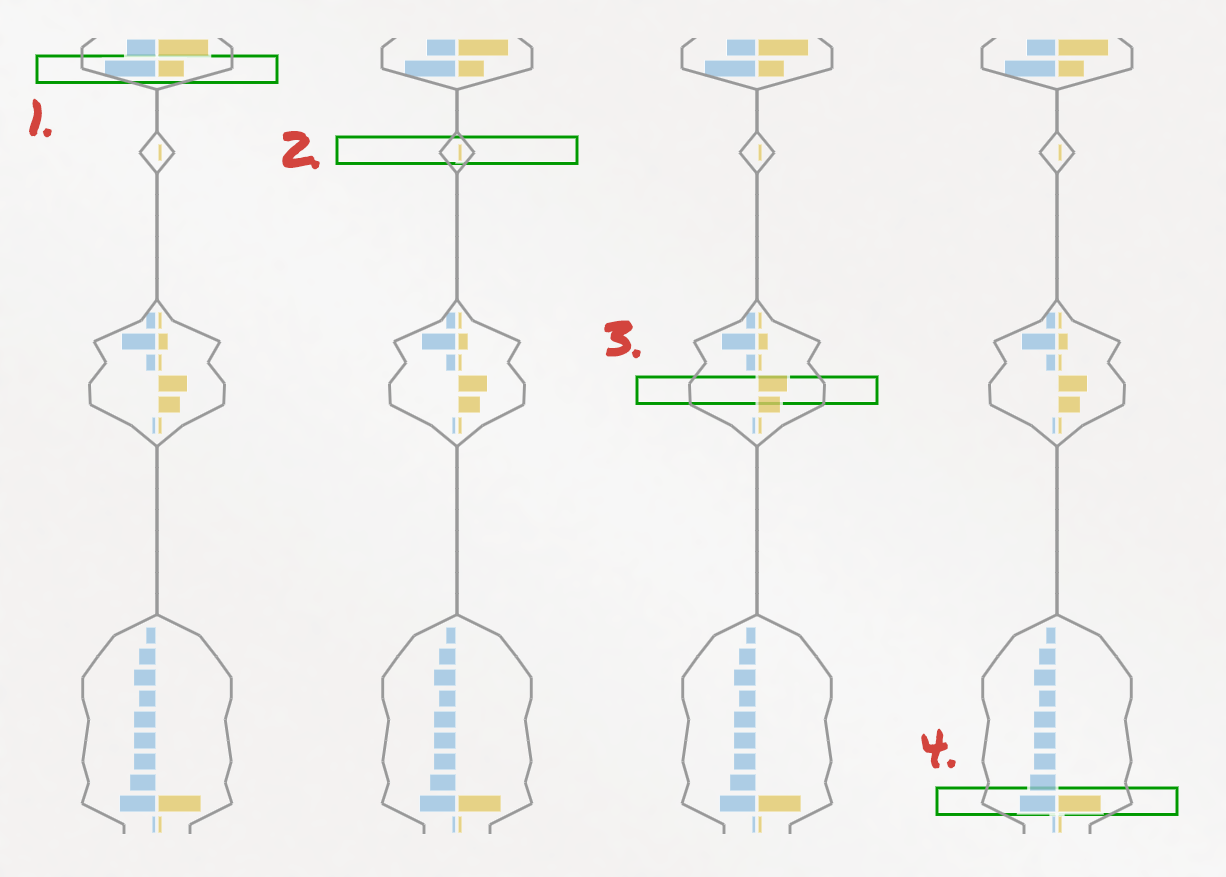
Do you go for number one? That’s almost certainly a header navigation link, and while you may want to get as close to the top of the page as possible, it’s likely that your link would be missed up there as it’s in such a high density area. Header links also tend to use drop-downs, so your link may struggle with visibility.
We’d imagine that most SEOs and Digital Marketers would LOVE position number two. It’s near the top of the page, completely isolated, and with lots of editorial context surrounding the link. This link looks like the Holy Grail of placement.
Number three is possibly the second choice for many people. While it’s beside a few other links, it’s still pretty prominent. And if that is indeed a sidebar of links, your link may appear on multiple pages.
Number four looks like a poor link if you only consider page position and density, BUT I’m sure that many practitioners would love to secure a site-wide footer link on every page of a prominent site.
The TL/DR for perfect page positon placement is the old SEO joke of, “it depends.” But, regardless of your aims for your project, we hope you can see just how powerful Link Density Charts are to help you zoom in on just those links and opportunities that are most important to you.
Here is that image again from the start of the blog post. Hopefully the labels make much more sense than they did a few minutes ago.
Where do you Find Link Density Charts on Majestic?
Link Density Charts are available for all Majestic subscribers. You can find them in two different places.
If you are interested in inbound links, you should check out the Site Explorer Context feature. All of the screenshots you’ve seen so far are from that tool. It provides a holistic look at the area around a backlink, in a human readable search-engine-like format, rather than a dry spreadsheet.
The second place is the Site Explorer Pages tab. Charts are available for most crawled pages, and while they don’t have a green box (as there is no incoming link on the Pages tab), it can still provide powerful insight. For instance, here are some pages on the Majestic Blog. By scanning through our own pages, we can use these charts to find larger areas of editorial text where we have no links.
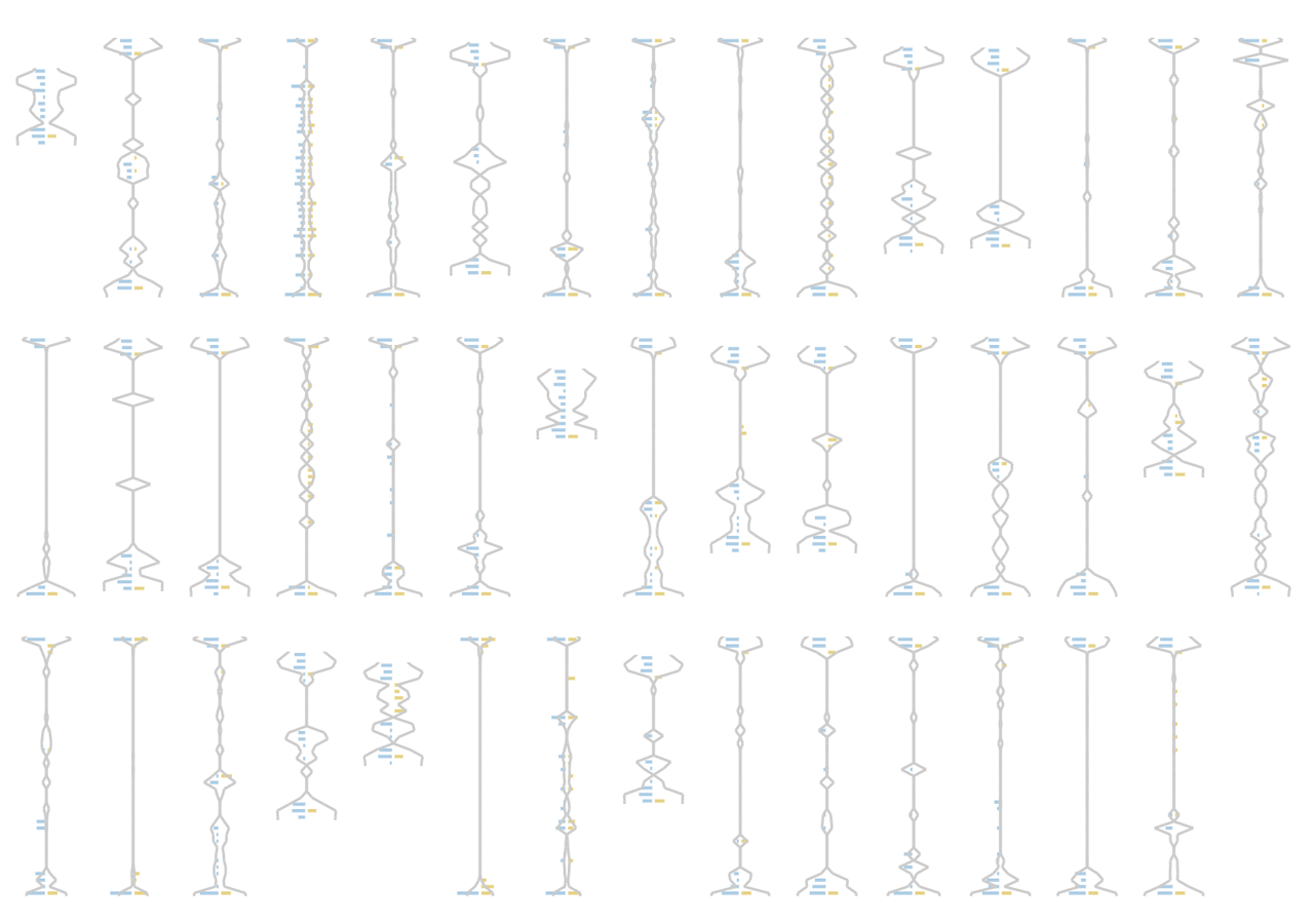
Note: This grid of Link Density Charts for Pages isn’t a view we offer at the moment. But if you’d find it useful let us know and we’ll see what we can do.
Further Reading
Since launching these charts in 2019, we have added a few blog posts that may give you more insights into the kind of tasks you can shape around Link Density Charts and Link Context.
- Find the placement of lost backlinks
- Use Visibility Flow to find low density links on high Trust Flow pages
- An Introduction to Link Context, by Dixon Jones [PDF]
As we’ve mentioned, Link Context and density charts are a cornerstone of Majestic for all customers.
If you have never subscribed to Majestic before, why not give us a try? We firmly believe that we have some of the best-priced plans in the SEO and Digital Marketing industry. Brand-new LITE or PRO customers (who have never subscribed before) are eligible for a 7-day money back guarantee.

- Master Backlink Analysis with Link Density Charts - July 30, 2026
- N-grams Near Links: Identify recurring phrases in the context around your backlinks - April 29, 2026
- TLD Checker – New for 2026 - February 26, 2026