


We have a small UI update that we’d like to share with you.
As the team developed Link Graph, one thing that stuck out was how much real-estate on our pages is taken up by the Majestic header bar – particularly in Site Explorer. As a team member suggested,“when I’m on my laptop, it’s like trying to look at Link Graph through a letterbox.”
Since that comment, we’ve been desperate to dedicate a bit of time to reduce this header size, and give you more immediate data before you start to scroll.
We’ve reduced the height of the big and blue Majestic header throughout the website. While it’s a relatively straightforward update, it may feel weird for a few days, (until your muscle memory refreshes).
What has changed in this update?
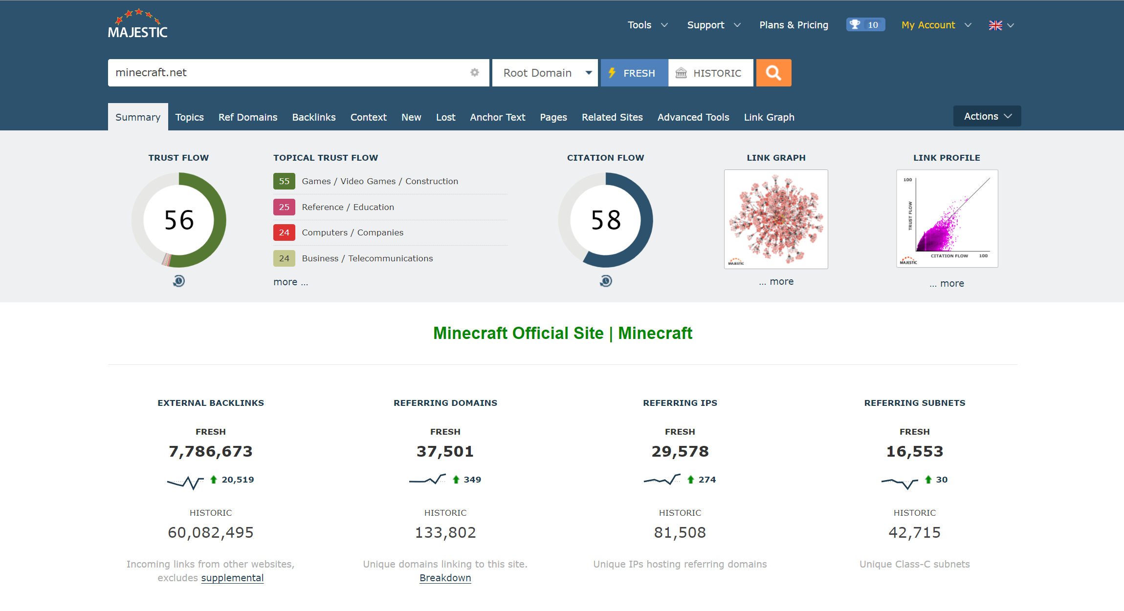
While it’s a small update for your workflow, this change will impact almost every page on the site. Here are the most obvious tweaks.
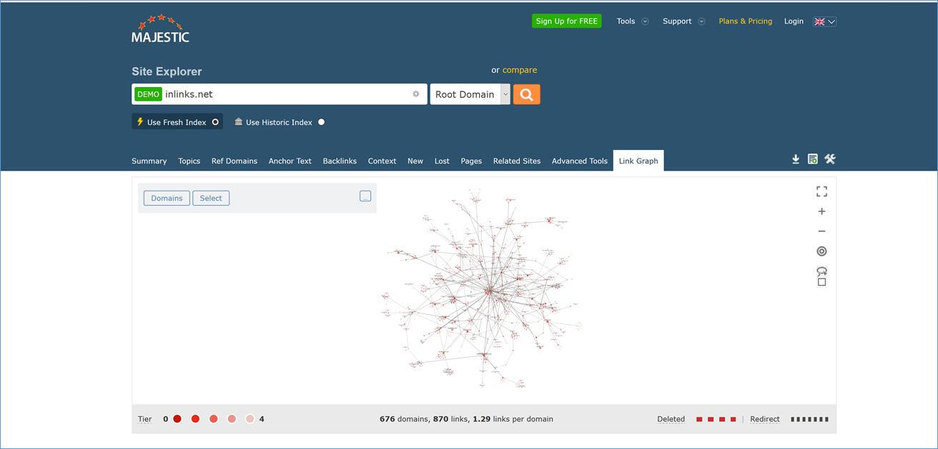
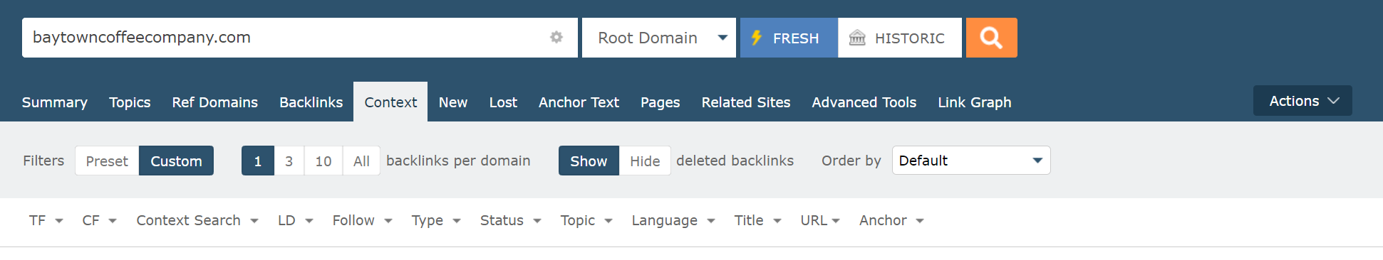
A smaller search bar for Site Explorer
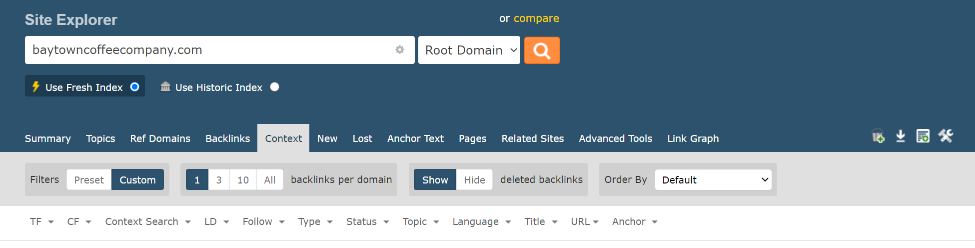
We have reduced the vertical height at the top of Site Explorer.
Replaced ugly “Actions” buttons
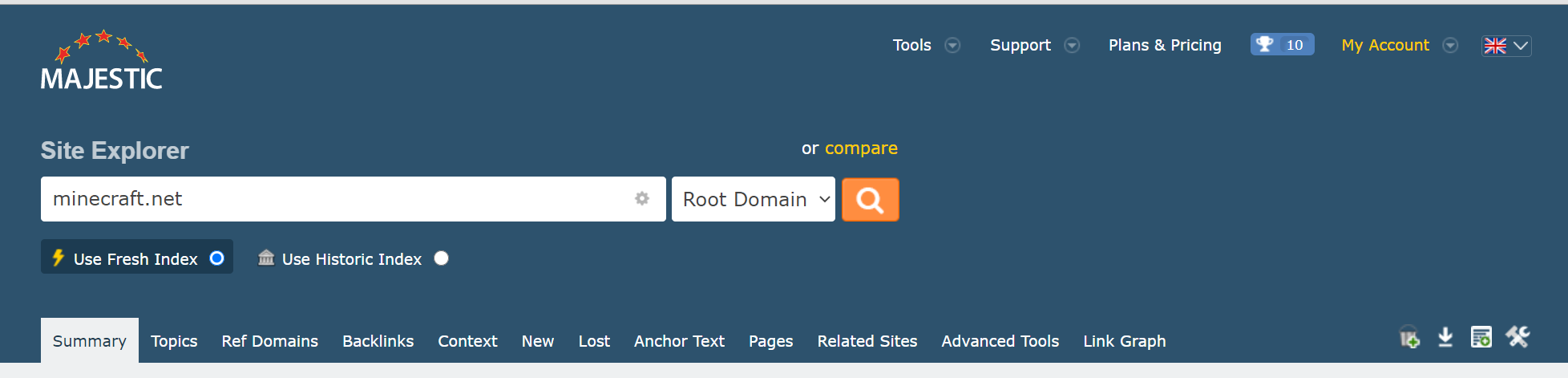
It’s been over five years since we introduced the small panel of actions icons to the right of Site Explorer. We’ve never tweaked them, as we haven’t had the horizontal space to add icons for other important actions. With this update, we’re replaced the old icons with a more comprehensive list of actions you can perform on your original search term.
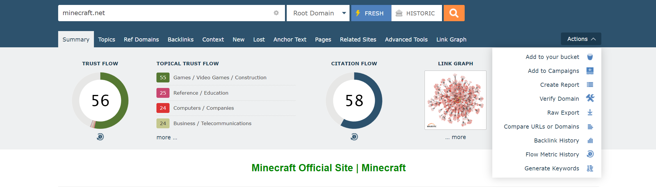
Let us know if we missed a shortcut that you’d really like in there.
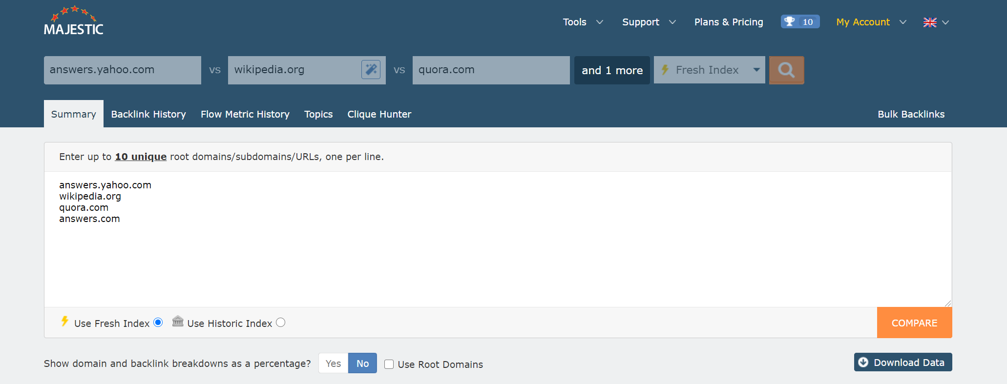
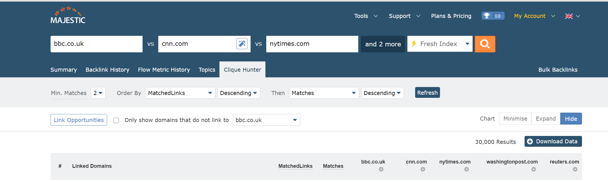
Streamlined Compare Tools search bar
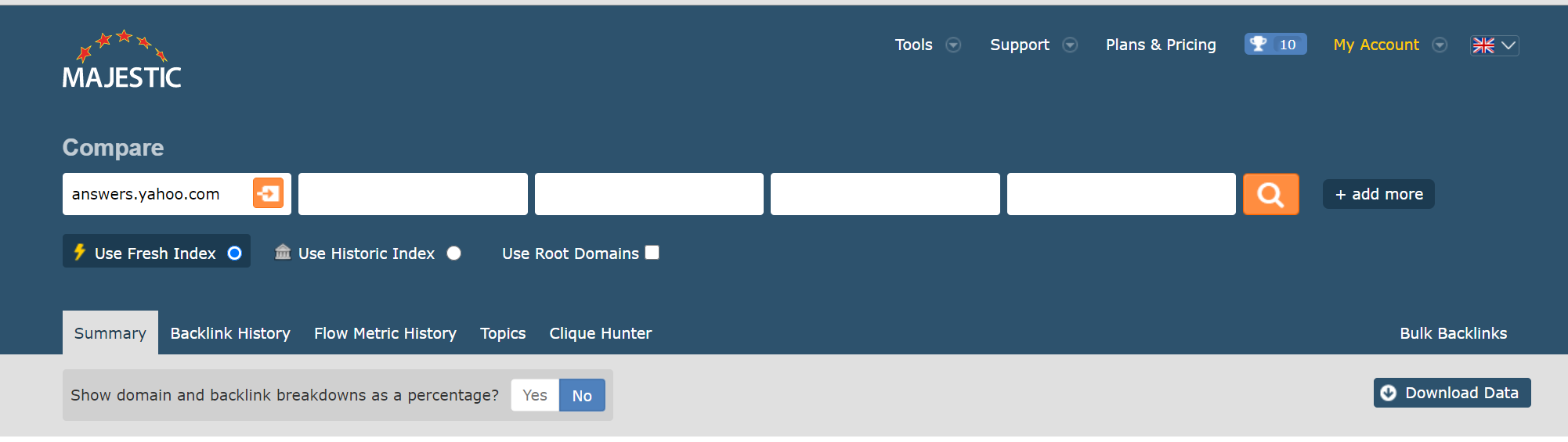
This was the most difficult part of the update. The Compare header used to have space for five search terms, but once we’d brought the Index changer inline, there just wasn’t enough space to keep so many inputs. We have reduced the number of always-on input down to three items.
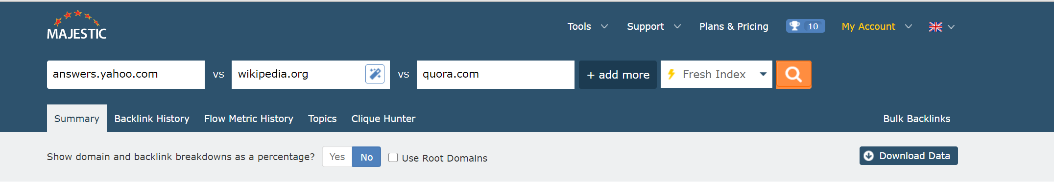
But, don’t worry! If you regularly add more than three inputs, you can press the [+ add more] button at any time to add up to 10 domains for any Compare Tool lookup.
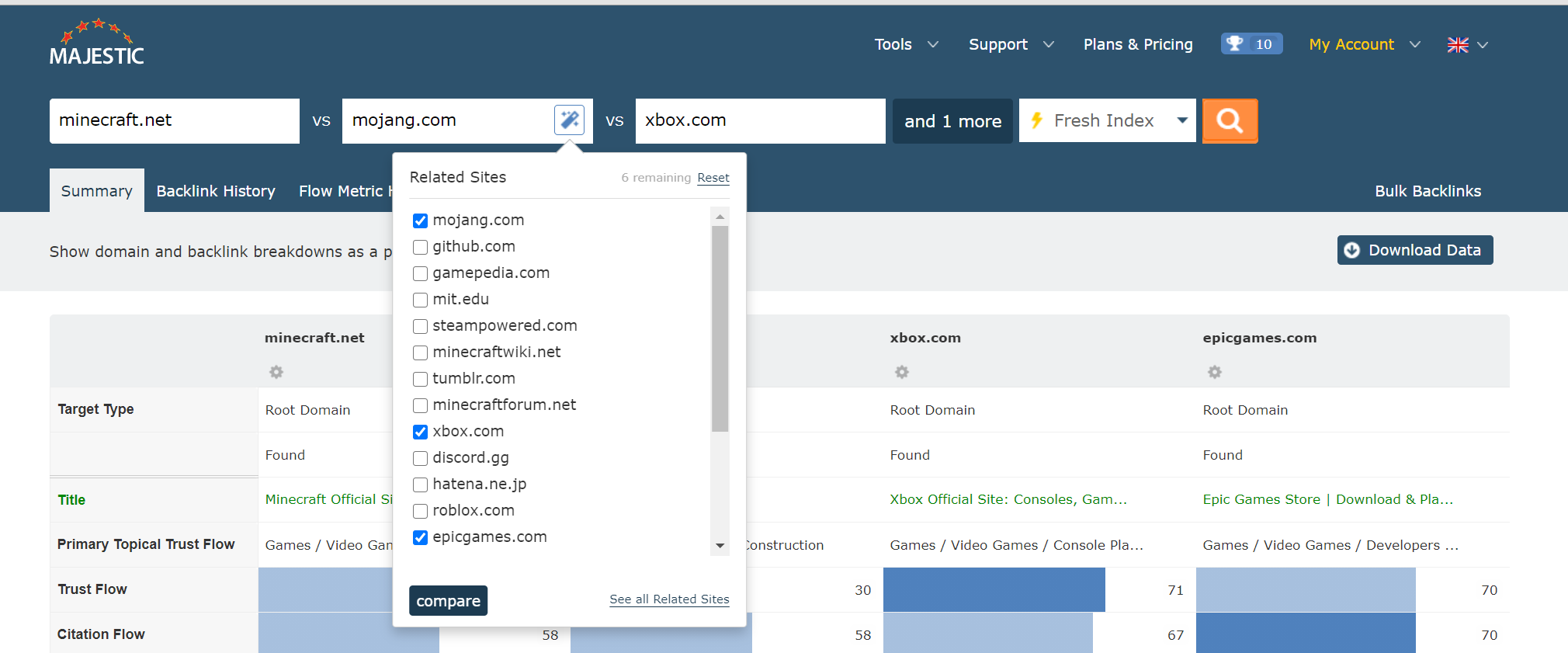
PRO TIP! If you don’t know who your competitors are, you can press the [Related Sites] wizard button at any time to choose up to ten domains from a list of similar sites. This list is compiled from all of the websites that are most often found nearest links to each other.
A smaller search bar for Search Explorer
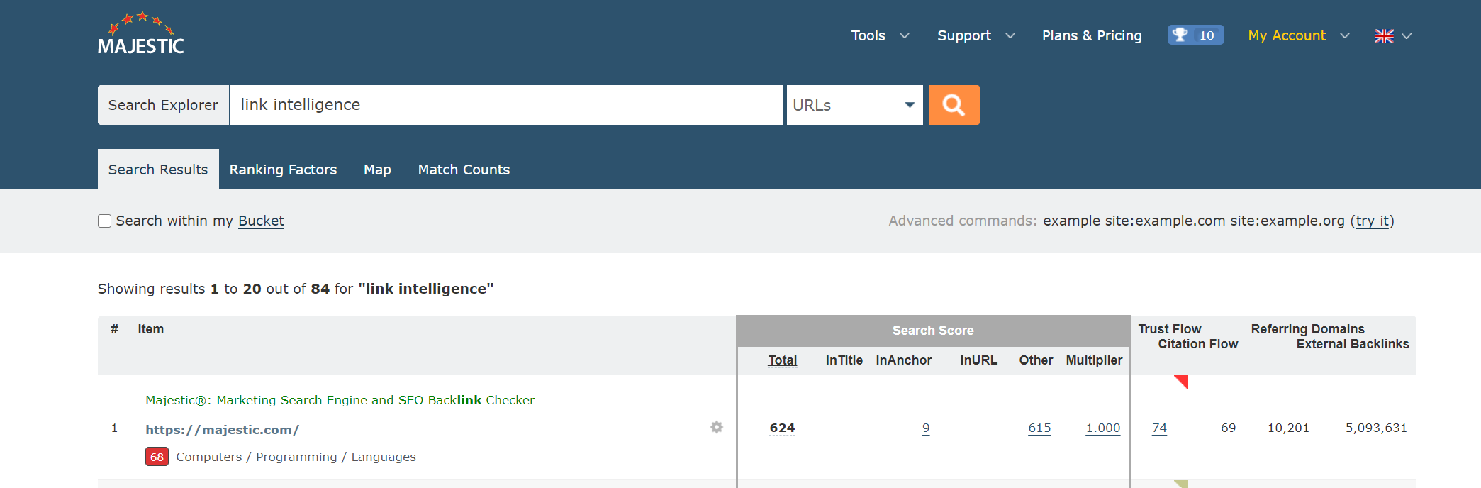
As well as streamlining the Search Explorer header, we have added a clear label to reinforce that you’re on Search Explorer (our text search tool), and not Site Explorer.
Removed legacy Clique Hunter parameters
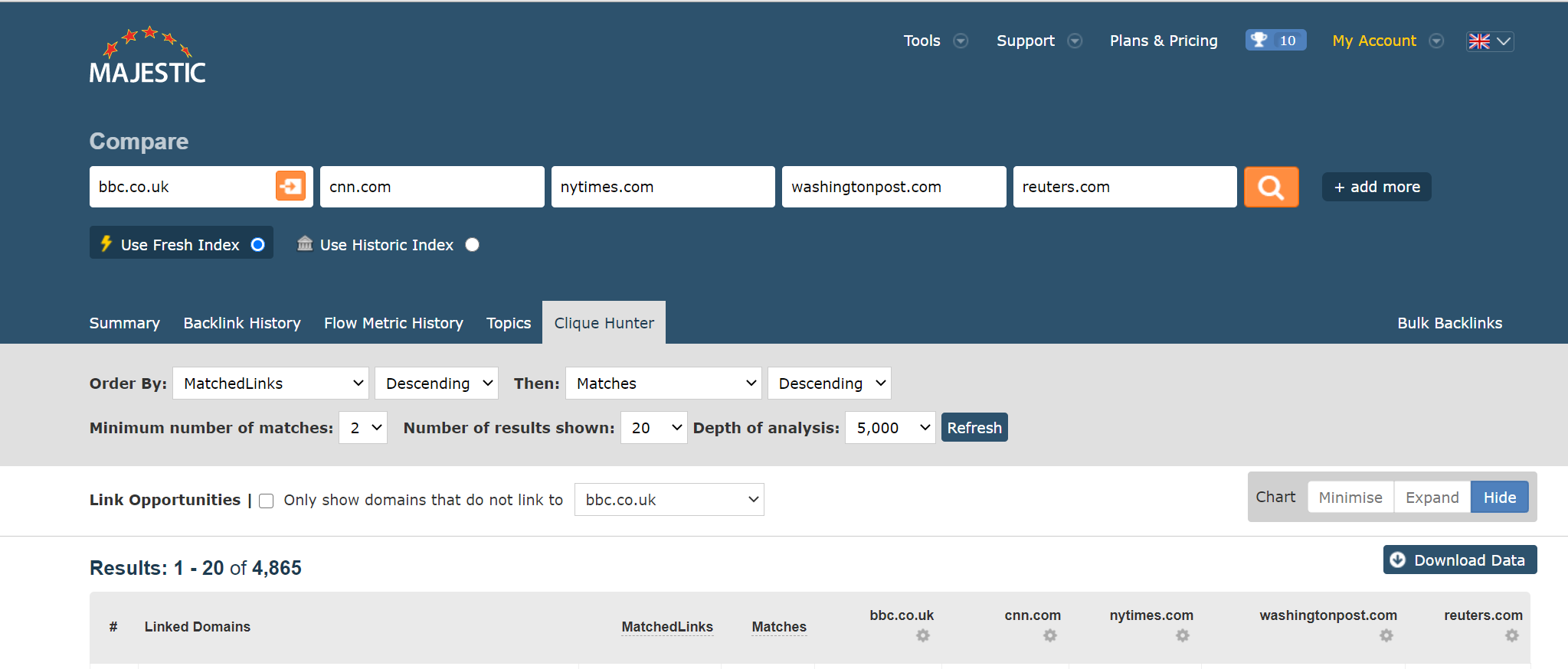
Clique Hunter is the Majestic tool that helps you find out which sites link to any group of websites. You can add up to ten sites (or URLs) and we will return a set of websites that have most links to that group.
To streamline your search decisions, we took the opportunity to reduce some of the unneccesary options for Clique Hunter. No longer will we ask you to choose a Depth of Analysis, or Number of Results. In both of these instances we have set the tool to run at the maximum value, giving you a consistent set of the most (and most relevant) results available at your subscription plan level.
PRO TIP! To see only websites that DO NOT link to one of your inputs, click the box beside Link Opportunities and choose a site. This is a great way to find which sites are bringing links to your competitor, but not you.
Standardised some legacy styling issues
We’ve reduced a lot of the noisy grey-on-grey throughout the site, and sorted out some inconsistent typography.
Network Checker
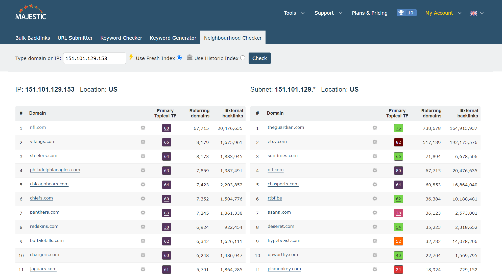
Finally, we have tidied our Neighbourhood Checker. If you haven’t used it, that is the tool that you can use to find out which domains are hosted on the same IP addresses or subnets.
Have you found any issues?
As with any sitewide change, there’s always a worry that we’ve overlooked a certain browser layout, or infrequent use case. If anything in this has made your Majestic workflow worse, or if you have any ideas about how we can make things even better, please do get in touch.
Thanks for reading this short update. It’s maybe not our most exciting release of the year (see: Link Graph update #2!), but we hope that these small changes will help improve your Majestic experience.
- N-grams Near Links: Identify recurring phrases in the context around your backlinks - April 29, 2026
- TLD Checker – New for 2026 - February 26, 2026
- Welcome Hub – Improving the final step of your login journey - September 9, 2025