


Full colour Trust Flow charts were introduced alongside Topical Trust Flow in 2014.
They are jam-packed full of useful information, and once you know how to read them, they tell you nearly everything you need to know about the types of trustworthy links that point to any website.
But, what do the different coloured sections mean? And why do the chart slice proportions not seem to match Topical Trust Flow numbers? Read on to work out how you can learn to interpret any Trust Flow chart.
What is Trust Flow?
Trust Flow is our headline metric. It is a score between 0-100 that models the quality of links pointing to a URL or domain. Trust Flow aims to reward high quality links from authority sites.
Once you know the Trust Flow of a site, you can use its Citation Flow as a balance. CF (Citation Flow) is a raw volume score, showing a domain’s quantity of links. In theory, sites that have higher TF scores than CF should have a higher proportion of high quality links.
Trust Flow Charts for non-subscribers
If you prefer to use Majestic without a subscription, that’s okay. But bear in mind as you read this article that non-subscribers see Trust Flow Charts like this, a solid blue bar that shows the Trust Flow score as a percentage.
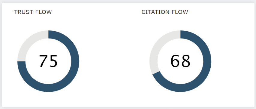
Subscribers, however, see the full colour charts – with added Topical Trust Flow.
What is Topical Trust Flow?
When launched, Topical Trust Flow was a revolutionary way of categorising web sites and niches.
Whereas Trust Flow is a score that looks at a URL’s link quality from the entire internet, TTF (Topical Trust Flow) is more selective, and instead checks to see how close any URL is to trusted websites in around 800 different topics.
TTF in a nutshell: We can say for a site, “This domain has lots of links from skateboarding websites.” If you’re running a sports equipment business, that’s great news. If your client is an estate agent/realtor, then it maybe shows that they’re getting links from the wrong places. Find out more
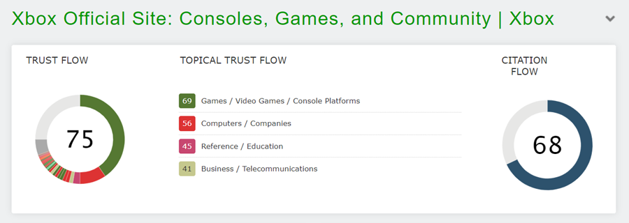
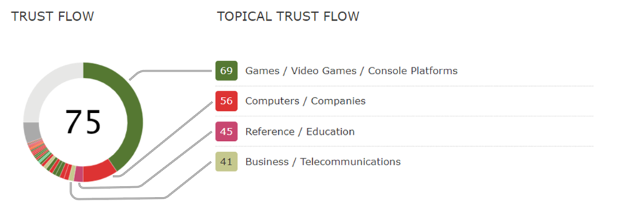
Trust Flow chart shows Trust Flow + Topical Trust Flow
To give you a high-level view of any site’s topical relevance and quality, the full subscriber Trust Flow chart overlays a Topical Trust Flow breakdown.
As each of our 16 topics has an individual colour, an experienced Majestic user can quickly identify websites that have the type of topical relevance they need.
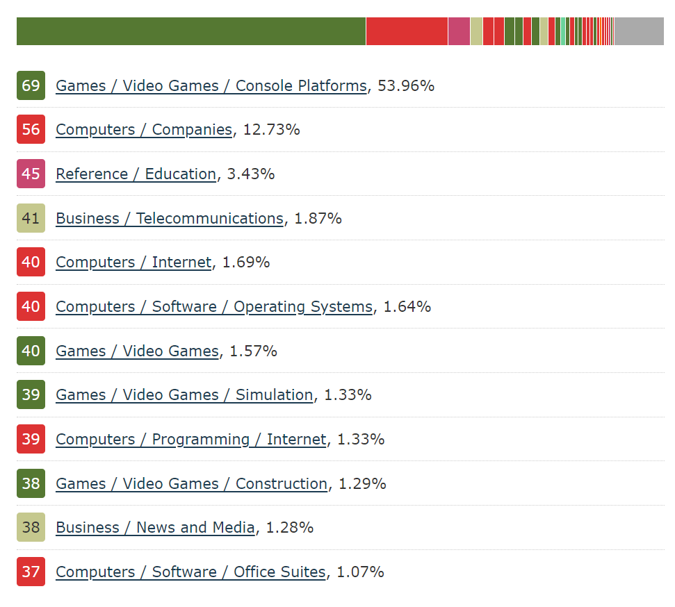
As an example, here are the Trust Flow charts for the BBC, The National Library of Scotland, Etsy, and USA Today. It should be realtively easy for you to work out which one is which.
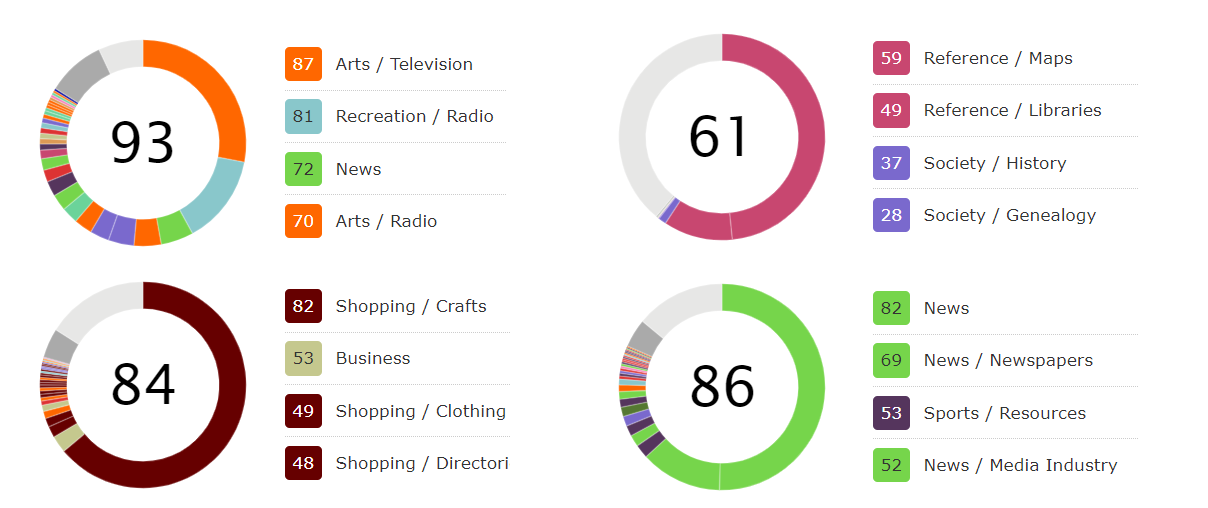
As you may have worked out, the first colours in the chart match the same four colours in the top Topical Trust Flow values.
They map across like this, with the largest topic going first, and the rest following in a clockwise direction.
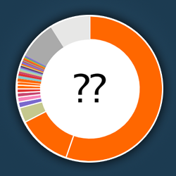
Why are the section sizes of the chart not in proportion to the TTF scores?
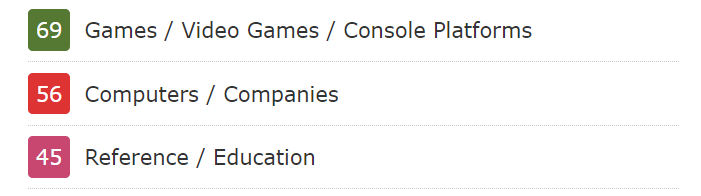
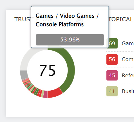
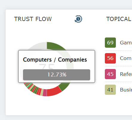
If you look at the Topical Trust Flow scores in our example (xbox.com), you can see that the first topic has a score of 69, and the next topic has a slightly lower score of 56.
To work out the relationship between those categories, it’s tempting to just divide 69 by 56. This would suggest that the top topic is around 1.3 times as big as the next one, and that these two categories are relatively evenly matched.
However, this is not correct. If you look again at the Trust Flow donut chart, the size of the green and red sectors are quite different. If you hover over each coloured bar to see the percentage weighting given to each topic, you’ll find out that the green [69] score provides 54% of this domain’s [75] Trust Flow, and the next category [56] contributes only around 13%.
So, what’s going on?
The answer is that Flow Metric scores are not linear. You can’t add two 5 Trust Flow sites together to get a 10 Trust Flow.
To keep this concept easy to follow, we’re going to use some very fake numbers as an illustration. If you want to find out real information, Dixon Jones went into much more detail in his 2017 blog post, “REALLY Understanding Topical Trust Flow”.
If you play the type of video games that award XP points, you have probably noticed that it’s easy to move up the first few levels. But, after that, each new level takes longer to achieve.
Our Flow Metric scores work in a similar way. Imagine a hypothetical situation where each new good link gets your site a ‘quality point’.
- 100 ‘quality points’ that point to a URL might get you a Trust Flow of 5
- 200 ‘quality points’ might get you a TF of 6
- 400 ‘quality points’ might get you a TF of 7
- 800 ‘quality points’ might get you a TF of 8
- and on and on, until a trillion or so ‘quality points’ are needed for a TF of 100
Obviously, these are completely made up numbers, and real-life Flow Metric calculations are far more nuanced and complicated than just doubling the points needed for each TF band. But hopefully this shows you how it becomes more difficult to move up to each new tier of TF score.
If you prefer to see all the percentages, without hovering over each chart segment, Site Explorer Summary has a data table available for subscribers.
If you want to find more about the categories for any domain or URL, you can visit the Topics tab in Site Explorer. Bear in mind that Site Explorer Summary topics are a combination of External and Internal topical links, whereas the Topics tab is External inbound links only.
Site Explorer Summary Visualisations
Along with our other headline visualisations of Link Graph and Link Profile Charts, the Trust Flow chart is an incredible tool when it comes to distilling the essence of a website in a single row of graphics.
From left, to right, you can find out any site, or URL’s…
- Trust Flow score, indicating the link quality
- Topical Trust Flow site categories, and use the Trust Flow chart to see the proportions of each topic
- Citation Flow score, indicating link volume
- Balance of quality vs volume of links, by comparing Trust Flow and Citation Flow
- Network of links around this site, with Link Graph.
- Spread of TF and CF for all of the links that point to this site, with Link Profile Charts.
This top banner is one of the most comprehensive ways to instantly discover a flavour for the health and category of any domain, subdomain, or URL. And now that you know how the Trust Flow chart works, you are one step closer to faster site evaluation.
Try them out
Hopefully this has been a useful guide to Trust Flow charts, and you now feel more confident as you evaluate a website’s topical quality based on a small chart.
The full charts are available to every Majestic subscriber.
Single blue segments are available for those who prefer to use Majestic without a subscription. If this is you, and you would like to see an example with Topical Trust Flow, please check out our current showcase site. It’s a freebie from us to you, that lets you test-drive a real-life website in Site Explorer.
- N-grams Near Links: Identify recurring phrases in the context around your backlinks - April 29, 2026
- TLD Checker – New for 2026 - February 26, 2026
- Welcome Hub – Improving the final step of your login journey - September 9, 2025