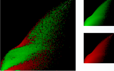
A few posters suggested the image in the previous post represented some manner of scatter plot – Linux Turner @ “localhost” suggesting an ACRank, backlink concentration chart indicating quality, Joost De Valk at Yoast suggesting a Distribution of websites/URLs over an AC rank / # links scale, and Jackie Hole suggesting a representation of the exodus of SEO professionals from a free bar when the drinks run out. Jackie, much though we love SEO related data, we have our limits…
We feel it only fair though, to provide a little clarity – so, I’m sorry Roland, from Cloudshapes – we can confirm that the new technology we are launching is in no way related to the genus sciurus, and whilst we appreciate the thought, Alex Flower, I guarantee the technology behind this is far, far more advanced than a simple IP addresses, AC Rank extract.
To attempt to explain the image above, without giving too much away, we generated a green flame for a big “thingy”, and fed some more data into our algorithm to generate a red flame for another big “thingame”. At a casual look, the two flames look pretty similar ( which won’t be a surprise to many when you learn what they represent ) – but when compared block by block, we see the subtle differences becoming more apparent.
Has this clarified your vision of what the new technology could be, or what the technology behind the “flame like scatter plot” could be – will it be the AC rank replacement loran750 has been dreaming of, or a link trajectory calculation as suggested by Brent Rangen?
Don’t forget to have a read of Brads’ Post if you fancy winning a two day pass to SearchMarketingDay at Poznan.
I’ll close by wishing you all a great weekend, with the promise that all will be revealed next week.
Oh… we should have said that ONE person more or less correctly guessed ONE axis in the initial post comments. One last clue is that the pixellation is there for a reason. Does this help? More guesses welcome below over the weekend.
- Introducing Duplicate Link Detection - August 27, 2021
- Python – A practical introduction - February 25, 2020
- Get a list of pages on your site with links from other sites. - February 7, 2020


Last time when I’ve seen graphics like this, was when I was looking data calculated with help of neuron networks to make predictions about nodes. But I can’t imagine what and how you did it. I’m pretty sure you guys are made something great, cos you’re the best in this business! I cant’t wait to see the new technology. Respect!
May 11, 2012 at 3:43 pmThanks for the compliments Alex, I hope you can give us some more feedback when you take it for a test drive!
May 11, 2012 at 5:04 pmHm, perhaps some full text analysis statistics ?
May 11, 2012 at 8:16 pmDoes it represent links from when they were first found (red / historic) as they disappear from the current (green / fresh) index over time?
May 12, 2012 at 1:07 am