


Occasionally, one stumbles upon a thing of beauty.
We were stunned to see a new visualisation of Majestic Data, a beautifully animated dataviz created by fusing the power of the Majestic API with the wonderful visual capability of the software version control vizualisation tool, “Gource.”
The visualization uses the generation of nodes within a linked graph to show the chronological spread of backlink growth.

What’s more amazing is that this concept went from an idea, all the way through to development, in just 24 hours at an MLH sponsored student hackathon, AstonHack, hosted at Aston University of which Majestic were proud sponsors.
If you want to see more than just a picture – the full video is below:
Stunned? We were.
It gets better.
The team that produced the hack above weren’t satisfied to rest on their laurels. In the same 24 hour hackathon, they went on to produce another visualisation which attempted to show the shortest path between two websites:
And to make it even more amazing (this is real cherry atop icing on cake with sprinkles sort of stuff), they released the source code for the dataviz onto Github.
Lets meet the talented indviduals who created these digital masterpieces:
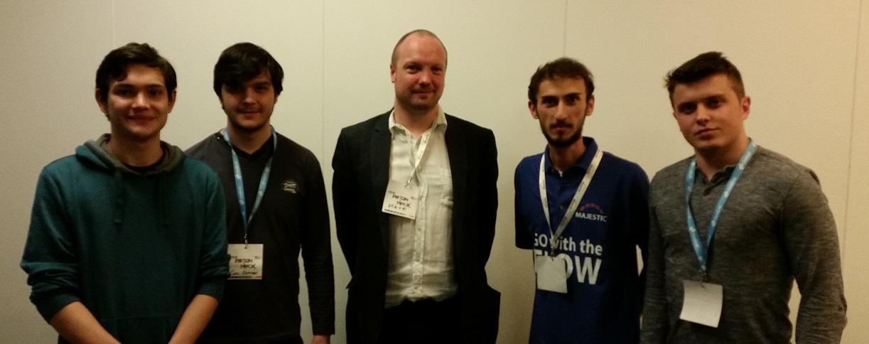
Steve caught up with the winning team, Paul Gafton, Stefan Idriceanu, Catalin Lupuleti, and Bogdan Duta from The University Of Manchester, after prize giving and asked them a few questions.
Congratulations on winning the Majestic and Cap Gemini prizes at the hackathon – how did you come up with your ideas?
After we set us up (i.e. getting access to internet and to your API), we decided to gather in a quiet space and discuss what are we going to do. The discussion took about 3 hours, time in which we shared what each of us found out about the API and tried to find something interesting to do. We were naturally biased towards data visualization, since it was obvious that you have a lot of raw data and statistics and just producing another set of numbers wouldn’t be interesting. At the end, after we considered tens of ideas and thought about data visualization approaches in various fields, we ended up with those 2 ideas that got refined while we were implementing them.
The end result of the animation was stunning – did you expect it to look so good?
Yes. We knew what we would like to see and we decided that generating that animation ourselves is going to take a long time, so we decided to find some libraries/tools that can help us. The animation itself is generated by a tool which is meant to show how a software project evolved based on its commit history and our challenge was basically to find a way to map your data to a set of commits and a file system.
I’m assuming this isn’t your first hackathon – which other Hackathons have you been to?
For me and for another team member, it is the first hackathon. For the other 2 guys, it is the second hackathon. So far I didn’t go to any hackathon because I lacked the confidence that I can build something interesting in the available time. Once I have got that confidence, I contacted some friends and built the team.
Which other hacks impressed you the most?
Gnome child, wiki crawler and TwEAT, not necessarily in this order.
We loved meeting Paul, Stefan, Catalin, and Bogdan, and seeing what they could do with our Majestic data.
We will cover some more of the excellent AstonHack entries in a future post, and if you are an IT student we would strongly encourage you to find and attend a local MLH sponsored hackathon.

Steve has been engaged with the Birmingham tech scene for years, co-organising the grassroots open-source conference YAPC:: Europe 2008, and founding the West Midlands Java User Group in 2014.
- Majestic head office – relocation - March 31, 2026
- Introducing Duplicate Link Detection - August 27, 2021
- Python – A practical introduction - February 25, 2020